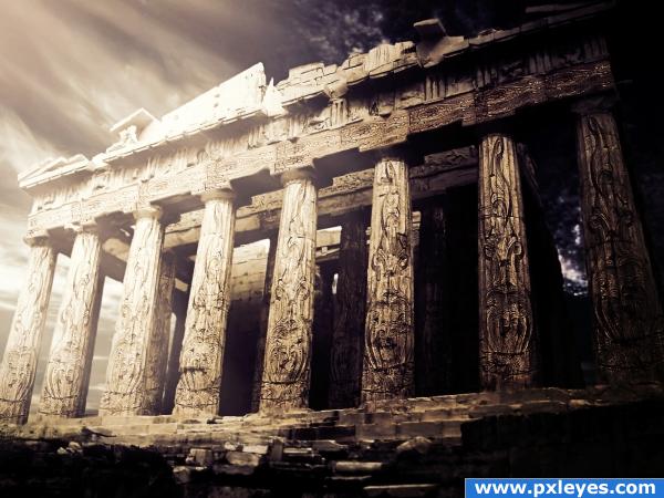
This was a fairly easy job, but I thought that due to the fact that the source image is quite difficult, the easiest way was to use the pattern on the wood.
So I did a selection of that pattern and put it on top of the Parthenon columns. Changed blending mode to hard light and then duplicated layer, desaturated and changed blending mode again to multiply, also lowered opacity to get more natural shadows.
Masked the pattern, distorted and warped it to better match columns shape.
Added gradient layers for coloring, and light beams (gaussian blur and lowered opacity). (5 years and 3930 days ago)
- 1: Parthenon
- 2: Light Beams







Good result! Maybe just blur the interior columns a bit...
awesome
clean work, i like the artistic vison you put in to it.
Awesome decor for an office.. YOWZA.. really nice image.. good luck author (this is a piece you put behind the desk so you scare the heck out of clients and it lets them know you mean business..hehehe)
Great idea very nicely done!
Wow, that is really cool... good luck and nice imagination....!
nice work Author a different twist on a familiar place.
Excellent job, author! Really love the high resolution of this!
Very nice idea and result
nice work
Very nice image.. good job!
really nice job author ... GOOD LUCK
Congrats!
Congrats!
Congrats again, Cornelia! Such a lovely mood! Don't know, why I didn't fav it before, but I do it now
Congratulations for 1st
Congrats, really nice work
congrats
Thank you very much for your comments and congrats! I am really happy you liked this one!
Congrats!
Congrats!
congrats!!
Congrats!
Congrats for 1st
Congrats!!
Howdie stranger!
If you want to rate this picture or participate in this contest, just:
LOGIN HERE or REGISTER FOR FREE