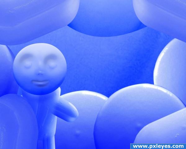
in some more years this is what we will eat (5 years and 4014 days ago)

"In the end, we will remember not the words of our enemies, but the silence of our friends."
..Martin Luther King Junior.
This entry may not be the greatest, but i want to dedicate it to the people who have left us due to drugs.
Only the source was used. (5 years and 4013 days ago)
the emptiness of the center really does make the point... AFTER you've read the description.. with the description it works.. with out it.. I thought the was a baby picture frame (sorry) my only suggestion if you changed the espression on the face to look into the dead space with an air of longing that would make the description unnecessary.. but that's just me.. LOL. this is your vision author (I do hear the piece quite well now)
If you look at the penultimate step of my guide you can see the expression that i originally had for it, but the reason for the smile was to illustrate the fact that many people who are in that situation always seem happy on the outside, no matter how much they are breaking up inside. I don;t blame you for believing that it was a baby picture.. that's what i wanted to show, the way that certain things can completely break you down into childhood. While i haven;t had any experience myself with substances like these, i had a friend who never told us anything, but always seemed normal and playful
and one day.. she was just gone.. Thanks GolemAura for the comment, but i hope this cleared things up.
Love the message you are going for and I agree with Golum about not really "getting it" until you read your description...IMO I would show somehow that what looks to be "candy" is just the opposite it's POISON and I don't think that is coming across..Keep working it and Good Luck
Thanks 
great
Cheers!
lol cool

"I hate to advocate drugs, alcohol, violence, or insanity to anyone, but they've always worked for me." Hunter S. Thompson
I'm glad they worked out for someone at least!

Thank you 
good idea
Howdie stranger!
If you want to rate this picture or participate in this contest, just:
LOGIN HERE or REGISTER FOR FREE
Photography and photoshop contests
We are a community of people with
a passion for photography, graphics and art in general.
Every day new photoshop
and photography contests are posted to compete in. We also have one weekly drawing contest
and one weekly 3D contest!
Participation is 100% free!
Just
register and get
started!
Good luck!
© 2015 Pxleyes.com. All rights reserved.

author, i hope not! nice image!
very Very VERY Clever Author.. I love the fact you kept the original feel and color and made an entirely different piece.. pretty cool
Good thinkin'...

future may be like this. good work author
Very nice. Is the "fruit" shadowed differently that the "meat" and "fish" on purpose? That's the only think I can see that stands out. Simple, yet Creative. Good job.
thanks for nice comments, and i think this food reality is not so far, chaplain fruit pills is on first plan, it was on purpose , to give depth feeling
Good job!
Cool idea nice work!
excellent thought.....love it....GL
nice
good job with the letters being sunkin down into the pills
Positive future image . If I see it correct, the main focus on the original image is in the middle of the picture. Down and on top in the image it's more out of focus. In that case I'd also expect the text (fruit and fish) to be a bit more out of focus). Just an idea. Good luck!
just some tips: there's some room for improvement.

1: some of the text isn't lined correct, which should be an easy fix. Try rotating and skew the text.
2. try using a displacement map on the text to make it follow the rounded tops.
Otherwise: good idea!
thanks for nice and helpfull tips
good luck author
good luck author
Congrats!
Howdie stranger!
If you want to rate this picture or participate in this contest, just:
LOGIN HERE or REGISTER FOR FREE