
Comments and suggestions are welcome.
(5 years and 4006 days ago)
- 1: Heart
(5 years and 4010 days ago)
nice idea, good luck!
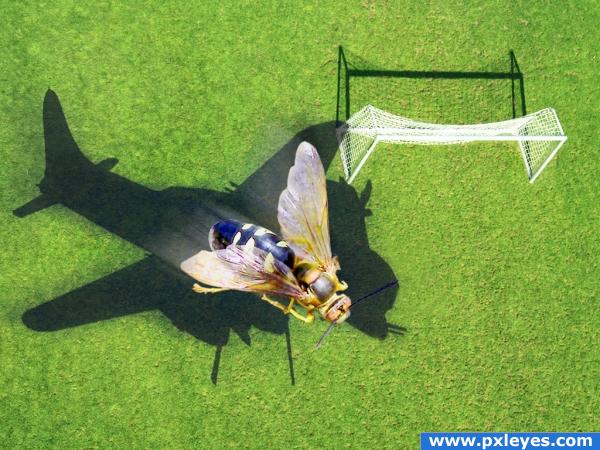
hey good idea...maybe sharpening the wings of the bee will justify it more
hmmmz well i like the idea very much, tho the shadows of the bee and the goal are off. the goal shadow is goin to the upper left while the shadow of the bee is goin to the upper right.... might be something you would want to check into. other than that GREAT image love it.
It's all a bit too blurry to work, both the forground image and the shadow. The idea is clever, but as a whole, it's missing cohesion.
@ Dragoncide: The contest is WRONG SHADOWS! Get it?  Nice job, author...
Ok, now your rockin! the REALLY blurry shadow before didn't look quite right. (seems like the goal light source doesn't match your new shadow though...)
Author, much better now!  And people, why do the shadows have to match the light source? What's the tiltle of the contest??? Sheesh...
incredible work!!!!! author this image is awesone indeed
wonderful!!!!!
Could there be a slight motion blur on the plane shadow too? Just asking, but its a nice pic anyway.
Great idea nicely done 

Howdie stranger!
If you want to rate this picture or participate in this contest, just:
LOGIN HERE or REGISTER FOR FREE
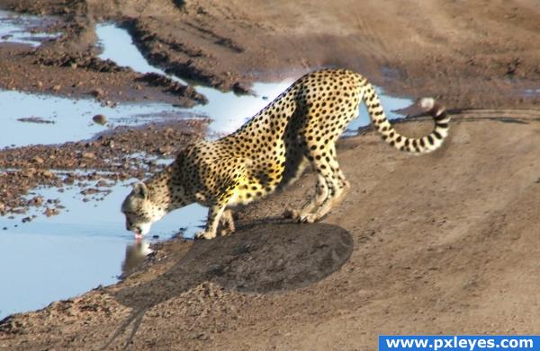
Not all cheetahs are as fast as they seem (5 years and 4010 days ago)
hehehehe.. good thinking author..very clever.. I think there might be some remenant shadow on the tail of the cheetah.. but the high res doesn't have that much detail... the composition and message is very well put together.. good luck
if u play more with the reflection of the of cheetah in water and brighten up a little more the opposite side of the shadow wil give it a effect.the source image is having the light coming from behind so brighten up the parts of cheetah having shadow to match with the rest.
This is a cute concept, when you changed the colors of the cheetah, something weird happened so it looks like it's not native to the photo though. If I hadn't look I would have thought it was pasted onto a new background. It's a little to saturated in color on the bottom of the main part of the body.
i love it. it is a bit hard to tell that it is a snail, however with the lighting that has it. the snail does go in that way, and the angle and perspective in my opinion make the shadow hard to see which to me is realistic
cute
Nice! I didn;t get it was a snail until i looked at your sources, it looked like a gazelle at first glance xD Good luck!
great
Howdie stranger!
If you want to rate this picture or participate in this contest, just:
LOGIN HERE or REGISTER FOR FREE
Thanks to bosela, Marzie and tvvoodoo (5 years and 4009 days ago)
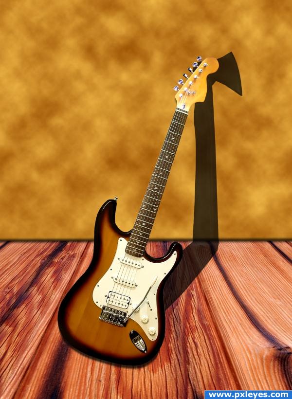
this is a really awesome Idea author.. think there is a way you could make the AXE more obvious?.. it took me a few moments to realize what you did..and this is such a great idea..there has to be a way you can make that Shadow more powerful.. I get it (and I love the work you did with the floor as well).. I'd just like to see the axe quicker... very good luck on this.. it's a very cool concept and I can tell you did some great work on this 
EDIT:.. WOW.. Perfect.. now I see the Axe immediately.. AWESOME JOB!!!
HAHAHHAHAHHA love the humor. awsome axe man.
I get the axe idea, but as a shadow it's not working. The perspective is good until you get to the neck, as a shadow it needs to be behind and to the right to be consistent.
cool idea! 
Flipped the axe head in the shadow.
better!
I like your idea, but for me it's really difficult to see the axe, i didn;t understabnd until i looked at your step by step guide, you may want to try making it more obvious
like the guitar
Howdie stranger!
If you want to rate this picture or participate in this contest, just:
LOGIN HERE or REGISTER FOR FREE
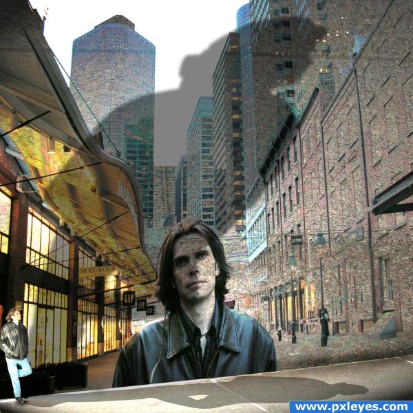
Impossible shadow split
my pictures and ps (5 years and 4008 days ago)
Nice! Very creative!! Good job!
cool, but why is he casting a shadow on the sky? 
ha ha ha elficho.. DOH!! that's what you get with impossible shadows 
elficho, cuz of the air pollution 
Because it's an easy cheat...
Contest Goal: Be creative with shadows, make them do things they normally wouldn't do. (shadow in the sky is cheating?)
I suppose that's CMYK's way of expressing himself xD I wouldn't get hung up about it author, it's an Impossible Shadow - fits perfectly with the theme.
cool very good author ignore cmyk!
Howdie stranger!
If you want to rate this picture or participate in this contest, just:
LOGIN HERE or REGISTER FOR FREE
Photography and photoshop contests
We are a community of people with
a passion for photography, graphics and art in general.
Every day new photoshop
and photography contests are posted to compete in. We also have one weekly drawing contest
and one weekly 3D contest!
Participation is 100% free!
Just
register and get
started!
Good luck!
© 2015 Pxleyes.com. All rights reserved.

Very nice image, touching sentiment! Well done!
had to look at it about 3 times .. there seems to be a dancing person in the heart.. I see it quite well LOL good luck
cool
good looking image! somehow it brokes my heard. why? cause i would love to fav that, but the source do alot in that work. so i cant fav you. ...you heardbreaker. ...but its a really great idea.
Howdie stranger!
If you want to rate this picture or participate in this contest, just:
LOGIN HERE or REGISTER FOR FREE