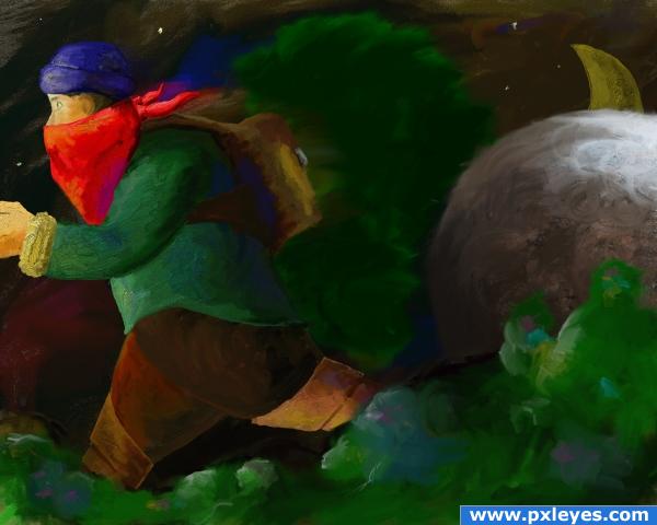
The ball reminded me of Indiana Jones...
No outside sources, used Artrage to make this. (5 years and 3885 days ago)
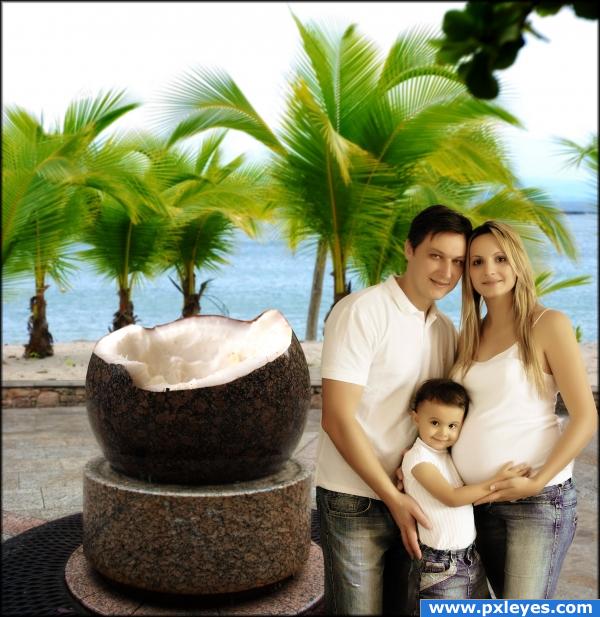
Best known for it's Stone Coconut Monument, the Coconut Island attracts thousands of tourists every year who seek the perfect vacation destination. (5 years and 3888 days ago)
cool looks real nice job Good luck Ps the people look a little placed they dont blend
errmm.. right. i did some tweaking and i think they look better now  thanks!
Nice image, but I never heard of a valley that was located on the beach.
because it's an ISLAND, duh!  fixed
fixed 
Very nice use of source, good job!
Oh makes me wanna go-- I love coconut.
Mmm. Tastey.
i was inspired by the first (and probably last) coconut i tried to open not too long ago. it's no picnic 
great thinking out of the box for source usage.
haahahah cool image! i love it author looks like a nice family photo!
I like the softness of the picture
gl
Oh author, I feel with you  Opening the one and only coconut in my life causes me a lot of cursing, sweat and a bleeding finger
  Very good blending and a really nice composition
  Good luck!
o.o looks like and advertisement for happyt family show the only comment i like to make is that the light falling on the ppl has a diff color then the light on the background from the source and the palmtrees
thanks! fixed  i hope they don't look to "pale" now..
Howdie stranger!
If you want to rate this picture or participate in this contest, just:
LOGIN HERE or REGISTER FOR FREE
(5 years and 3891 days ago)
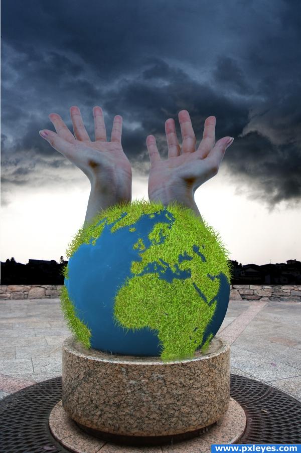
A very interesting use of the source image, i'll give you that, but i think you could blend the hands a little better, maybe starting from lower down on the globe to make it nice and smooth. I also question or use of the grass for the world, the image would be a lot more effective with a flat - brown and green land. That's just my opinion though, after all, it's your image! Good luck!!
i like it but think it would look better without the hands.
i like the image we all need rain it makes the worl happy right? and we all need to be nice to the worlsd ! its our only one right! nice blending on the hands! i love the earth you know because without it, we wouldnt evenbe here wed just be...well... nothing so i congratulate you on your wonderful image and idea and im giving you high marks! oh and by the IMO
Very creative.......love the grass
the earth looks great, but I think that the hands should be lightened a lil bit more. Also, the mood og the image should be in harmony with the other graphic ellements.
very interesting
the foreground of the image is very bright considering the background you have chosen.. Also the hands are a nice touch but maybe lower them a bit so they look like they are coming out of the earth... right now they look like they go straight up and it throws the whole perspective off to me  goodluck.
idea is good but this gress in earth is ugly, sorry, good luck
I LIKE THE GRASS... REALLY SMART IDEA.... GREAT WORK
nice
i like the grass a lot... good job...
Howdie stranger!
If you want to rate this picture or participate in this contest, just:
LOGIN HERE or REGISTER FOR FREE
(5 years and 3888 days ago)
great use of source, you need to work on thos reflections, or shadows a bit more.. good luck!
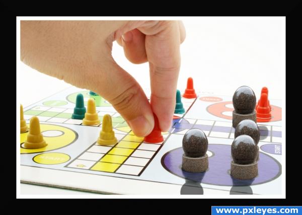
All game pieces should have equal shadows...
good idea well done -- reflections/shadows are a bit strong (IMHO)
great idea, hmm shadow shadow, never know shadow was so important until I came to pxl
@darkshellie.. i didnt either, and honestly i never comment on it cause im still a bit lost lol.. different idea author, well done.
creative use of source. shadows on "Stone balls" dont match the rest of the board., hand and other pieces.. a little balance between the shadows would improve your work
great job! the image has a realistic feel to it! and the shadows are pretty cool too i love the image i just cant get over that!
you have 3 different types of shadow 
Hmmm... It looks like the other pieces are not casting shadow, instead they look like casting reflection on the gameboard... I dunno, hard to figure out in small res...
Edit: Yup, they are casting reflection not shadow... I saw the source in full resolution and surprisingly no dominant shadow of the game piece on the game board... Rather there are it's reflection... So you might as well try adding light reflection to the stone pieces.. The hand has a shadow though...
Stone the crows this is good
gl
shadows are way too sarp and dark also perspective is wrong good idea tho 
just lower the opacity of the shadows... otherwise... very nic... i like the idea... very creative...
Howdie stranger!
If you want to rate this picture or participate in this contest, just:
LOGIN HERE or REGISTER FOR FREE
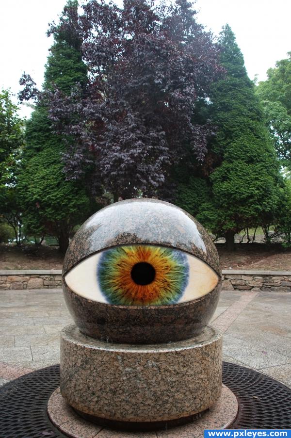
Thanks to erwinbacik for the eyball (5 years and 3890 days ago)
interesting.. good job!!
Needs a bit of shading under the rim, otherwise well done! 
EDIT: Better with shading, good luck. 
awww that looks trippy lol, very good 
really cool, love the multipul colors in the eye. And like how you kept the background, made it look more realistic.
pretty cool there author...
Pretty cool.
Adjusted the shadow lines
In this big brother new Technology . Very good GL
Its looking at me!!!!!! lol... nice work
gl
Uuuuh, I feel watched now  Very nice and convincing work!
  Good luck
just wow... i feel mesmerised...
Howdie stranger!
If you want to rate this picture or participate in this contest, just:
LOGIN HERE or REGISTER FOR FREE
Photography and photoshop contests
We are a community of people with
a passion for photography, graphics and art in general.
Every day new photoshop
and photography contests are posted to compete in. We also have one weekly drawing contest
and one weekly 3D contest!
Participation is 100% free!
Just
register and get
started!
Good luck!
© 2015 Pxleyes.com. All rights reserved.

Getting better, but he doesnt look like indy.
I know Sander, it's his dwarf brother LOL
pretty cool!
Nice idea...
nice colors
Howdie stranger!
If you want to rate this picture or participate in this contest, just:
LOGIN HERE or REGISTER FOR FREE