this was fun to do :D
comments and suggestions are welcome.
you might want to check high res before voting. (5 years and 3976 days ago)

Howdie stranger!
If you want to participate in this contest, just:
LOGIN HERE or REGISTER FOR FREE

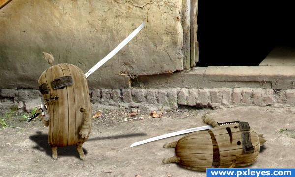
".... psssst, go for the one in the other hand - they taste like chicken!"
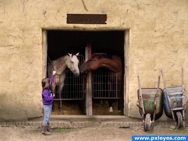
Constructed the Livery sign in CS3 - sbs to follow. (5 years and 3974 days ago)

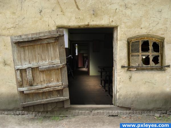
Old barn turn into an Old school. This is my first Entry so please be nice :) (5 years and 3979 days ago)
even though the result is technically horrific.. it's really quite cute.. good job and lots of work here
EDIT (Technically horrific in the sense that some one was technically sliced in half and it should be gross..(and it came out cute) it was a compliment)
what do you mean by technically horrific?
These guys are great! Light is from upper left in source pic, so you might want to rethink the shadows...still, high vote from me!

LOL ohh thats funny..or sad.....very well done
So cute.
CMYK46 i was looking at the leaf in the center and from the shadow it casts i believe the light is coming from upper right.
also the light in the source comes form top left, based on the shadows, but the source part used in my image was flipped, therefore what was top left became top right.
GolemAura thanks for the compliment.
haha very nice and funny
..i love it! xD
That's a great 'chop'
love it
wow this is amazing man really like it, it just looks right to me!
simply wonderful and creative! Love it!
good and funny!!
great idea , great result, gl
thank you all.
a little darker on sliced area and thats it perfect!
excellent use of the source. Agree with on the lighting angles, I missed the leaf, but the brick behind the twin on the left's right hand (if that makes any sense) tells the story. Excellent work here, author. Top marks. (with the "confirmed" lighting angle, I'm not so sure the shadow of the "winners" katana would be present on the blade of the fallen twin - but I am a beginner, so use your best judgement.) Great work.
you're absolutely right, the brick shows clearly that the light comes from top right, maybe i should have made the shadows more to the left. but since that's the only thing that shows the correct angle of the light source i think i have an other idea how to fix that contradiction. thanks for noticing.
A few more cuts and nicks would sell this some more.. The main shadow I saw as out of place was the one of the sword. You have the body shadow off to the left and the swords out to the right? Maybe shorten the swords shadow?? GL.
ditto on most of what everyone has already side. nice entry.
i thought about adding some more cuts and nicks, but then i said having one single clean slice would only show how easy the fight was, how easily evil won against good.
but i do have to make some minor changes to the shadows, when i do, i will shorten a little the sword's shadow too.
EDIT: made some minor changes.
this is cute!
part 2 "...but good never gives up" :
http://www.pxleyes.com/picture/8301/but-good-never-gives-up-.html
Congrats for your first place, inanis!
Congrats, really well done
Congratulations for 1st
Congrats!
Congrats!
thank you everyone for your high votes.
Howdie stranger!
If you want to rate this picture or participate in this contest, just:
LOGIN HERE or REGISTER FOR FREE