Thanks to:
- faestock (http://faestock.deviantart.com)
- mjranum-stock (http://mjranum-stock.deviantart.com)
- aisac (http://aisac.deviantart.com)
- emmytonks (http://emmytonks.deviantart.com)
- Mattox
- dimitri_c
- Falln-Brushes (http://falln-brushes.deviantart.com)
- LoRdaNdRe (http://lordandre.deviantart.com)
- lilnymph (http://lilnymph.deviantart.com) (5 years and 3871 days ago)

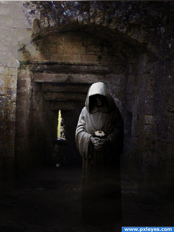

 It's like seeing a small dot on a white wall, but it helps in improving concentration( it is a compliment author



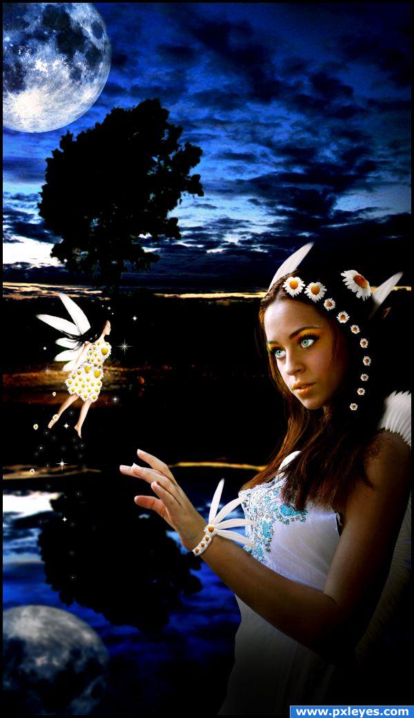
Very nice! Just a bit more shadows on the fairy's dress, and you're good to go!
Added more shadows to the dress, thanks.
All the blacks in the foreground, middle ground & foreground make this image confusing...
Interesting idea. But I agree with CMYK about the darkness. I feel you need to have the horizon almost visible for the distinction between the reflection, but thats your call. I would work more on your edges - like the fingers. They seem rushed compared to the rest of the image. Also your girl is in focus, the background blurred and the moon is also in focus? GL.
That's the ywwllo line, as you can see it's the really begining of the sky. Added more shadows and lights to her hand.
The background looks very strange, but i like the overall image, good luck!
Well i wanted to place a lake or river and a plain... i tried many lakes and rivers but none looked good, so i decided to create a mirror reflect of the plain and sky
Howdie stranger!
If you want to rate this picture or participate in this contest, just:
LOGIN HERE or REGISTER FOR FREE