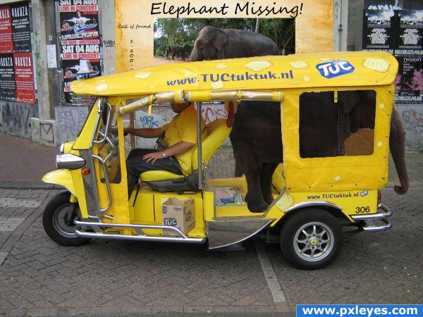
downoffthedragon: Hey! First! Ooo! It's Dutch! I checked out the website, of course. ( 5 years and 3702 days ago )
Eladine: lol to be honest i didnt check the website lol i just shot that pic a couple years ago.. loved the lil yellow car... now the pic comes in use ( 5 years and 3701 days ago )
downoffthedragon: I like checking out websites. I look in magazines I like just to find new websites to check out. I'm an internet junkie, just looking for a fix! ( 5 years and 3701 days ago )
ice: I looked at the website too and can't understand a word! lol. Except Oreos. ( 5 years and 3698 days ago )
Howdie stranger! If you want to participate in this contest, just:
author... you must add a STEP BY STEP... you will get much higher votes if we can see all the work (already gave you a high mark LOL.. but just trying to get you more LOL
Since this is a beginner's contest, a SBS is not compulsary. However, it's always nice if you can show how you made your entry . About the image, you may want to feather the edges from the flames a bit, so they match better with the rest of the image. Good luck!
Funny . You may want to distort the text on top a bit. The letters shouldnt go all vertical, there's a bit of perspective (check the windows under). With a bit of warp you can look it also more like the letters are round (like the side of the roof is). Good luck!
author says:
Thanks for the comment. It seems to still be pixelating, but at least when its viewed in hi-res its not
the text on the roof is a little too sharp and they dont follow the shape of the roof, also please run a very soft blur brush over the edge of the roof or move the boat a lil cus it looks like theres a lil outline on top.
I like this one alot... but for $19.99 I think it should be round trip.. lol... great image!
author says:
lol, thats funny you say that about the price...i swear thats what i had the most issue with. Silly i know. Finally I decided to go off the fare it is for me to take the bus from here to the airport. lol
high res please!!!! I really want to see this up close... go to MY STUFF and MY CONTESTS and re upload a HIGH RES image (it will get you higher votes as well
Hi author! Not bad for 14. I just wanted to give you advice... don't take to heart comments people will leave. Alot of people are excellent artists and they give lots of opinions and suggestions and it might feel like your being picked on. . And some people are far more picky and blunt then others. Take anything people say as creative critism. And if you agree with their comments try changing your picture and reupload it. If not... just enjoy your work and learn from others work .
author says:
Haha thanks for the advice, Hopefully my future entries will be better. =]
Funny idea . Masking is not bad, maybe on top of the car could be a bit more smooth. I'm not sure how you made the selection, but in case you use a mouse you can use the pentool to create a path and turn that into a sweet mask. Elephant itself needs some shading. Make a new layer above the elephant layer, make it a clipping mask, fill it with a gradient black 100% on top to 0% down and put the blending on overlay. And then see if you like the effect or not...otherwise play a bit with the blending modes. Idea is that the elephant gets some shading on top of his back, so it looks more he's in the car. If you give the poster in the background a little bit blur, it will fit better with the rest.
Good luck!
That elephant is mad small... also ice is definitely right. I'm 17 and kind of in the same boat as you; for example, I don't understand 75% of the things wazowski told you in his comment.
I'm laughing as I vote. I'm just imagining the hell people go thru on this ride! Great job, author!
By the way, author...you need to place your source link in the correct place. You accidently put it in the 'tags' section and not source link area.
You may want to check this commercial http://www.youtube.com/watch?v=73M2ABDedi4 Ontopic: if there's motion blur for the car, maybe you can add some blur to the backwheel too (which is rotating, so maybe you can experiment a bit with some motion blurs from different directions to give a supposed rotated movement) . Good luck!
nice use of source.
cool use of source.
great!
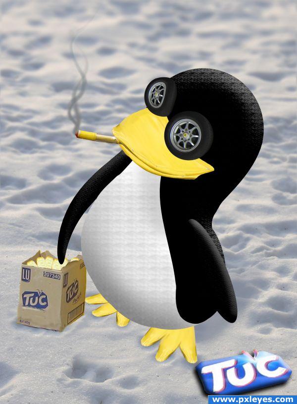
the smoke is awesome! lol
Congratulations for 1st
Congrats for your first place!
Congrats, nice work
Congrats!
Thx everyone =D
Congrats!
Congrats!
Howdie stranger!
If you want to rate this picture or participate in this contest, just:
LOGIN HERE or REGISTER FOR FREE