I'm not really happy about how this got but in factg I wasn't very inspired for this picture. (5 years and 3948 days ago)

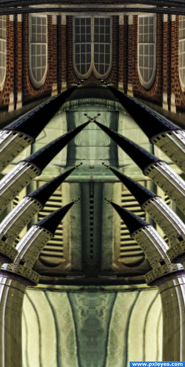
Sort of a Fractal, gothic, thing... I dunno, I had a picture in my head and went with it.
The second photo used is from a photo I took here in my hometown. It is a photo of a dome that I created a pseudo-HDR using qtpfsgui and ev-altered raws. The source photo is actually ONE of the photos that was rendered through it. Whatever pl was short for... can't remember - don't think I liked the result as much as the others though, as I recall. (5 years and 3944 days ago)

Thanks:
http://www.sxc.hu/photo/1094969
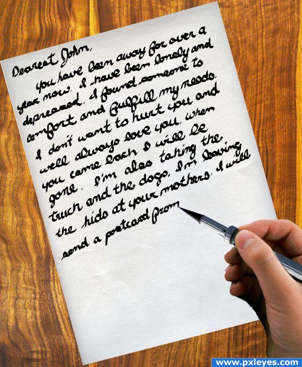
handwriting
cierpki
http://www.sxc.hu/photo/1210011
white paper
mychelley
http://www.sxc.hu/photo/793460
board
plusverde (5 years and 3950 days ago)
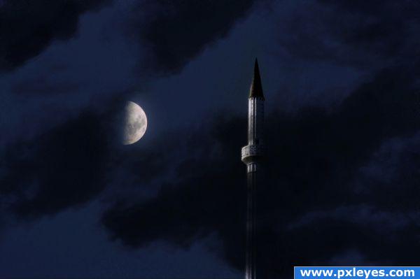
Interesting image, i like it, it looks peaceful, but it's a bit on the darks side. Just try pushing the brightness up slightly.. the rest is great!
In fact I put the wrong picture and I saw it was too dark. Do you know how I can modify the picture and if I can?
Yes you can - got to My Stuff - My Contests then find the right image and click 'Edit Entry'
That's what I just did but it doesn't change the picture. I will let it like that then :/.
your image has changed, it's a lot easier to see now. My suggestion now would be to use a full moon, because it doesn;t look like half of the moon is hidden. Anyway, good luck!
It's pretty good, but the perspective is skewed as either the moon should be higher or the tower should be from the standpoint of someone on the ground.. Also you shouldn't make images just for the sake of entering a contest.
Wow... Creepy, that's great! GL
@visba: I haven't say that I did the image just for the sake of entering the contest, it is just that I wanted to do something original with the spire but it didn't come out as desired because I wasn't in an "inspiration mood". And moreover I don't understand what you were saying about the perspective for the tower ?! But I can tell you that it was intended to have both the tower and the moon at the same height. Thanks for the comment anyway.
Oh well if it was intended to have the tower and moon at the same height that's fine, it just makes it look like the tower is unbelievably tall. If the middle of the moon was parallel to the tippy top of the tower it would look right. Sorry for misinterpreting your lack of inspiration.
well.........you chopped and thats whats important
Howdie stranger!
If you want to rate this picture or participate in this contest, just:
LOGIN HERE or REGISTER FOR FREE