source and fish picture (5 years and 3851 days ago)

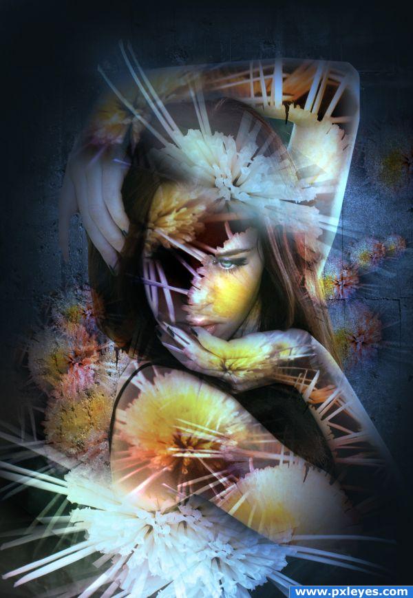
Just a strange colorful melange of these flowers. First of all I've made some little changes to the sourceimage by adding different spots of color and played a lil bit with the contrast also. form this it result some nice "floral fireworks" that I've blended on the girl's skin. Enjoy!
credits and thanks:
http://www.cgtextures.com
http://faestock.deviantart.com (5 years and 3853 days ago)
cool
WoooooooW!!!!!!
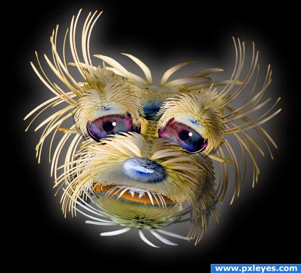
Oh it's rufus!!!! so cute!!! love the eyes
This is awesome...perhaps a more interesting background would finish it off.
excellent suggestion Stowsk, and I tried several back grounds, but I decided to just let the piece be, I started to build a body, but I knew it would take too long to make it work, so I stopped once the head was done..(shading a Chrysanthemum TAKES FOR EVER) Thanks for all the kind comments
Like it.....Good job Author......Good Luck.
Very nice indeed Author Cool chop
very very nice
Great job...and wonderful use of source, author! Agree with Stowsk...
nice!
I could immediately fall in love with the eyes. They look great! Very good idea, to use a fish image to get this great iris. Such a cute little thing. Good luck!
Ah! That kinda scared me ! But it's very cute
Good idea but theres a few things that let it down in my opinion. bad masking, colour choices like blue and orange, white glow on plain black background and floating head.
great work.gl
so cute .. great use of source.
@JSK... I just wanted the source to show very clearly,, I could have easily blurred and smudged all the masking but then it would have looked like fur, and I wanted the source to be seen.. as to blue and orange.. the last time I checked the rules of traditional complimentary color, (Blue to Orange, Red to Green, Yellow to Purple) (since the dominant color in my piece was Blue, I went with orange overtones and an orange mouth... I added purple to compliment the Yellow of the original image (I'm a big Cezanne Fan), and I already explained the reason for the background...and I'm very happy you think the head is floating..it was one of my main goals But to alter it now wouldn't be fair to all the nice members who already voted
I'm terribly sorry this piece is such a let down for you.. I'll try to do better next time
Just my opinion. You can take my critics on board or leave it as it is. Im happy either way. just trying to help. btw i ment that blue and orange were strange choices for a dog, not the way they compliment eachother. Just want to point out that i think the contruction of the dog is well done but its not as precise as i would have preffered. Then again my opinion so dont worry too much. Anyways good luck
@JSK.. cool
Nice lookin' pooch indeed, but I agree with JSK too...
@CMYK... darling, I could draw a perfect replica of the Mona Lisa in blood and crayon and you'd tell me I didn't give her any eyebrows and I obviously used blood to create it LOLOLOLOLOLOLOL


just funning
Very nice! I love him.


Edit: I knew it was you when I read your exchange with JSK.
Awesome chop!!
So very cute, congratulations!
Congrats for your first place, Ernest!
Congratulations for 1st
Congrats GolemAura...
congrats on 1st place..... this has to be my fav thing that you have made Golem beautiful work there mate.
Congrats, this is really cute
Congrats! Well done entry!
That's very good. Congratulations.
wow congrats friend
Congrats
Congrats
Congrats
Congrats!!
Thanks every one for your kindness
congrats!
Howdie stranger!
If you want to rate this picture or participate in this contest, just:
LOGIN HERE or REGISTER FOR FREE