(5 years and 3584 days ago)
You are welcome  by nasirkhan 11938 views - final score: 61.6% | Fairy Tail  by CorneliaMladenova 14449 views - final score: 57.8% | The Meaning  by Geexman 9936 views - final score: 57% |
Memories 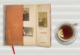 by friiskiwi 10536 views - final score: 57% | Family Album 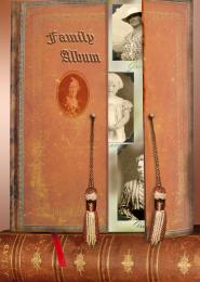 by Disco 12434 views - final score: 55.7% | Photoshop secrets 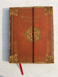 by mounirupa 7694 views - final score: 55.2% |
The Secret 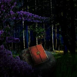 by rufkut 4683 views - final score: 54.8% | Horror Book 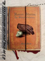 by KingRafox 5507 views - final score: 54.5% | Book of time 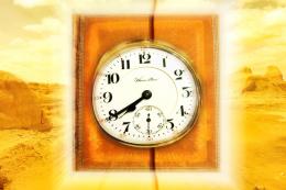 by silencer32 6327 views - final score: 53.4% |
My Photo Album 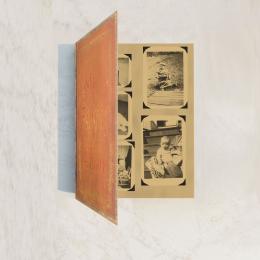 by Chuck 6537 views - final score: 53.3% | BOOK 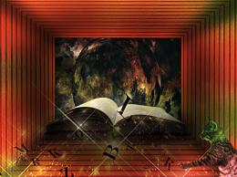 by DYNOSSAURUS 9706 views - final score: 53.2% | Book Of Shadows 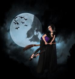 by jadedink 5240 views - final score: 52.6% |
painting my dream land  by ankitsuhaill 8370 views - final score: 52.4% | An Old PXLEyes Rule Book 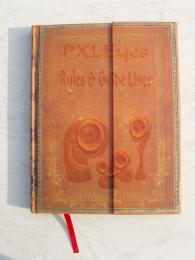 by Chuck 7929 views - final score: 52% | Magic Book  by Vlado 6523 views - final score: 48.5% |
Howdie Guest!
You need to be logged in to rate this entry and participate in the contests!
LOGIN HERE or REGISTER FOR FREE
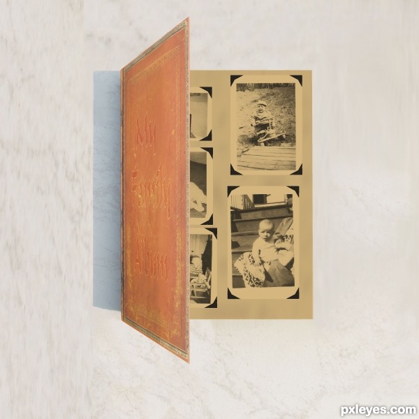
The cover is too garish, and the ribbon just stops abruptly. Try to make this more realistic, keeping in mind the cover could be more subtle. It also would have a light source, and hence a shadow. GL.
Thanks CMYK46 I hope this is what you ment. I did a little retouch far as the ribbon its just a marker and I didn't do anything with it. Its the same as original was same spot. I could have cut it out maybe?
Do you see how you made some parts a bit dark just on the edge of the binding of the book (to the left)? Trying doing that to the whole front of the book to give it an older look. Try giving it an overlay tone that makes it look older.
Thanks k5683 I did some changes to age it I think that was what CMYK46 was trying to tell me I added three colors to add some age to it does it look any better?
author... it's gud but cover is very bright.. and inner part is luk like old so give original book color to color than look like nice.. and your inner color(gray) that's need some grunge background than luk older book
i think you understand wat iam say
Ok Thanks all I have scrapped album and redid it I hope this looks better.I used original with adjustments.
ya.. it's seems gud but gray paper seems it creating paper so remove gray color and add old paper to your album
Ok Thanks here is change removing gray.
Howdie stranger!
If you want to rate this picture or participate in this contest, just:
LOGIN HERE or REGISTER FOR FREE