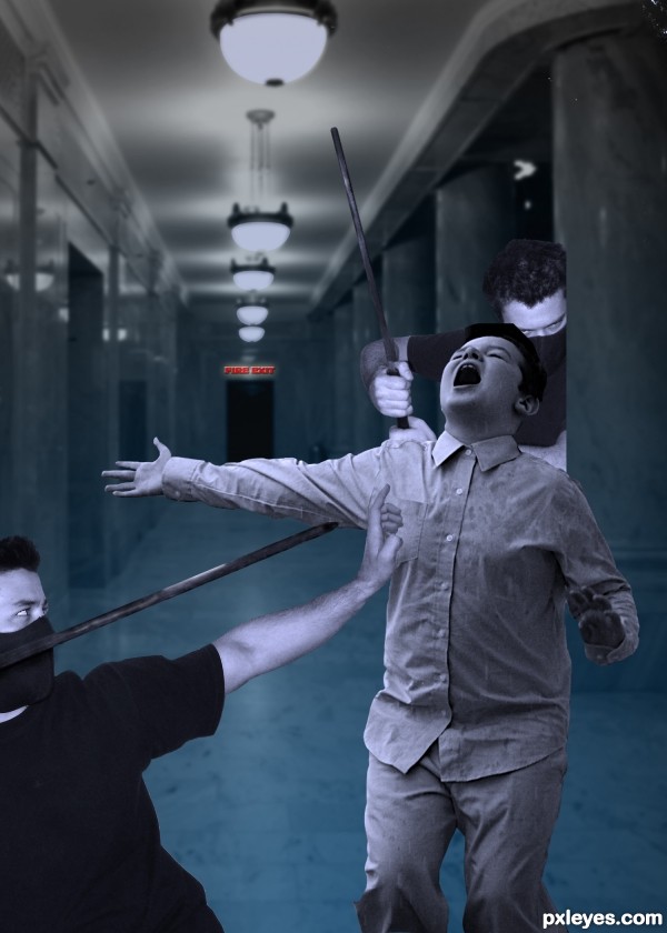
With thanks to the following:
victorward for the two mercenary images,and harrykeely for the screaming man. (5 years and 3580 days ago)
3 Sources:
- 1: Mercenary
- 2: Mercenary
- 3: Screaming man
Clean Up  by Chalty669 12296 views - final score: 64.9% | The Door  by artist3001 28027 views - final score: 61.8% | Ward 13  by Missy 10405 views - final score: 59% |
Subway 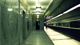 by tnaylor21286 12003 views - final score: 58.6% | Zoo.Earth.3011 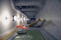 by Poss 12997 views - final score: 58% | Crime scene 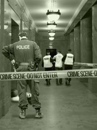 by erikuri 9566 views - final score: 56.4% |
HELP 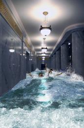 by rufkut 4306 views - final score: 55.1% | Suffering  by Lamantine 4464 views - final score: 54.2% | Underground Canals  by itgik 9246 views - final score: 53.3% |
A Dome At Desert  by silencer32 5986 views - final score: 53.1% | THE GUARDIANS  by lolu 3773 views - final score: 52.8% | Photograph  by Lamantine 3689 views - final score: 52.7% |
The Pool of Prayers  by Widiar 5083 views - final score: 52.5% | ghost of the hallway  by rakib888 9706 views - final score: 52.1% | Hallway_FPS  by rajeshtgkr89 6179 views - final score: 51.7% |
What Level  by Chuck 18905 views - final score: 51.6% | The Haunted Hallway  by Chuck 9356 views - final score: 51.3% | Shattered halls  by janetww 7279 views - final score: 51.2% |
Assassins 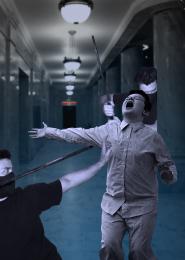 by Disco 3798 views - final score: 49.6% | Members Only  by Chuck 6161 views - final score: 49.1% | hallway_28919  by jack2 3285 views - final score: 48.1% |
Howdie Guest!
You need to be logged in to rate this entry and participate in the contests!
LOGIN HERE or REGISTER FOR FREE
Backward man is too big to hide behind the column, and the boy is too big for them two...
Thanks erikuri, I've changed it now, hope it's better!
Would be better if everything was in grayscale.
Bigger res would help and agrees with the previous comments. The exit sign is too much in focus. It's doesn't look real.
CMYK46 - why? I'm going to see what it's like in grayscale!
And jawshoewhah - have ticked the high res box at least 5 times but to no avail. I don't know why.///
There! Uploaded it again, ticked "high res" and it did it -good!
And - tried it in grayscale - not keen!
Well the color scheme on the figures bears no relation to the background...just looks like simple cut and paste.
LOL...
Sorry to mention this, but the right ninja is not aligned with the pillar. He is just half a ninja floating behind the kid.
creepy
Howdie stranger!
If you want to rate this picture or participate in this contest, just:
LOGIN HERE or REGISTER FOR FREE