
Thanks to Fantasystock and NightFateStock from DeviantArt
The rest is from SXC
Thanks to Garwee (5 years and 3577 days ago)
- 1: Lighthouse
- 2: Sky1
- 3: Birds
- 4: Father and Son
- 5: Water
- 6: Sky 2
- 7: Texture

Thanks to Fantasystock and NightFateStock from DeviantArt
The rest is from SXC
Thanks to Garwee (5 years and 3577 days ago)
Arrival 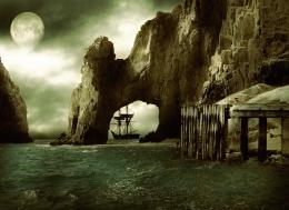 by nasirkhan 8875 views - final score: 63% | "Our Secret" 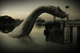 by Geexman 8489 views - final score: 60.8% | Robonut  by artist3001 16398 views - final score: 59% |
wet hall 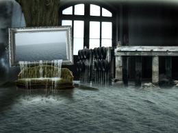 by sawan911 10713 views - final score: 58.9% | Tell me a story, dad.  by ponti55 8888 views - final score: 58.7% | Lost Amulet 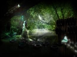 by Ressiv 4216 views - final score: 57.8% |
Rhino  by nasirkhan 3796 views - final score: 57.4% | Storm Fishing  by xwd 5114 views - final score: 57.3% | 45 minutes  by nasirkhan 3562 views - final score: 57% |
Hello Guys!  by George55 4942 views - final score: 56.3% | A Quiet Place  by artgirl1935 3995 views - final score: 56.2% | Tubing with Mom and Friends  by lchappell 6737 views - final score: 55.3% |
Gleaming the Cube  by Drivenslush 5027 views - final score: 54.8% | This Old Girl  by IRONCOW 5292 views - final score: 54.7% | full moon  by friiskiwi 4415 views - final score: 54.2% |
Catching Rays  by Drivenslush 4813 views - final score: 50.9% | Lonely Boat  by Lamantine 5842 views - final score: 49.1% |
Howdie Guest!
You need to be logged in to rate this entry and participate in the contests!
LOGIN HERE or REGISTER FOR FREE
This is very good. I like the use of textures , Just a suggestion: Erase the part of texture which is on the sea, your image will look much better if the texture is present only in the sky. GL !

EDIT : Considering elficho's comment, I would say that its up to you to decide
i disagree. it gives a nice grungy feel to the whole image.
Keep the texture through out, looks like an old picture, well done.
I really like this work. Since the texture and final antique coloring are so important to your image, it might be good to add how you achieved them to your SBS. GL
Great looking image, bit light on the how much of the source you used IMO. good outcome from all the images G/L
I like this a lot it’s a superb idea and the textures really do make the image but and theres always a but.......
What you have at the moment ( texture wise) is a little to overwhelming maybe try a texture with less marks.Or flip the one you have no harm in trying
Thank you for your comments everyone.. Lamantine, i very rarely work with textures, and i only use them to blend images together to help match colours. If i only applied it to the sky it would defeat the point of having it in the first place.
Ironcow, in my eyes the source is there to be used however the author wants, the idea came when i zoomed into the high res picture and saw the shape of the source.
Warlock, thanks for the comment, i lowered the opacity on the texture layer (it's the best i could do short of replacing the texture altogether)
I got ya. Fits the image well and looks dead sexy. Was just my opinion I hate using outside images myself but think I might mess around mixing some up
  . G/L author
Better than this it's impossible! Except if it's another work of yours, of course...
I agree with erikuri, well done author
this is a beautiful picture. Just try to sharpen more the rocks. GL!
Nice chop good luck too you
Thanks to everyone!

Siderismaris, i sharpened the rocks
Love it good luck
man, this pic is awesome!
Amazing image and very cleverly used texture
Howdie stranger!
If you want to rate this picture or participate in this contest, just:
LOGIN HERE or REGISTER FOR FREE