Thanks to Claudia Meyer, Paris (http://www.sxc.hu/photo/1088035) (5 years and 3570 days ago)
4 Sources:
Dark  by CorneliaMladenova 7133 views - final score: 62.5% | The Earth  by nasirkhan 8979 views - final score: 60.3% | Birth  by ponti55 8498 views - final score: 60.2% |
INSIDE 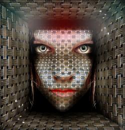 by lolu 7343 views - final score: 59.5% | love spaceship traffic light! 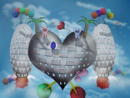 by kevinice95 11260 views - final score: 58.6% | sahara dance 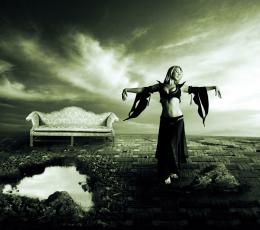 by sawan911 6036 views - final score: 57.8% |
The Effects of Deception 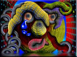 by Drivenslush 5395 views - final score: 56.9% | The Weaver Man  by rufkut 6261 views - final score: 56.7% | My new bag 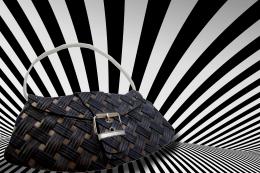 by mishti 4588 views - final score: 56% |
misterie weave baloon 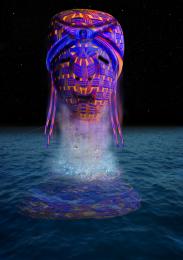 by jack2 5798 views - final score: 55.6% | Obtaining the Jinn 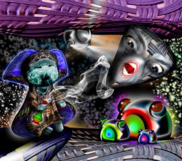 by Drivenslush 4268 views - final score: 54.2% | Depression  by Lamantine 3505 views - final score: 52.3% |
Golden Bird 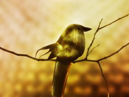 by Lamantine 4123 views - final score: 52.1% | Old rag  by dorothea 4875 views - final score: 52% | FASION  by vinucheruppa 3360 views - final score: 51.3% |
Buddha  by mishti 6391 views - final score: 51% | Ocean Retreat  by Chuck 4533 views - final score: 50.6% | Abandoned Instrument 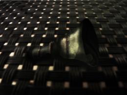 by Lamantine 4102 views - final score: 49.6% |
Weaving Bird 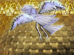 by shaiju1974 4696 views - final score: 48% | apple  by ramsesje 4319 views - final score: 44.9% |
Howdie Guest!
You need to be logged in to rate this entry and participate in the contests!
LOGIN HERE or REGISTER FOR FREE
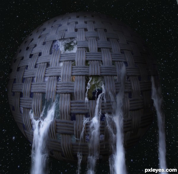
Fantastic work. Just one thing: The Earth looks a bit too bright compared to the dark background. Maybe darken a bit. GL !
The idea is so much better than the execution. The masking of the earth showing under the cover is actually very sloppy. I would actually add some more contrast to the earth below.. andmake some light shadow to the 'holes' to give some depth. Anyways, the overall masking needs a lot of more work.
Gonna vote later, if you decide to work on this.
It's a great idea, but i do agree with Widair, rough selections are quite obvious especially in high resolution. I would also suggest lowering the number of stars in the sky, it seems a bit clustered at the moment. Good luck
Thanks lamantine, widiar and ponti55 for nitpick. I have corrected some masking issue. Hope it is ok now.,
what a great idea! i agree about contrast, maybe make the whole image a bit darker? a step by step would be great too
that is really amazing. stunning creativity you executed this perfectly!
Thanks elficho and CrystleClear. elficho, SBS uploaded.
It's a lot better already. For the biggest 'hole' in there you should mask the left edge better. If the weave/ribbon is broken, just copy paste a new solid ribbon for the edge part and mask it carefully to blend in. Some more contrast (and a bit darker background stars) and maybe an overall inner shadow for the whole globe with quite large choke and size to make it even more 3D .. it doesn't have to be a strong shadow, but quite big. Also check the masking for the leftmost waterfall. Either hide the left edge or make sure the water falls from the 'hole', like with the rest of the picture.
I'm glad you're working on this, already so much better.
kevinice95, thanks for comment but you can't erase background in this source by simply background eraser. I always use masks. In this case I have used color range selection tool, then refine some edges manually.
Widiar thanks again for observing very closely my work. Have made some changes.
Wonderful!
This entry makes me wonder that we always waste water (bad use, pollution, etc.)
yes i agree i had the same idea in vegie close up whit new earth new life
very nice work author with great message...best of luck
I like it!
I like the water pouring out, very good work
Congrats for your second place, Nasir!
congrats for the 2nd,..you are the best....
Congrats again
Yes, Nasir! You are great! Congratulations...
Congratulations, Nasir and many thanks for the congrats!
Congrats!
Congrats for second place
Howdie stranger!
If you want to rate this picture or participate in this contest, just:
LOGIN HERE or REGISTER FOR FREE