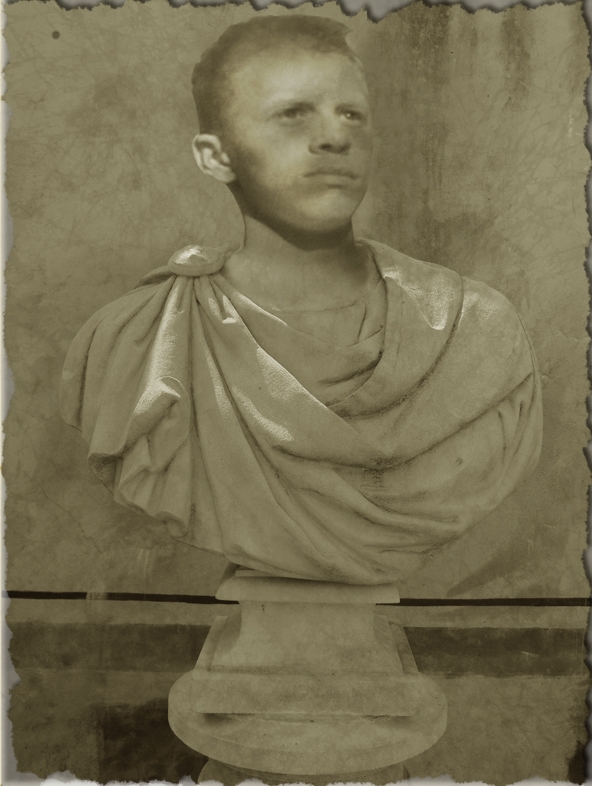
the statue is my own image and i'll post it in my stock once the contest has finished :) (5 years and 3952 days ago)
Making The Perfect Lodd  by arkncheeze 13035 views - final score: 60.6% | Lament  by pingenvy 8705 views - final score: 60.4% | "Look out Lodd!!!"  by philister 11167 views - final score: 60.4% |
distracted  by neverlander 8429 views - final score: 57.3% | Bobblehead Lodd 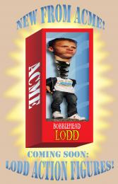 by CMYK46 8269 views - final score: 55.9% | Just Lodd  by Missy 4525 views - final score: 55.8% |
Lodd Caeser 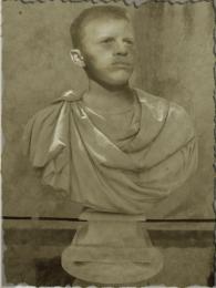 by ReapRevenge 4470 views - final score: 55.6% | my city 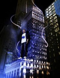 by luislago 5590 views - final score: 55.6% | Runes of Lodd 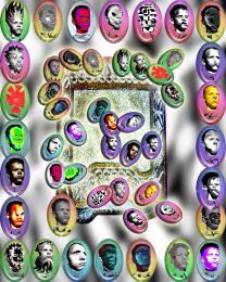 by GolemAura 5021 views - final score: 55.5% |
Lodd and bear 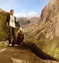 by nasirkhan 5372 views - final score: 55.2% | no title 2  by roon 5825 views - final score: 55.1% | Apathy 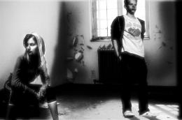 by themadrone 4982 views - final score: 55.1% |
PST Fashion week 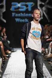 by claudiolky 7448 views - final score: 55.1% | Oh, my Lodd !  by Feodora 4042 views - final score: 55.1% | The Giant 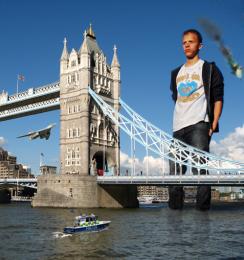 by mjeprie 5433 views - final score: 55.1% |
The man with shield 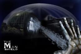 by cristiyori 6703 views - final score: 54.8% | Lodd at Windsor 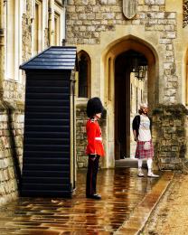 by lchappell 5341 views - final score: 53.2% | Oscar Lodd!  by Nigrechok 7712 views - final score: 52.9% |
SpaceBoy 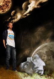 by crdf 5367 views - final score: 52.7% | just sitting 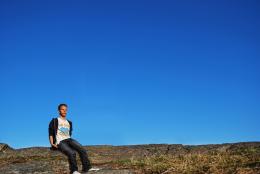 by gitsadr 5283 views - final score: 52.4% | no title  by roon 3627 views - final score: 52.1% |
Comeback 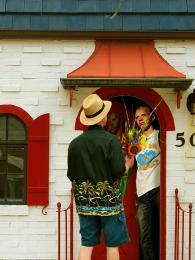 by fille 3420 views - final score: 52.1% | Mi-Lodd-Pede 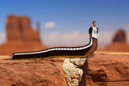 by Paulus62 3592 views - final score: 52% | Rockstar Lodd!!!!  by ryandon 5084 views - final score: 51.7% |
The Triple Lodd 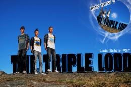 by estate23 5109 views - final score: 51.4% | Wrong Business Partners ? 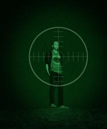 by Feodora 5713 views - final score: 51.2% | Too many burgers 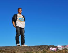 by solkee 5017 views - final score: 51.1% |
Burned Lodd  by danistano 6210 views - final score: 51.1% | around the world 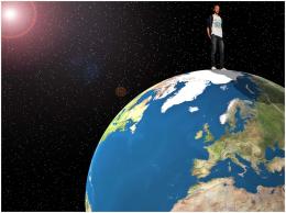 by mariosilva 4242 views - final score: 50.6% | no title 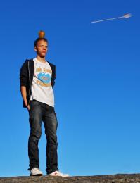 by roon 3914 views - final score: 50.5% |
Spider sunset 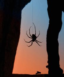 by PhotoRepair 4909 views - final score: 50.4% | Not Another Vacation Photo!!!! 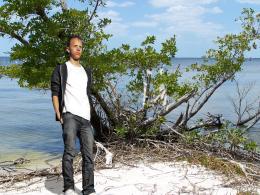 by tapiona 5247 views - final score: 50.2% | Lodd's Halloween costume 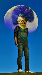 by lchappell 6747 views - final score: 49.9% |
Good vs Bad  by PSA2009 4816 views - final score: 49.8% | Lord Lodd 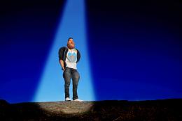 by Nator 4578 views - final score: 49.6% | Lodd's Ladies 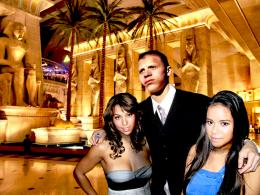 by lchappell 4744 views - final score: 49.5% |
Where is she?!!! 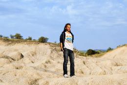 by shaiju1974 3914 views - final score: 49.4% | can you have too many Lodds? 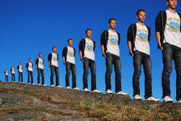 by friiskiwi 6732 views - final score: 49.3% | where is the love?  by mariosilva 4014 views - final score: 49.3% |
Lodd Wallpaper  by PSA2009 4821 views - final score: 48.6% | Barack O'Lodd 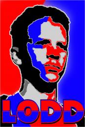 by GolemAura 3106 views - final score: 48.1% | Lotta Lodd 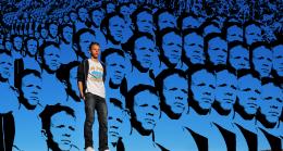 by GolemAura 3749 views - final score: 48% |
Impostor  by donh 3259 views - final score: 47.9% | Lodd of FIRE 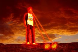 by robk 3452 views - final score: 47.7% | The Lodds 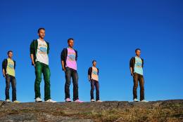 by sigi 3750 views - final score: 47.3% |
Lodd 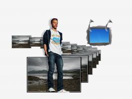 by RGB 3033 views - final score: 46.6% | Ocean View 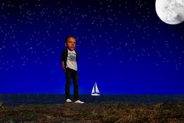 by jim40004 3336 views - final score: 46.3% | The Adventure ... 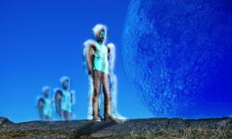 by thecreative 3223 views - final score: 45.3% |
lodd 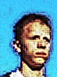 by mariosilva 3370 views - final score: 41.8% |
Howdie Guest!
You need to be logged in to rate this entry and participate in the contests!
LOGIN HERE or REGISTER FOR FREE
I may sound childish: First comment on the first entry !
LOL p3!!! Great idea author! Best one so far! LOL!
the neck looks just a little small where it joins the statue, very nice idea and good luck =)
Edit: much better and looks perfect, the best first entry ever =p
I agree with tapiona.. the neck area needs a little work.. try transforming the head a little bit large and use warp to set it around the neck area.. but don't overdo it.. good luck..
Good idea!
Head looks a little flat.nice idea though.GL
Definitly an original idea! I think you should burn some light parts, to look more realistic.
Congrats for the first new entry of our new beloved home. (oh and I like it too!)
Congrats for first entry
i think the ear has too much light on it....gl
the neck area needs a bit more of blending with the body. The ear looks realistic while face looks like a pencil sketch.Try giving outer shadow to the face. Also dupicating the layer and giving an overlay style may give u some highlights on the face . gl
Cant...resist....must...post...in...first...PostPST...entry...ever...Done! And yes, also agree with Tapiona: maybe if the head&neck are a bit bigger plus you wrap the cloth a bit closer around the neck (perhaps with liquify you can push it a bit more to the right), it would all fit better. Good luck!
Love the concept... good luck
Thanks folks for your comments ... i've listened you you and give lodd a fat head i mean bigger head
add some contrast on the face, and if you can, make the edges sharper... see that the bottom part edges are very sharpy compared with the ones on the face
Cool very nice work Good luck!
His face expression fits perfect for something like this Good luck!
Make the hairs more white.
very good idea! good luck!
Nice.
I liked this idea before and I still do...maybe needs some subtle darker areas on the head to blend (eyes, nostrils, under ear)...gl!.
it looks better than before.. u can still work on the hair region. It still looks like a pencil sketch. Give it some shadows and highlights. gl
Maybe overlay a sandstone texture to match the rest of the bust?? GL.
Congrats of first entry
Good job, its well
nice one
Great idea, needs a bit more work to make him look like stone thou...GL
good job and good luck
nice work author goodluck.
You lost the highlights on the head from your outside source pic...what were you thinking? You've had lots of time to amend this into maximum coolness...
Congratulations, celebrations, well done Keep up the good work
congrats Reap!!!!!!!
Howdie stranger!
If you want to rate this picture or participate in this contest, just:
LOGIN HERE or REGISTER FOR FREE