Tools used:pen tool
brush tool
copy/paste etc (5 years and 3966 days ago)
1 Source:
- 1: Source 1
Lost...  by wazowski 20035 views - final score: 79.7% | The forgotten  by loopyluv 12099 views - final score: 63.9% | The Skeleton  by nasirkhan 12324 views - final score: 63.5% |
Pirate Still Life  by IDt8r 13597 views - final score: 63.2% | Legends 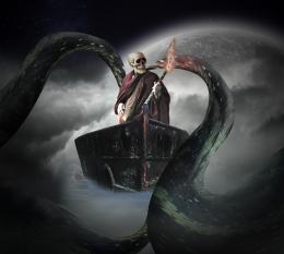 by cristiyori 11182 views - final score: 62.8% | Pirate trap  by siderismaris 8678 views - final score: 62.7% |
Infernal Tea Time....! 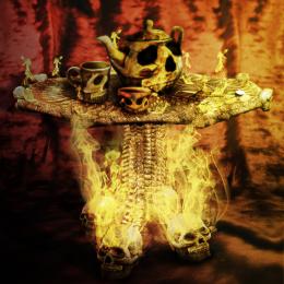 by Nellista 7340 views - final score: 62.1% | The Last Light  by Missy 6051 views - final score: 62.1% | Bones 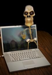 by freejay 4704 views - final score: 59.6% |
Eternal slave 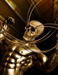 by loopyluv 6273 views - final score: 59.2% | cursed gold_4a2adcb4a05d8  by genuine2009 4730 views - final score: 57% | Cold Fire  by crdf 9448 views - final score: 56.5% |
No Swimming  by robk 5600 views - final score: 56.2% | Nothing to do down here..  by elficho 6910 views - final score: 56.1% | A Pirate's Life  by rykerbeck 8326 views - final score: 56% |
scary woman... 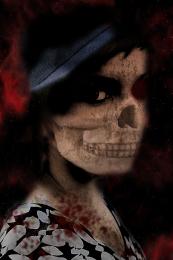 by nishagandhi 11927 views - final score: 55.3% | Firery Rest 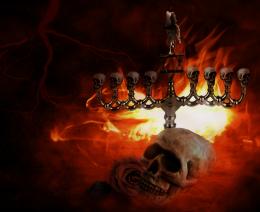 by OliviasArts 5453 views - final score: 53.9% | Give me the gold  by marina08 5760 views - final score: 53.7% |
Skullking 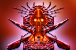 by lahiripartha 4845 views - final score: 53.7% | Nightmare  by lanadobrota 5504 views - final score: 53% | Feeding Pink Tongue 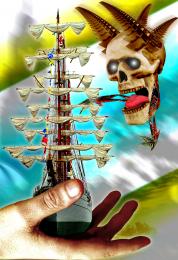 by GolemAura 7636 views - final score: 52.9% |
Welcome to your nightmare...  by Nator 5844 views - final score: 52.9% | What Curse?  by OliviasArts 7260 views - final score: 52.9% | Secret  by Milena 8222 views - final score: 52.8% |
Skull Shakespeare  by GolemAura 8709 views - final score: 52.2% | Exorcist  by Chrome 6165 views - final score: 52.1% | Yummmmmmmmmm!  by tapiona 4774 views - final score: 51.6% |
The Cursed Chest!!!!! 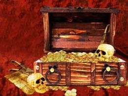 by ryandon 8005 views - final score: 51.3% | Dead Zone 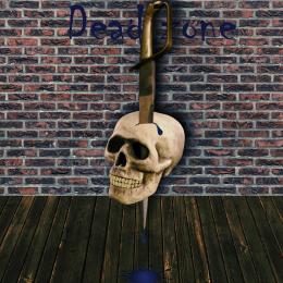 by XphotoshoperrX 7202 views - final score: 50.6% | The last unseen god 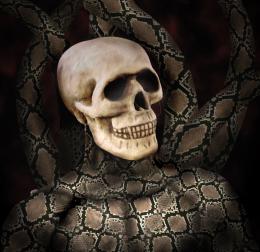 by cristiyori 7661 views - final score: 50.1% |
Gold Digger  by lchappell 5327 views - final score: 49.6% | stop!! 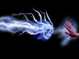 by luislago 6993 views - final score: 49.3% | Deadman's Chest  by adrianaq03 7421 views - final score: 48.4% |
More gold  by Onager 10795 views - final score: 48.2% | Golden skull  by Onager 8924 views - final score: 48.2% | The Gold Princess  by Akassa 6009 views - final score: 48.1% |
Stone 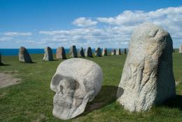 by RGB 4522 views - final score: 47% | Three skulls  by BlueSparkle 8441 views - final score: 45% | skulls  by mariosilva 5984 views - final score: 44.9% |
skully gold  by estate23 5891 views - final score: 42.9% |
Howdie Guest!
You need to be logged in to rate this entry and participate in the contests!
LOGIN HERE or REGISTER FOR FREE
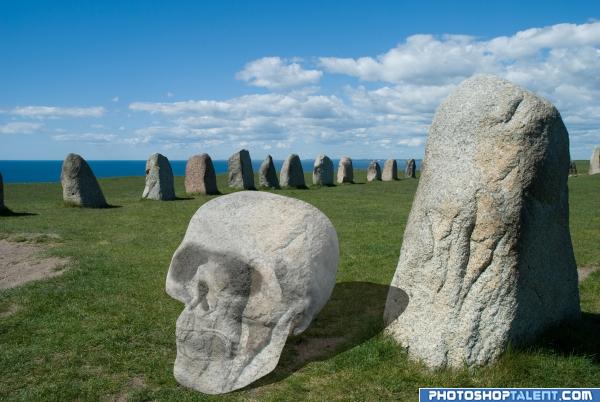
Darken the skull & fix the shadow. Look at the shadows of the stones...the light is from the left.
Very interesting choice... you may want to try and match the shadow angle.. your shadow is at 1 o'clock and the shadow on the stone is at about 3 o'clock.. also the darkness on the shadow side of the skull should match the darkness on the stone.. it's really a great idea,, I'm sure other peeps will be along to help push Idea
Looks like the skull is floating.
Skull is not luking like made of stone....Its jst like a cutted paper texture....add some tones...GL
time is something like quarter past one... :P good luck!
1> you texture doesn't cover the entire skull, the top left, 2> darken the area over the eye sockets, nose opening and around the teeth, as if someone carved the rock, a very good idea, just needs a few tweeks, good luck =)
Interesting image !!!!
A good idea.. Apart from the shadow fix's as mentioned, I would download a new texture and use that, the rick while nice has specific shapes in it that you would need to make follow the contours of your skull.. GL.
You can see where you copied the texture of the stone onto the skull - use the clone tool to fix this so the skull looks less see-through...
You can see where you copied the texture of the stone onto the skull - use the clone tool to fix this so the skull looks less see-through...
Very interesting but the skull needs work.
Cool, but needs a bit of work still ...light source, skull, shadow...go fix fix fix
nice
Why is the skill opaque? Also why does its shadow just go flat over the other rock, and sorry to be mean, but also, the shadow is in the wrong direction, look at the other shadows. But after all that, I still like it, with a little work it could be a great entry
nice
good idea, shadow on the stone need to be reworked
Oeh, great idea but not made that good... will hold my vote to see if you can do better
gl
I like it... good luck
skullhenge
Needs work on shadow and the on the texture
the skull is very light. goodluck.
Howdie stranger!
If you want to rate this picture or participate in this contest, just:
LOGIN HERE or REGISTER FOR FREE