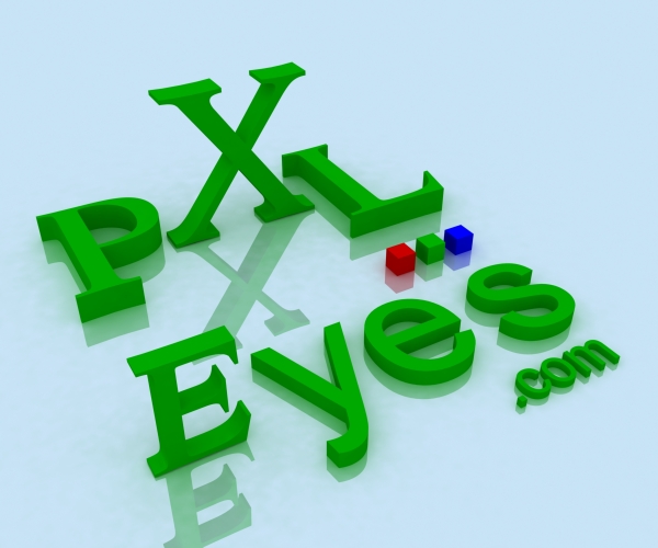
Vray setup with just G.I. Set near white and multiplier of 1.0
Please view SBS for smaller and integrated versions (5 years and 3971 days ago)
stop boring text  by Giallo 15766 views - final score: 70% | Web 2.0 - Logo PXLEyes v3.2  by Mike 13016 views - final score: 69% | pxleyes  by suresh 11831 views - final score: 68% |
Web 2.0 - Logo PXLEyes v5.0  by Mike 13577 views - final score: 58.3% | Web 2.0 - Logo PXLEyes v3.1  by Mike 13309 views - final score: 57.9% | Web 2.0 - Logo PXLEyes v2.1  by Mike 5640 views - final score: 57.1% |
pxleyes logo  by zeero 6926 views - final score: 56.6% | Web 2.0 - Logo PXLEyes v1.1  by Mike 5904 views - final score: 56.2% | Web 2.0 - Logo PXLEyes v1.3  by Mike 5968 views - final score: 56% |
Web 2.0 - Logo PXLEyes v4.2  by Mike 6545 views - final score: 56% | PXLeye 3D  by creativangle 9070 views - final score: 55.9% | PXLEyes  by nbaztec 4939 views - final score: 55.8% |
Web 2.0 - Logo PXLEyes v1.2  by Mike 6163 views - final score: 55.8% | Web 2.0 - Logo PXLEyes v4.1  by Mike 6379 views - final score: 55.2% | PXL Logo 3DS Max v.2 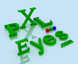 by Missy 8011 views - final score: 55% |
PXLEyes v2  by nbaztec 4290 views - final score: 54.9% | PXLEyes- logo  by gopankarichal 5318 views - final score: 54.8% | 3dPXLEyeslogo  by DigitalDreamer 4002 views - final score: 54.4% |
PXLeyes Flourish Logo  by vladimir735 4874 views - final score: 54.3% | pxleyes logo  by elemare 4994 views - final score: 54.2% | PXLeyes Logo  by PhotoRepair 5921 views - final score: 54.1% |
final  by genuine2009 4265 views - final score: 53.9% | PXLEyes v3  by nbaztec 4470 views - final score: 53.6% | Web 2.0 - Logo PXLEyes v2.2  by Mike 5875 views - final score: 53.3% |
PXL.2  by genuine2009 5049 views - final score: 53.2% | PXLeyes  by szudi 4320 views - final score: 53.1% | PXLeyes Shiny Logo  by vladimir735 6298 views - final score: 53.1% |
BlueEye  by slikelvis 4210 views - final score: 53% | Logo  by justalone 4275 views - final score: 52.9% | PXL Logo  by Missy 5074 views - final score: 52.9% |
New logo  by CMYK46 5030 views - final score: 52.7% | Same background color  by CMYK46 5969 views - final score: 52.7% | Quick and Simple try  by tysambouille 6678 views - final score: 52.5% |
PXL logo with X  by Xpressions 5453 views - final score: 52.1% | PXL  by JRD 3899 views - final score: 52.1% | Dot must do the trick!!  by digitalia 7984 views - final score: 51.7% |
pxleyes  by crdf 4075 views - final score: 51.7% | PXL  by vino 3563 views - final score: 51.7% | PXL logo 3  by Xpressions 4574 views - final score: 51.6% |
art | love | pxleyes.com  by digitalia 4964 views - final score: 51.6% | Logo2  by justalone 3736 views - final score: 51.5% | Just PXLEyes  by George55 5076 views - final score: 51.5% |
PXLEyes Logo Contest_4a302e229e101  by genuine2009 3003 views - final score: 51.2% | PXL  by vino 3857 views - final score: 51.2% | PXLeyes  by DML 3636 views - final score: 51.1% |
PXL Logo 3  by Siminho90 5133 views - final score: 50.9% | ThiS eYE SeeS...  by vino 4900 views - final score: 50.9% | PXLEyes Logo Contest_4a3138f43c0e1  by tnaylor21286 2897 views - final score: 50.9% |
PXLeyes  by Xpressions 12934 views - final score: 50.8% | PXL logo no "X"  by Xpressions 4602 views - final score: 50.8% | PXLeyes Logo green  by PhotoRepair 5142 views - final score: 50.8% |
PXLeyes Flourish Logo (Color)  by vladimir735 5719 views - final score: 50.8% | Logo  by mellowdesign 3740 views - final score: 50.6% | PXLE  by darkshellie23 4894 views - final score: 50.5% |
PXLeyes 2  by elficho 3500 views - final score: 50.3% | PKL eyes  by intrinsic 4102 views - final score: 50.3% | PXLeyes :)  by loopyluv 3650 views - final score: 50.3% |
PXLEyes Logo Contest_4a31677881dc6  by tnaylor21286 3055 views - final score: 50.2% | curious eyes  by KingLin 5708 views - final score: 50.2% | PXLeyes logo  by chacem 4374 views - final score: 50.1% |
Pxleyes logo  by suresh 5825 views - final score: 50.1% | PXL logo  by Missy 5191 views - final score: 50% | PXL lago  by luislago 8027 views - final score: 50% |
PXL Eyes Logo  by burtzomega 5294 views - final score: 49.9% | Pixelated!!! LoL!!  by digitalia 4540 views - final score: 49.8% | PXLeyes Logo  by Lodd 4864 views - final score: 49.8% |
Fresh Pixel Drops  by Richirajd 5479 views - final score: 49.8% | PXLEYES LOGO  by intrinsic 4164 views - final score: 49.7% | bippo text  by GolemAura 5261 views - final score: 49.6% |
Logo  by estate23 3807 views - final score: 49.5% | Creative Eye  by creativangle 5796 views - final score: 49.5% | PXL Logo 3  by Missy 4333 views - final score: 49.3% |
SQUARE NUMBERS  by GolemAura 4108 views - final score: 49.2% | PXL Logo 1  by Siminho90 4194 views - final score: 49.2% | PXLEeye  by minimonst100 3568 views - final score: 49.2% |
PXLEyes Logo Contest_4a326b8803bb4  by tnaylor21286 2739 views - final score: 49.1% | PXLEyes logo 1  by KatGV 4170 views - final score: 49% | logo 1  by tommo08 5024 views - final score: 49% |
Pixeleyes logo  by George55 8328 views - final score: 48.8% | logo 2  by tommo08 5229 views - final score: 48.5% | PXL-ated Logo w/lens flare  by bjaockx 6752 views - final score: 48.5% |
logo 2  by chakra1985 3132 views - final score: 48.5% | pxl logo  by tapiona 3942 views - final score: 48.5% | zzz  by genuine2009 3378 views - final score: 48.4% |
PXL logo  by RGB 4022 views - final score: 48.3% | Eye Of The Tiger  by arkncheeze 5709 views - final score: 48.3% | PXLeyes logo 2  by Jbern 4615 views - final score: 48.3% |
logo 3  by chakra1985 3718 views - final score: 48.2% | PST to PXLE  by darkshellie23 7020 views - final score: 48.2% | PXLeyes Glass Sphere  by vladimir735 5083 views - final score: 48.1% |
PXL Logo 2  by Siminho90 4125 views - final score: 48% | PXLEYES LOGO  by intrinsic 4185 views - final score: 48% | Just an idea  by Feodora 4467 views - final score: 47.9% |
logo3  by mariosilva 3670 views - final score: 47.9% | PXLeyes.com  by boogeyman 3928 views - final score: 47.9% | marque logo  by GolemAura 4021 views - final score: 47.9% |
Tags  by scampiehot 3412 views - final score: 47.8% | PXL Logo Transparent  by MJCP 4493 views - final score: 47.8% | PXL  by RasGold 3486 views - final score: 47.7% |
logo  by mariosilva 3572 views - final score: 47.7% | PXLeyes logo  by tnaylor21286 3791 views - final score: 47.7% | pixelies  by genuine2009 3717 views - final score: 47.6% |
pxl.4  by dante 3391 views - final score: 47.5% | Eyes  by interuniversal 3202 views - final score: 47.5% | PXL.1  by Choppy 3253 views - final score: 47.5% |
Family  by fille 3858 views - final score: 47.4% | not really 4  by interuniversal 4027 views - final score: 47.4% | No. 10  by RasGold 2781 views - final score: 47.3% |
PXL logo 3DS max 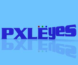 by Missy 6589 views - final score: 47.3% | #1 pxleyes logo 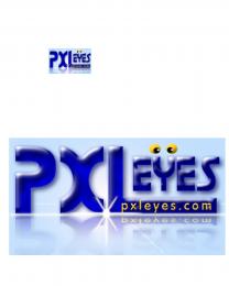 by KatGV 4186 views - final score: 47.3% | Lies222  by genuine2009 3714 views - final score: 47.2% |
PXLEYES LOGO  by intrinsic 3945 views - final score: 47.2% | PXLeyes Glass Sphere 2 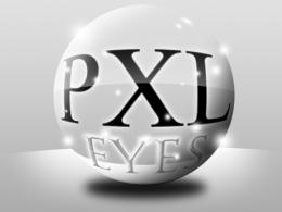 by vladimir735 5025 views - final score: 47.2% | PXL logo  by Jbern 4221 views - final score: 47.2% |
not really 3  by interuniversal 4001 views - final score: 47.2% | OneMoreLogo  by Ory 3059 views - final score: 47.1% | PXL logo  by Jbern 4191 views - final score: 47.1% |
PXLdotcom  by genuine2009 3084 views - final score: 47% | PXLeyes Magic Logo 2  by vladimir735 4705 views - final score: 47% | PXL.3  by genuine2009 3653 views - final score: 47% |
PXLeyes Magic Logo 4  by vladimir735 4877 views - final score: 47% | PXLeyes Logo  by PhotoRepair 3648 views - final score: 46.9% | third and final version  by interuniversal 5326 views - final score: 46.8% |
another one  by minimonst100 4012 views - final score: 46.8% | Glow  by achiver 3285 views - final score: 46.7% | PXLeyes RGB  by bjaockx 4586 views - final score: 46.7% |
pixelize  by genuine2009 3399 views - final score: 46.6% | cat's eye  by arkncheeze 3628 views - final score: 46.6% | PXL eyes.com  by boogeyman 7181 views - final score: 46.6% |
simple  by mjeprie 3342 views - final score: 46.5% | Eye Balls Logo  by Giulia 5104 views - final score: 46.5% | not really 2  by interuniversal 3605 views - final score: 46.4% |
logo pxl  by mariosilva 4166 views - final score: 46.4% | PXLeyes 1  by elficho 3320 views - final score: 46.3% | PXLeyes Magic Logo 3  by vladimir735 4380 views - final score: 46.2% |
PXLeyes.com  by boogeyman 4042 views - final score: 46.2% | not really  by interuniversal 3755 views - final score: 46% | PXL Logo 4  by Siminho90 2572 views - final score: 45.9% |
PXLeyes Classic Logo  by vladimir735 4726 views - final score: 45.9% | PXL Eyes 1  by Paulus62 4047 views - final score: 45.8% | eyes of truth  by gabriellax 4232 views - final score: 45.8% |
PixelLogo  by Ory 3390 views - final score: 45.7% | Logo pxl lies  by cristiyori 5240 views - final score: 45.6% | PXL eyes only  by Paulus62 4588 views - final score: 45.5% |
Tiles  by scampiehot 3481 views - final score: 45.5% | Maybe Blue  by MJCP 4080 views - final score: 45.4% | challenge  by gabriellax 5441 views - final score: 45.3% |
pxleyes  by tapiona 3467 views - final score: 45.3% | logo  by chakra1985 3146 views - final score: 45.3% | hmm  by dante 3001 views - final score: 45.1% |
return with a vengeance  by gabriellax 5240 views - final score: 44.9% | PXLeyes Magic Logo  by vladimir735 4618 views - final score: 44.9% | Logo PXL  by Missy 4271 views - final score: 44.8% |
pxl  by tapiona 3748 views - final score: 44.7% | Logo2  by adrianaq03 3255 views - final score: 44.5% | pxl  by keriss 3179 views - final score: 44.2% |
PXLeyes (blue)  by DML 4126 views - final score: 44.2% | Circles  by GolemAura 3472 views - final score: 44% | PXL Dragon  by tapiona 3739 views - final score: 43.8% |
Whisk Design with Stain Glass  by GolemAura 6610 views - final score: 43.8% | cantor  by GolemAura 3317 views - final score: 43.7% | Logo 1  by adrianaq03 3514 views - final score: 43.6% |
.  by jossif 2674 views - final score: 43.5% | PXL Logo 5  by Siminho90 4568 views - final score: 43.5% | Daddy Long Legs  by GolemAura 5111 views - final score: 43.3% |
PXLeyes.com  by shaiju1974 3788 views - final score: 43.2% | PXLEyes  by CookieMonster 3207 views - final score: 43.2% | Kingthing font  by GolemAura 4971 views - final score: 43.1% |
Endless  by fille 3457 views - final score: 43.1% | I pixel the world!  by gabriellax 4345 views - final score: 43% | LavaLogo  by Ory 3100 views - final score: 42.9% |
eyes and Martin font  by GolemAura 5503 views - final score: 42.6% | Logo_Attempt1  by iquraishi 4503 views - final score: 42.5% | Fire  by achiver 3085 views - final score: 42.2% |
Take on Bubble Gum Entry  by GolemAura 6495 views - final score: 42.2% | PXLEyes LOGO  by RasGold 4949 views - final score: 42% | Secret  by achiver 3202 views - final score: 41.9% |
PixleYes  by CookieMonster 8315 views - final score: 41.8% | Eye  by Ory 3723 views - final score: 41.8% | pxleYES  by fille 3494 views - final score: 41.2% |
PXLeyes logo try 1...  by Chrome 4378 views - final score: 40.7% |
Howdie Guest!
You need to be logged in to rate this entry and participate in the contests!
LOGIN HERE or REGISTER FOR FREE
WOW.. this is the hardest contest every made.. it's going to be very hard to narrow it down... this one is fantastic..
EDIT.. hehehe. JINX.. great job Author
The more I look at this one the more I feel this one is going to get a high vote.. this is so exciting LOL
cool man
nice design..i love it
Wow! Good effort!
nice design. but it should be little more compact.
good entry....realy!
Niceeeeeeeeeeeeeeeeeeeeeeeeeeeeeeee
nice idea good luck!
wow I like this one!
woooohooooo i think we have a top contender!!!
Good Luck
as good as it is, it wont have the same effect once shrunk
I like it
Not bad, but I doubt this will work in the right size. THis is maybe fun as variation, but as frontpage logo it needs to be less complex. Good luck!
Great job!
Nice! Bit complex for a logo tho!
Howdie stranger!
If you want to rate this picture or participate in this contest, just:
LOGIN HERE or REGISTER FOR FREE