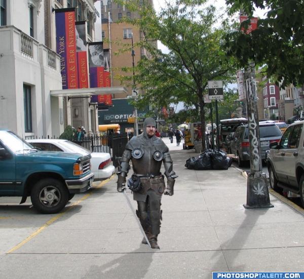
thanks to two-ladies-stocks and jello-stock from DA. (5 years and 3948 days ago)
Aint no horse pullin that Wagn 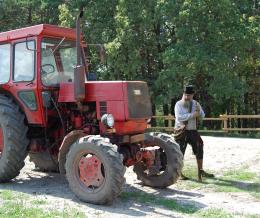 by pingenvy 8249 views - final score: 58.2% | Past meets present. 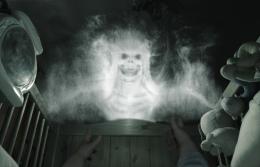 by Digitalheavens 7493 views - final score: 58.2% | what happened..? 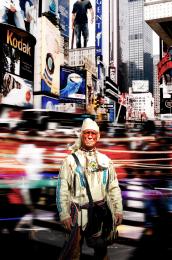 by elficho 6345 views - final score: 56.9% |
No! Nooooo!!! 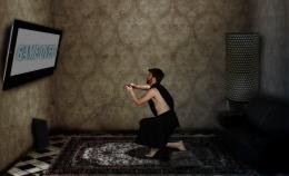 by elficho 4118 views - final score: 55.5% | Mc Shakespeare  by minimonst100 9689 views - final score: 55.4% | A Home At Last 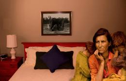 by donh 3748 views - final score: 54.7% |
Amelia Earhart 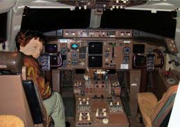 by lchappell 6802 views - final score: 54.6% | Are we lost? 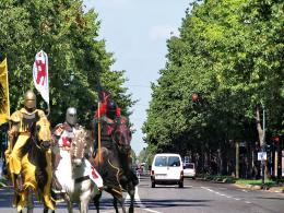 by nevena 4209 views - final score: 53.4% | Reborn 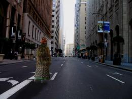 by burtzomega 14522 views - final score: 52.4% |
Modern Knight 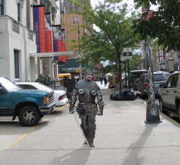 by damianjenkins1 7146 views - final score: 51.8% | after reborn 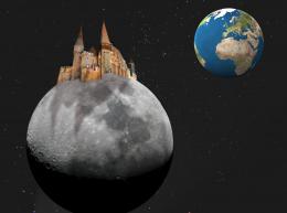 by mariosilva 3783 views - final score: 50.3% | War Horse reunion watercolor 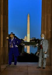 by lchappell 3665 views - final score: 49.2% |
Howdie Guest!
You need to be logged in to rate this entry and participate in the contests!
LOGIN HERE or REGISTER FOR FREE
nice work good luck
yonder, we see bag with bodys...
lol @ fille ( we had a bag with a body dumped outside our house years ago on xmas morning, headless too )
)
Nice2... he looks like someone who popped out of a storybook lolz. Just a little suggestion (I'm not that good in Photoshop btw, but I'd like to help out).. Maybe you might want to darken the knight a little coz it appears that the light source is supposed to be coming from somewhere behind him, not overhead. Darkening the knight and adding a little highlight on his shoulders might help.
Knight has now been darkened a bit to suit the lightsource a bit better. Thanks for your suggestion chacem and thanks for all the comments.
good
There.. blends in better than it did last time ^__^
Funny!
Masking and shadow looks pretty ok. Some nitpick, but I do think it needs to be fixed: the soles from his shoes are kinda missing. There is some, but compared to the original picture there could be more. I think with more sole he'd look better (as in less cut out around the feet). Good luck!
Howdie stranger!
If you want to rate this picture or participate in this contest, just:
LOGIN HERE or REGISTER FOR FREE