
copy transform (5 years and 3967 days ago)
3 Sources:
New Canal 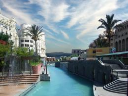 by Paulus62 12738 views - final score: 64.5% | Be Brave! 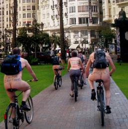 by FairyGardens 11683 views - final score: 62.3% | We've Got The Power! 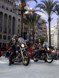 by FairyGardens 11743 views - final score: 59.3% |
Anyone for a PIE? 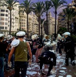 by FairyGardens 10339 views - final score: 58.7% | Lonely Frigid Happiness 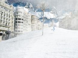 by pixelkid 8797 views - final score: 56% | Go Green 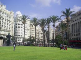 by mrgrey 5059 views - final score: 55.5% |
the square fills up 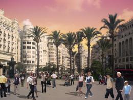 by friiskiwi 5276 views - final score: 53.8% | Sightseers' DREAM!!! 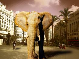 by kyluvlee 4307 views - final score: 53.1% | As seen through the EYES 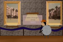 by wolverine 7650 views - final score: 51.3% |
Pigzilla ... 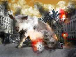 by thecreative 6048 views - final score: 50.1% | The Spanish Fly 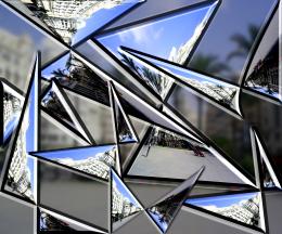 by GolemAura 4502 views - final score: 49.8% | fire 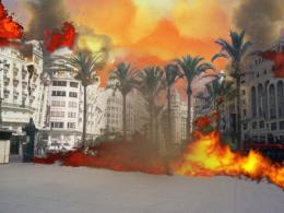 by mariosilva 3425 views - final score: 48.3% |
Howdie Guest!
You need to be logged in to rate this entry and participate in the contests!
LOGIN HERE or REGISTER FOR FREE
somehow reminds me dadaism... good luck!
dádá is nice is just about atitude.thanks & i apreciate your comments, regards.
original idea i like the buildings destroied but the fire its weird
good idea; i think some smoke would make it more realistic;and also the falling buildings look too flat and need some structure behind
i think you should work more on flame.. akasha is right.. add smoke to make it more realistic.. gl
You need to cut betetr the source image.
thanks 4 tips. regards
looks unreal. improve it
nice idea, lol! I'm working on something quite similar ))) gl, author
Good Luck
looks much better with the smoke the falling buildings still look flat though
fire doesnt looks real...................
your buildings need more dimension
nice job
the sky looks good to me, the fire on the street just looks pasted
Howdie stranger!
If you want to rate this picture or participate in this contest, just:
LOGIN HERE or REGISTER FOR FREE