(5 years and 3962 days ago)
1 Source:
- 1: face
Almost Ready To Fly  by jaskier 35704 views - final score: 67.3% | The Lonely Fairy  by suresh 41270 views - final score: 66.5% | Berrypiller  by Paulus62 35366 views - final score: 64.3% |
Love is....  by loopyluv 32891 views - final score: 64% | bibbidi-bobbidi-boo  by Milena 40497 views - final score: 63.9% | Elegant romance  by loopyluv 7326 views - final score: 62.8% |
Redis.  by fille 10222 views - final score: 62.2% | The Halloween Pendulum  by Panshie 8301 views - final score: 58.7% | Frankenberry 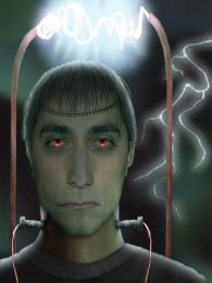 by IDt8r 6054 views - final score: 57.9% |
Fossile 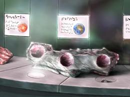 by Sander 5423 views - final score: 55.7% | Berry world 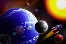 by jlmina714 5985 views - final score: 55.2% | king's Cherry Horse  by Nav777singh 8307 views - final score: 55.1% |
can't believe my eyes 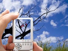 by ryandon 8438 views - final score: 53.9% | Spider in berry  by shaiju1974 7720 views - final score: 53.1% | painted rose  by wtfayla 4959 views - final score: 48.8% |
Berry Glen  by tapiona 5752 views - final score: 46.6% |
Howdie Guest!
You need to be logged in to rate this entry and participate in the contests!
LOGIN HERE or REGISTER FOR FREE
looks nice
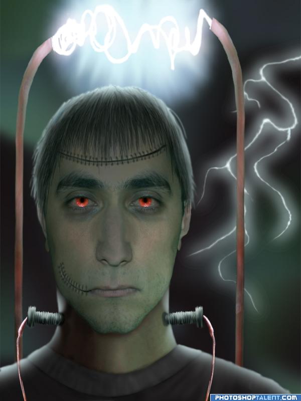
Well made, but you ignored the bright light source...
good work but keep working on shadows
I know he's probably suppose to be creepy, but he comes off as actually handsome in a very wierd way LOL.. good luck author on a very interesting piece
good,nice work details of scars are very good .G.L.
The light above him should cast a downard shadow on his face... The top of his head I think, should also look brighter
Yes, I ignored the bright light source, because I wasn't sure how to do that. So after looking at a bunch of backlit sources and scouring the net for tutorials (and finding none), this is my best shot at it.
Yes! He looks way better now!
 (What a difference lighting can make...)
And yes, he's supposed to be *almost* handsome. For me, the unnatural made pleasing is pretty scary. (Think Bundy)
OH GOD AUTHOR..NOW he DOES give me the creeps.. EEEEEEKKKKKKKK goose pimples everywhere.. YIPE (grabbing my binky and covering up my toes tight)
Original use of source, monster looks quite creepy, yes . The lighting in the background is a bit less convincing for me, maybe if you use filter-other-maximum you can make the beam a bit less thick. Up to you if you'd prefer that, of course. Good luck!
nice work
lol@golem...Don't be scared. Some would argue that the unnatural is very pleasing (Think Pamela Anderson) lol
Thank you, Wazowski. I didn't even know about filter>other>maximum. Does it do anything else besides make things skinny? And where can I find one for personal use?
where are the berries good job..but you lost the source image
nice work
nice job
Howdie stranger!
If you want to rate this picture or participate in this contest, just:
LOGIN HERE or REGISTER FOR FREE