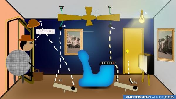
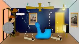
A guy comes home weary from office, now..just whipped up a few steps to make his entry into his house smooth and charming !
1. The hat stand and the hat fall on the switch board, turning on the fan.
2. Fan starts rotating
3a. The rope is cut and the ball falls on the remote and the TV is switched on.
4a. The ball then kicks up another ball which strikes the door of the bedroom (in which his wife will be there) ..just a gentle hint that her guy is back home ..so she can come out and give him a warm welcome
3b. Similarly, this ball falls down and kicks up another ball which strikes the switch board and now the light bulb is switched on.
4b. The other ball flies and strikes the switch board to turnon the light
5. The bulb is on !
So, a guy comes back from office and pushes the door open, and viola ! his fan sends forth a gentle breeze, the TV plays his favourite channel, the light is on, his wife comes out and adds to this warm welcome !
Just made some good use of the fan !
Not exactly a Goldberg, its not so complicated nor is it humorous ,
No external images used, pretty straightforward use of rectangles and other shapes, coloring, gradients, some gaussian blur and pen tool.
I had used the image provided in the "empty square" contest and also the guy here was made by me in my submission to the "empty square" contest..again basic use of shapes and pattern overlays..the photoframe was again created by me using standard shapes and duplication and gradients and bevel & emboss
(5 years and 3965 days ago)




Step 45a sounds interesting . Some perspective issues maybe. on the other hand, it can be also seen as illustration style which looks funny
  . Good luck!
Interesting idea - but your TV is partly transparent and can balance on two legs.
Nice idea, just distort the picture on the far right to make it fit in and the perspective will be much better. Yeah as ani says, make the TV solid.
idea is good, but perspective problems are there(eg:painting on the wall)
nice
Howdie stranger!
If you want to rate this picture or participate in this contest, just:
LOGIN HERE or REGISTER FOR FREE