Thanks susiet (5 years and 3938 days ago)
1 Source:
- 1: beach
Romantic 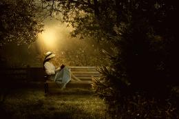 by nasirkhan 11157 views - final score: 62.3% | Oh Noes!! 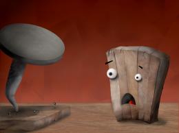 by Kid 11551 views - final score: 60.8% | Lonely 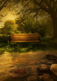 by siderismaris 8875 views - final score: 59.7% |
sitting on circle 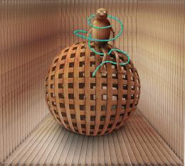 by MrHack 9790 views - final score: 59.5% | sun set 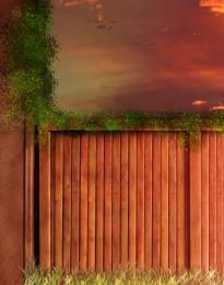 by Mayechung 11670 views - final score: 58.6% | Rich and Poor 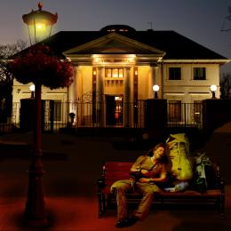 by Paulus62 6294 views - final score: 57.4% |
Back Stage 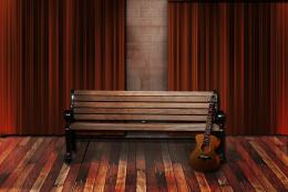 by lchappell 8213 views - final score: 57.3% | He never came (fixed shadows) 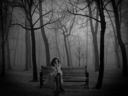 by prairiekittin 10284 views - final score: 56.4% | Granny's Kitchen Table 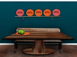 by lchappell 8073 views - final score: 55.6% |
Magical bench 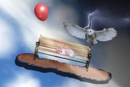 by vilone 12438 views - final score: 55.3% | bench beach 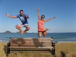 by filantrop 5983 views - final score: 55.2% | sleep of memory.. 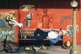 by akasha 8743 views - final score: 53.4% |
Ohhh Nooo!!!! 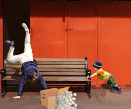 by BlueSparkle 7651 views - final score: 53.3% | Who moved the Bench ?? 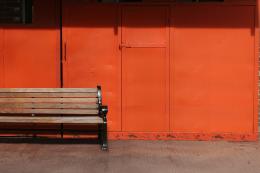 by Alan2641 6787 views - final score: 52.9% | After The Fire 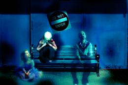 by vladimir735 5737 views - final score: 51.9% |
Mental Anguish 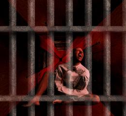 by tapiona 6027 views - final score: 51.6% | Crying Girl 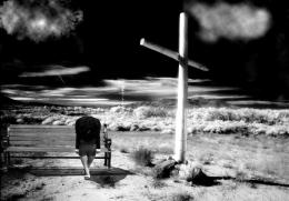 by decay33 7839 views - final score: 50.7% | Burn Bulla on Bench 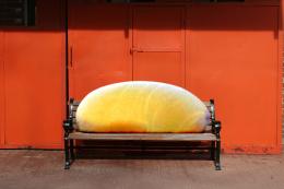 by GolemAura 6842 views - final score: 47.5% |
Howdie Guest!
You need to be logged in to rate this entry and participate in the contests!
LOGIN HERE or REGISTER FOR FREE
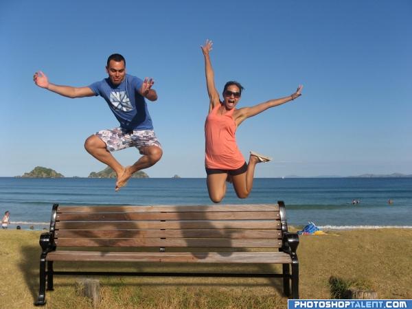
Good job and good luck. Take a look at the shadow on the ground. There should be a shadow of the people through the bench and onto the ground.
in the shadow casted by the bench, it should not be completely black as there are gaps between the wooden planks in the bench.. One more thing is the shadows casted by the characters... the shadows of the feet of the male char and knee of female char are wrong.. these shadows fall on the horizontal seat of the bench and do not get seen as shown in this pic. there should be a small deviation between the shadows on horizontal portion and vertical portion of the bench.. just my opinions.. gl
an eg of shadows on uneven surface - http://www.itchy-animation.co.uk/tutorials/01-blue-shadows.jpg take a look at the shadows of the branch on teh window...it maybe difficult to incorporate this fact in PS, in that case u could just raise the shadows so that they fall on the vertical portion of the bench alone..
setting the shadow discussion aside. this is a very energetic picture.. very happy and fun mood.. good luck
Nice idea good luck!
very nice
good
nice
Bench looks way too big in relation to the people.
nic, could do better with the shadow tho
Funny . To make you more nuts about shadows and such, I think the shadow from the bench should be a bit less deep amd more to the left. And up to you, but if you like a more symmetrical image, I'd crop a bit from the right side of the image. Good luck!
Very good, looks like it could really be there, good one
Looks pretty realistic,great job.Maybe you could make the people a bit larger,but that's up to you.
odd clean bench on the beach. What are the tree stumps?
Very fun. Nice job!
Howdie stranger!
If you want to rate this picture or participate in this contest, just:
LOGIN HERE or REGISTER FOR FREE