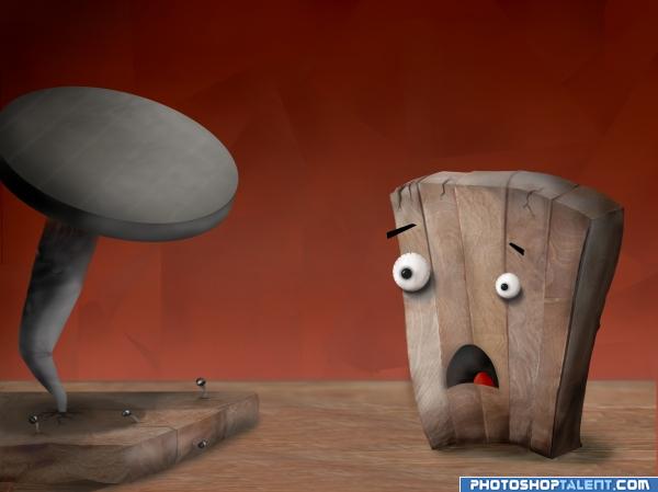
"What happened to my buddy?" O.o
(no outside source used)
Edited: 2 time (5 years and 3955 days ago)
Romantic  by nasirkhan 11186 views - final score: 62.3% | Oh Noes!!  by Kid 11587 views - final score: 60.8% | Lonely  by siderismaris 8914 views - final score: 59.7% |
sitting on circle  by MrHack 9819 views - final score: 59.5% | sun set  by Mayechung 11687 views - final score: 58.6% | Rich and Poor  by Paulus62 6338 views - final score: 57.4% |
Back Stage  by lchappell 8235 views - final score: 57.3% | He never came (fixed shadows)  by prairiekittin 10311 views - final score: 56.4% | Granny's Kitchen Table 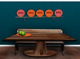 by lchappell 8097 views - final score: 55.6% |
Magical bench 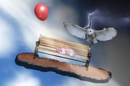 by vilone 12500 views - final score: 55.3% | bench beach 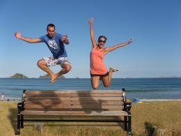 by filantrop 6006 views - final score: 55.2% | sleep of memory.. 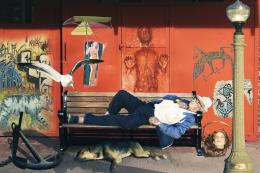 by akasha 8780 views - final score: 53.4% |
Ohhh Nooo!!!! 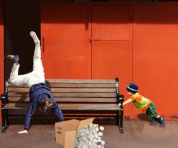 by BlueSparkle 7681 views - final score: 53.3% | Who moved the Bench ?? 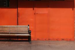 by Alan2641 6822 views - final score: 52.9% | After The Fire 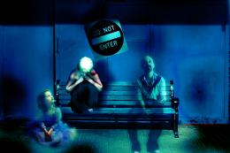 by vladimir735 5766 views - final score: 51.9% |
Mental Anguish 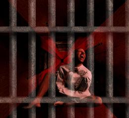 by tapiona 6050 views - final score: 51.6% | Crying Girl 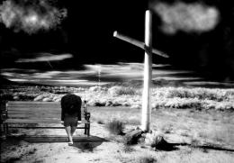 by decay33 7871 views - final score: 50.7% | Burn Bulla on Bench 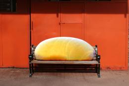 by GolemAura 6867 views - final score: 47.5% |
Howdie Guest!
You need to be logged in to rate this entry and participate in the contests!
LOGIN HERE or REGISTER FOR FREE
perhaps I know who have done this.....u always do awesome work.....
colors, expression an all nice, but size of eyes are not ok(perspective)
That's seriously thinking outside the box. This is a cool peice. Good Work. Good Luck.
This has a great cartoony feel to it, and disappointing lighting issues for such fine work...
on highres the single boards of the bord dont fit well, and it needs some finework in details. but i LOVE this picture! great idea author!
coooool
Really love the work on the eyes.. I'm not sure about the GIANT nail.. it took me a few minutes to realize what if was.. not that detracts from the piece in anyway... the face is SO expressive.. good luck on this.. it's a lot of fun
EDIT: NOW IT LOOKS LIKE A NAIL.. I didn't know how to tell you but in the original submission it looked like a giant deformed olive.. giggle snort..you should heard me trying to figure it out, I scared my cat..LOL much better now) (I make a lot of weird noises when I'm confused)
cute. i like the way you did the background. thats cool.
very creative
haha cool
LOL. Nice.
nice job on the expression and the large nail -- mouth and tongue a bit blurry
lol thats funny/cool good luck
This is so much fun. I like the subtlety of strokes and lighting on the background. It almost looks like two light sources going on here; the drop shadow behind the board and left eye looks like light from above and to the left, the tongue, and the right eye look like light from above and to the right. The wood grain on the table and the board is great. Nice work! Good luck.
LOL very funny
Okay, changed lots of things!!
-Changed size and shape of nail
-Shadows on eyes and wood adjusted
-Added eyebrows
-Sharpened mouth and tongue
Dramatic . Funny outcome, cant see well, but you might want to use the side of the wood for inside the mouth too (so that the mouth looks less flat). The living wood's shadow is made with some greys? I'd use a blending mode, so you're still able to see the wood structure from the floor under. Good luck!
EDIT: shadow on the floor looks a lot better!
Changed blending of shadow underneath the piece of wood (thanks for all the suggestions )
)
cool
oOo!Great!

Congratulations for 2nd
very cute, congratulations
Congras!
congrats
congrats
Congratulations.
Howdie stranger!
If you want to rate this picture or participate in this contest, just:
LOGIN HERE or REGISTER FOR FREE