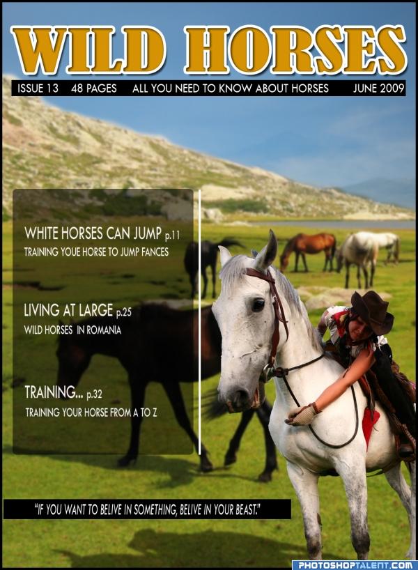
This is a fictional front cover of a magazine. I used two fotos(and that are made by me). Hoppe you like it. It sure was fun making it. (5 years and 3947 days ago)
Spring Graze 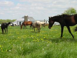 by pingenvy 13678 views - final score: 58.2% | Horses in Heaven 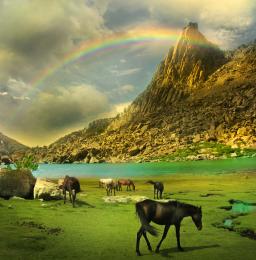 by siderismaris 20976 views - final score: 55.9% | Mr. Horse 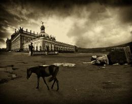 by Nator 13731 views - final score: 55.8% |
Land of Wild Horses 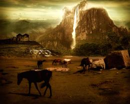 by nasirkhan 16871 views - final score: 55.4% | Lunch 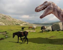 by CMYK46 13705 views - final score: 53.8% | wild horses  by meena 8925 views - final score: 53.8% |
Wild Mountain Horses 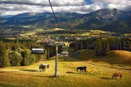 by Tuckinator 7193 views - final score: 53.8% | forest horses 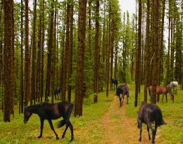 by friiskiwi 13429 views - final score: 53.5% | Horses on Mars  by siderismaris 6921 views - final score: 53.5% |
Golden horn  by filantrop 5826 views - final score: 52.9% | The archer  by DarkQueen 5049 views - final score: 52.9% | FRONT COVER - LUNA 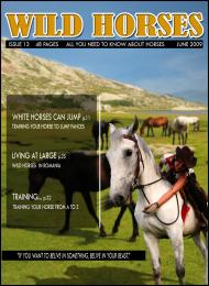 by ame13hd 7462 views - final score: 52.8% |
Perro  by danistano 3892 views - final score: 52.7% | Horses on the Moon  by tuckerh 8555 views - final score: 52.5% | Redneck Paradise  by lchappell 6076 views - final score: 52.1% |
Ceremonial Cave  by artgirl1935 3368 views - final score: 51.9% | Spring Time 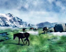 by Akassa 5661 views - final score: 51.3% | wild but not free 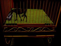 by ame13hd 6226 views - final score: 51.2% |
wild horses 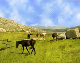 by DONROB3R7 5544 views - final score: 45.8% |
Howdie Guest!
You need to be logged in to rate this entry and participate in the contests!
LOGIN HERE or REGISTER FOR FREE
whole lot of fun.. good luck!!
If this were a real cover, the type would be better under the logo and on the mountain, rather than in a ghosted box that obscures the main image. The line at the bottom would be better in white against the background, not in a black bar.
Great use of the source...Sorry but I'm a stickler about spelling...You misspelled "Training Your Horse To Jump Fences" Definitely on theme Good Luck
sorry about the spelling mistakes.I'm not english, but i will do my best to overcome this problems.
good idea. reduce the size of the box.
thank you guys for your advices, but your missing the point. If this would be an actual magazine it would have more text on the cover, because the photo would be presented inside the magazine without any alterations. But thank you for your input.
i like this cover
i like it

Faza cu caii salbatici din Romania face toti banii, tine-o asa.
mersi billyboy. bafta
Howdie stranger!
If you want to rate this picture or participate in this contest, just:
LOGIN HERE or REGISTER FOR FREE