this is NOT an old entry...
made this entry this week: )
(5 years and 3950 days ago)
Mud is running out! 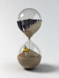 by loopyluv 10907 views - final score: 62% | Stairs 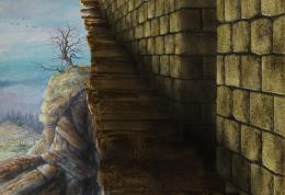 by pingenvy 9539 views - final score: 59.4% | LionWatch 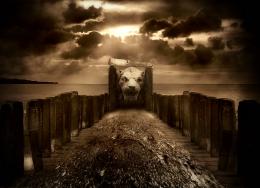 by nasirkhan 8402 views - final score: 57.3% |
Stairway to Heaven 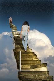 by Paulus62 10424 views - final score: 57.2% | Sea Alert (or Don't Get Crabs) 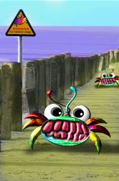 by GolemAura 12097 views - final score: 54.3% | Night....... 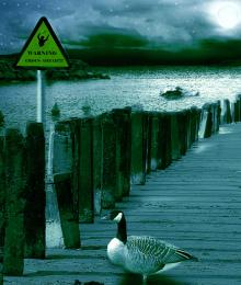 by nishagandhi 3421 views - final score: 54.1% |
Colorize 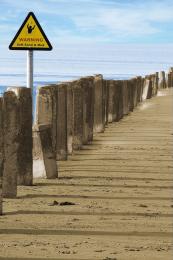 by noorbaduk 5579 views - final score: 53.3% | Quick Sand 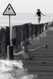 by KatGV 7639 views - final score: 52.2% | Hungry Birds? 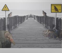 by cabldawg71 3976 views - final score: 51.7% |
beach  by RAZ0R 3259 views - final score: 51.1% | man drowning 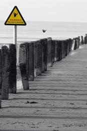 by minimonst100 6393 views - final score: 50.6% |
Howdie Guest!
You need to be logged in to rate this entry and participate in the contests!
LOGIN HERE or REGISTER FOR FREE
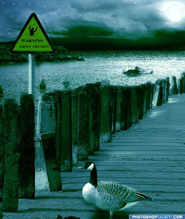
I'm liking the mood but I think you need work on the goose.. his feet are kinda wounded and he's looking a bit floaty.. you have a good composition going though. now just make it work for you more
(I can't really see the croc either.. and I really am trying.. good luck author)
Much BETTER!!!. those feet were driving me crazy.. which isn't very far for me to drive LOL
(I can see the croc now.. I didn't realize he was swimming sideways, so I couldn't build his shape.. much better now)
golem thanx for the comments u can see the croc in the water only head is visible (as in the source link)
 hope its ok now golem
edit:have moved the goose down
very nice. good job author
Love the feel of this image...Croc is a little sharp compared to the surrounding area and the goose edges need to be sharpened...Good Luck
nice colors, shadow of bird is not ok
thanx all for the nice comments: ) Nator: have darkened the sky..christy: and gopankarichal :have made changes as u said
you need to work on the birds shadow i like it though
good idea love the colors
  GL
GL 
nice work and good color
Fantastic!
Giid entry, i think maybe the shadow on the goose should be a bit more subtle, and maybe try giving a harsher edge to your alligator or crocodile. Otherwise it's a very nice mood and good luck!
Croc is way out of scale...unless you're going for Hollywood monster flick....shadow on goose is opposite light source.
As CMYK says, the light is from the moon, there would not be the shadows from the posts across the sand, they would come forward.
i have readjusted the shadow..hope its ok now
Hmmm.. Not sure what you have done - but your pole and sign are now semi transparent! So are some of the pillars at the top.
beautiful colors
hey animmax i have not done anything to the pole and the sign ....i had just readjusted the shadow of the duck as mentioned before in my previous comment


anyway thanx a lot everyone for the nice comments
i love the mood, great job author

Beautiful work author, this is truly beautiful and calming like.
Howdie stranger!
If you want to rate this picture or participate in this contest, just:
LOGIN HERE or REGISTER FOR FREE