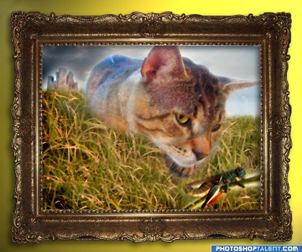
See the high resolution for the painting details (5 years and 3950 days ago)
1 Source:
- 1: source1
another world  by gopankarichal 12572 views - final score: 64.5% | deep  by gornats 8715 views - final score: 58.8% | Encased  by intrinsic 9016 views - final score: 58.2% |
Rise of the robot  by marina08 7563 views - final score: 57.9% | Hopzilla  by ponti55 7649 views - final score: 56.6% | Mutants Duels  by CSevrip 5625 views - final score: 55.3% |
bottoms up!  by gornats 4093 views - final score: 55.1% | KingHopper 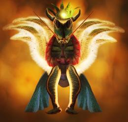 by nasirkhan 3038 views - final score: 55.1% | Hoppy 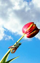 by tallyna 5902 views - final score: 54.7% |
The Giant Leg-humping Hopper! 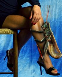 by tnaylor21286 12306 views - final score: 54.7% | Creature 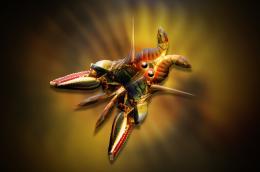 by lahiripartha 4706 views - final score: 53.7% | Duel  by blewguy 4488 views - final score: 53.1% |
Assassin hopper 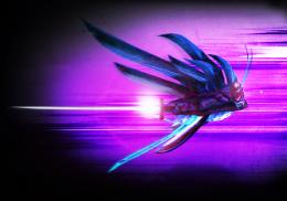 by Siminho90 6006 views - final score: 52.9% | Swarm 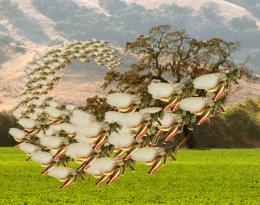 by Ory 6482 views - final score: 52.4% | WeirdWorld 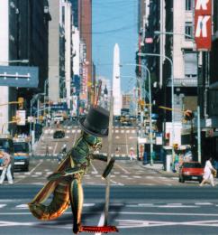 by Ory 4657 views - final score: 52.1% |
Father and Son 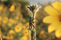 by Alan2641 5573 views - final score: 50.2% | Cat 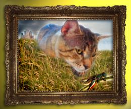 by nevena 4885 views - final score: 50.2% | Grasshopper Man 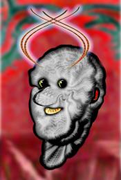 by GolemAura 6561 views - final score: 49.3% |
Howdie Guest!
You need to be logged in to rate this entry and participate in the contests!
LOGIN HERE or REGISTER FOR FREE
cool
very nice idea.. a light burn along the edge of the painting might be in order to give it more of a mounted look instead of dropped in.. but try it first to see if that is something you'd be happy with... good luck
edge darkening really helped author.. good luck
the picture is floating in the frame, use the burn tool very lightly on the outer part of the picture along the frame connecting them, even if you only decide to only do two sides, a frame leaves a small shadow on the picture with it's greater width. Very nice idea and good luck =)
Love the image!! I'm not a fan of the burn tool...I create new layer and use a soft paintbrush with the opacity set to 10% so I can control how much or how little I want. Use white or black depending on whether you want a highlight or a shadow...Hope that helps and Good Luck
good idea, but cut & paste feel is there(insect) correct it
Nicely done. In high resolution I appreciated all the details because in low resolution it does not look like a painting.
should not sign you'r work - for better or for worse it is something to be considered

ok
nice!
Nice idea but the cut outs are very poor. Work on the edges to greatly improve this image. Also the painting details are just a filter so its not really details.
I like this idea...the cat looks low res. Otherwise...
lol..
Edge of the whole cat has too much blur Gl!
MMM crunch good luck author. There's a little bit of a white background behind each image other than that cool idea
the edges of the cat are transparent, grasshopper too and the stem kinda looks like it's glowing but nice concept!
yum
Howdie stranger!
If you want to rate this picture or participate in this contest, just:
LOGIN HERE or REGISTER FOR FREE