thanx to Lennon-STOCK from deviantART (5 years and 3952 days ago)
1 Source:
- 1: source
Spring Graze  by pingenvy 13695 views - final score: 58.2% | Horses in Heaven  by siderismaris 20989 views - final score: 55.9% | Mr. Horse  by Nator 13742 views - final score: 55.8% |
Land of Wild Horses 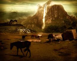 by nasirkhan 16888 views - final score: 55.4% | Lunch 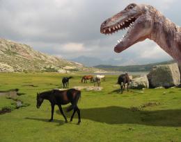 by CMYK46 13714 views - final score: 53.8% | wild horses  by meena 8934 views - final score: 53.8% |
Wild Mountain Horses  by Tuckinator 7201 views - final score: 53.8% | forest horses  by friiskiwi 13443 views - final score: 53.5% | Horses on Mars 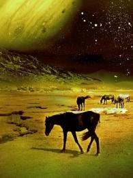 by siderismaris 6934 views - final score: 53.5% |
Golden horn 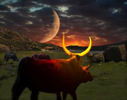 by filantrop 5836 views - final score: 52.9% | The archer 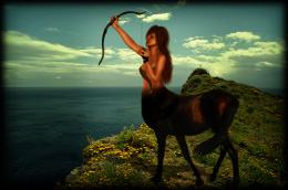 by DarkQueen 5056 views - final score: 52.9% | FRONT COVER - LUNA  by ame13hd 7477 views - final score: 52.8% |
Perro  by danistano 3903 views - final score: 52.7% | Horses on the Moon 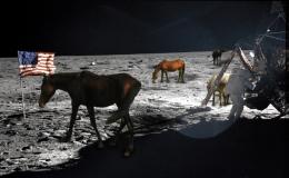 by tuckerh 8569 views - final score: 52.5% | Redneck Paradise 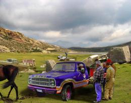 by lchappell 6089 views - final score: 52.1% |
Ceremonial Cave 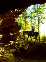 by artgirl1935 3371 views - final score: 51.9% | Spring Time 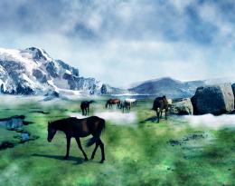 by Akassa 5672 views - final score: 51.3% | wild but not free  by ame13hd 6237 views - final score: 51.2% |
wild horses 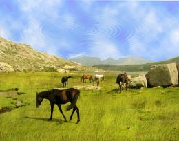 by DONROB3R7 5549 views - final score: 45.8% |
Howdie Guest!
You need to be logged in to rate this entry and participate in the contests!
LOGIN HERE or REGISTER FOR FREE
Photography and photoshop contests
We are a community of people with
a passion for photography, graphics and art in general.
Every day new photoshop
and photography contests are posted to compete in. We also have one weekly drawing contest
and one weekly 3D contest!
Participation is 100% free!
Just
register and get
started!
Good luck!
© 2015 Pxleyes.com. All rights reserved.


nice! good luck
nice work
The horizon line is not matched up very well, nor does the water color match, nice idea
Is there a water fall behind the Tree??. that would explain the water plane not matching up.. good luck!!!
It will look much better if you level the horizons.
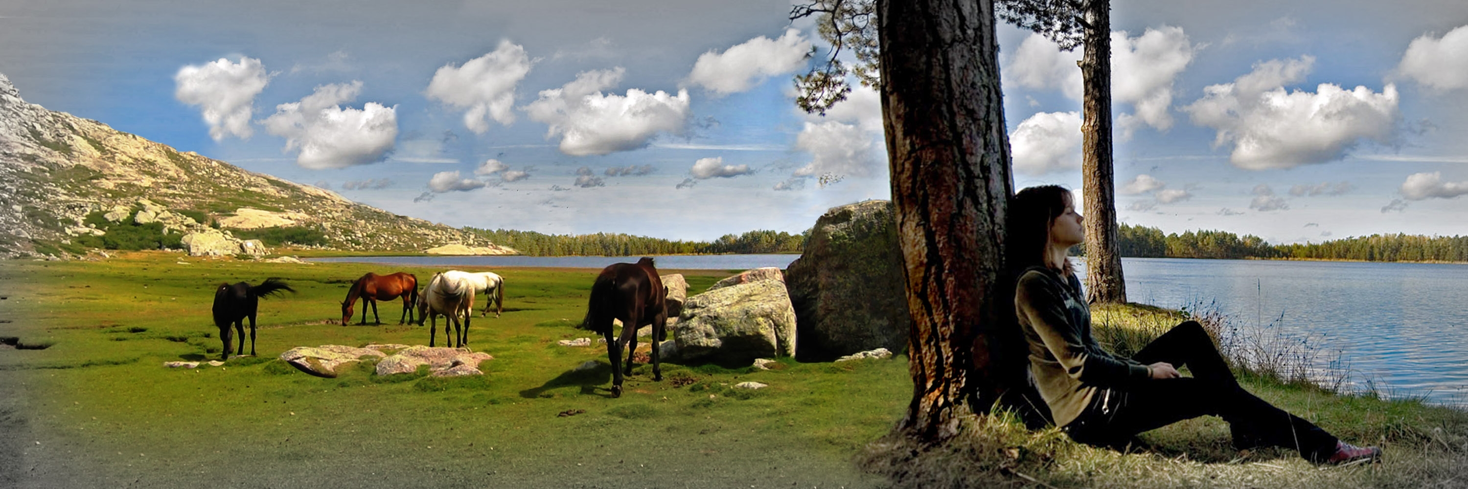
???? Is this supposed to be Land of the Giants? She's bigger than a horse! And what's the black thing above her?
EDIT: Well, except for the opposite light sources, it's better...
Very nice composition for this entry, although I would remove the closest horse because he doesn't contribute to the scene at all. Other than what has been mentioned above, your lighting directions are fighting each other. With these few corrections this could evolve into a beautiful scene! Good luck!
OOOK , i guess i was half awake when i did that
  i fixed it as much as i could, please tell me more
  , thank you all -i dont know where that black thing came from
 -
-
very good love the image


i agree with CMYK, give attention for scale object proportions n perspective. nice job.
The horizon line looks much better, IMO you still need to work on the color of the grass and the scale issue...looking better
Howdie stranger!
If you want to rate this picture or participate in this contest, just:
LOGIN HERE or REGISTER FOR FREE