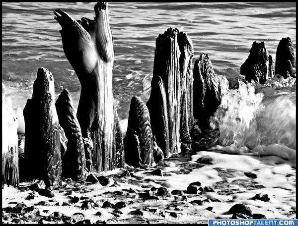
Firstly if this offends anyone - please let me know.
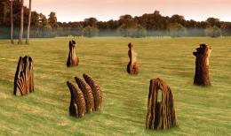
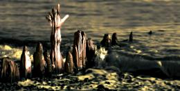
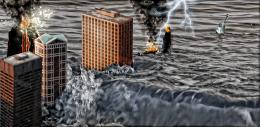
I was looking at the source and that part just looked like a female torso. So I added one, then subdued the visual by the final change to B&W and adjusted the contrast.
Note: the double link is as per Stock owners request.
EDIT: gave it a name, even though it was supposed to be blank... (5 years and 3931 days ago)





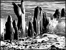



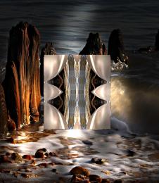


not offensive in any form I can see.. Unless we have a super prude in the audience... the Idea is subtle and well executed. .the only bad thing is that GOD AWFUL TITLE.. shore 4a4b6e994f97c????.. come on author.. you can do better then that.. Shore Study Nude 1 would be much better.. LOL.. (Just teasing ya.. good luck) Wonderfull form.. though a phallus would not be out of order.. just keep it pg (Don't do it..that would be over the top for this site)

 :poke
:poke hehehe
EDIT:oops.. high High HIGH marks for this one.. I would love this in a decor portfolio... great entry way piece for a condo on the beach.. It would knock a clients socks off
(AND A few POKES FOR ORY
hmmm...thats a nice entry... not offensive.....good work author
hehe boobies.
I think the name could do with some sprucing up! Good entry otherwise xD
Torso should have more wood grain, otherwise it's a good effort...
i think the figure should be stood on its own !!! nice idea though
I was trying for more woodgrain actually.. I will spend some more time on it and see if I can make it stand out some more.. Thanks everyone..
nice work and very creative, good luck
nice
Howdie stranger!
If you want to rate this picture or participate in this contest, just:
LOGIN HERE or REGISTER FOR FREE