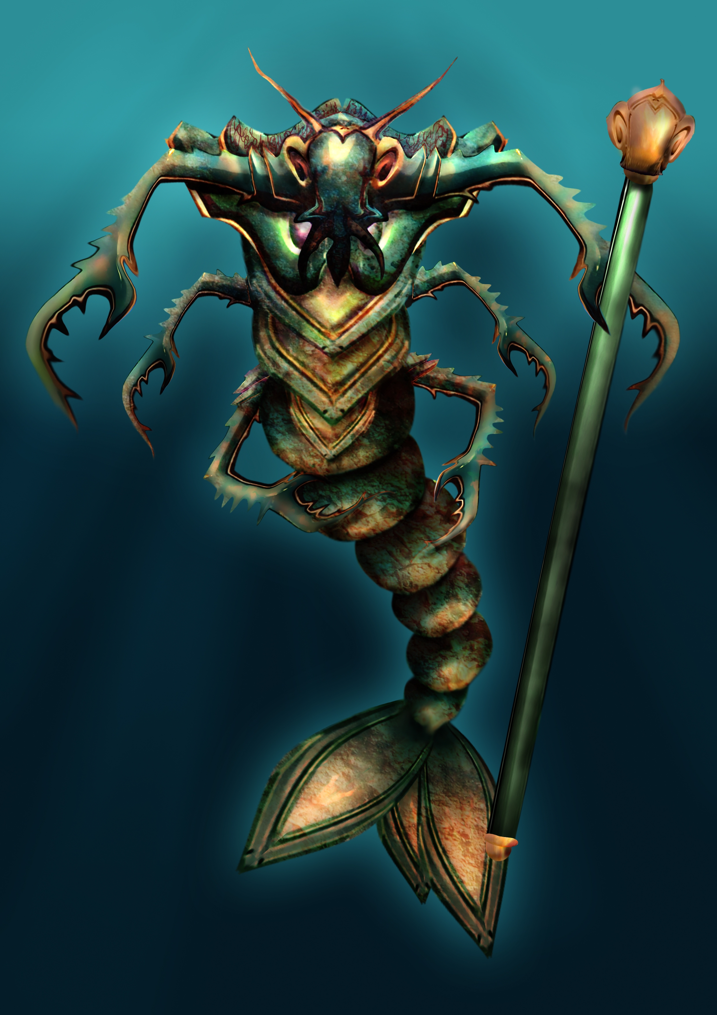
deep deep under the sea theres a sign of existence...
did some corrections (5 years and 3946 days ago)
1 Source:
- 1: texture
some kind fo creature  by anatole 19804 views - final score: 64.2% | walk like .......  by gornats 17728 views - final score: 56.6% | Magic house, Magic woods  by marina08 20524 views - final score: 56.2% |
Hey You  by nasirkhan 16572 views - final score: 55% | Country Robots 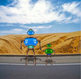 by RGB 20073 views - final score: 54% | City lights 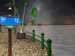 by billyboy 4255 views - final score: 53.7% |
on air  by arsal 4409 views - final score: 53.5% | A little R&R 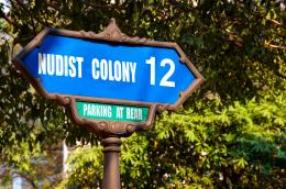 by animmax 4375 views - final score: 53.2% | Si Lom  by chady 5125 views - final score: 52.8% |
NSFW (Not Safe For Work)  by GolemAura 7145 views - final score: 52.6% | Road to Slumber Land  by artgirl1935 4676 views - final score: 51.3% | My way 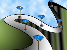 by sathya 3076 views - final score: 51.3% |
Howdie Guest!
You need to be logged in to rate this entry and participate in the contests!
LOGIN HERE or REGISTER FOR FREE
Photography and photoshop contests
We are a community of people with
a passion for photography, graphics and art in general.
Every day new photoshop
and photography contests are posted to compete in. We also have one weekly drawing contest
and one weekly 3D contest!
Participation is 100% free!
Just
register and get
started!
Good luck!
© 2015 Pxleyes.com. All rights reserved.


Very creative work
 . Correct spelling in title ("fo" --> "of"
Superb!
creative work!
very imaginative
Pretty cool guy! Try to blur some sharp edges & blend the limbs & body better. The 2 claws against his body are transparent.
love it
Nice work - I admit to not seeing the source in there till I looked at the sbs.. corrections as already mentioned.
good work. good colors. some sharp edges are there, correct it
well done
very good in use of source image
wow...great stuff
fantastic creation & very creative still needs a little work here & there mostly on the edges
I don't know what to say you have a really productive imagination lol amazing creation for sure
Really nice work! Excellent color and composition.
Very nice i love it!
very nice
Very very nice, at first I thought this was origionally made for the grasshopper contest as its got the same colours and all that, but this is really excellent work, nice one
This really is an amazing work. To think that you pulled this from that little street sign is just mind boggling. I love the colors and textures that you used on the creature as well. If I had to nitpick, I'd say lose the outer glow on the creature and lose the staff entirely. Sometimes less is more, and I feel that you don't really need either of those two elements. If you keep the staff, though, I'd at least fix the cap at the bottom of the shaft. It blends in with the creature's tail a bit too much and, until I viewed the hi res, I didn't even know it was part of the staff. Anyway, awesome!
awesome how did i miss this entry...great job
Strong entry.. good luck !!!
Congrats! Well done!
Congratulations for 1st
Congrats. really well done
congrats for 1st
Congrats!!
Congratulations!!!!
congrats
Howdie stranger!
If you want to rate this picture or participate in this contest, just:
LOGIN HERE or REGISTER FOR FREE