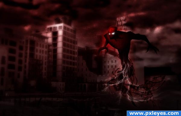
I'm sure "Blood Strike would fit right in among any of the X-men games. (5 years and 3938 days ago)
Princess of sword, Luthien 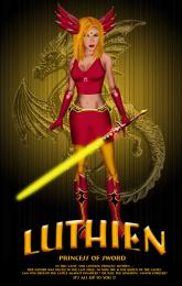 by chakra1985 11346 views - final score: 62.8% | Red Raven 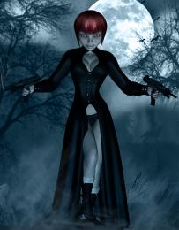 by Warlock 11832 views - final score: 61.7% | Tomb Raider 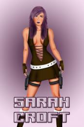 by chakra1985 10218 views - final score: 59.4% |
MAFIA WARS 3D 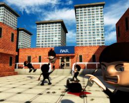 by hsbee 18839 views - final score: 58.9% | "Blood Strike" 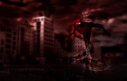 by cain726950 11551 views - final score: 58.7% | Ai 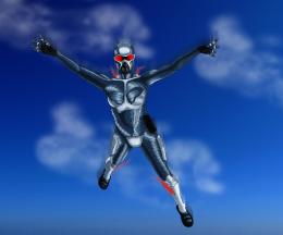 by arkncheeze 18551 views - final score: 58.5% |
Knight of The Night 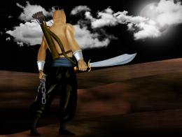 by orientallad 5482 views - final score: 58.5% | Alien Encounter-The Forgotten 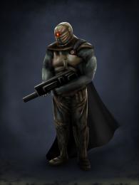 by artist3001 17871 views - final score: 58.5% | ancient king 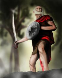 by coeff 6670 views - final score: 58.4% |
Narutric (fighter) 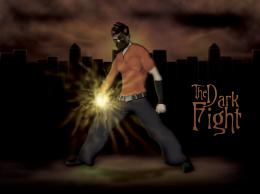 by creativangle 4402 views - final score: 58.2% | A mecha character... 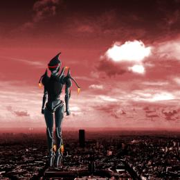 by arkncheeze 8425 views - final score: 57.7% | Jack the explorer 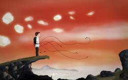 by mrsheffels 5834 views - final score: 56.3% |
Run Al Run 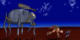 by arkncheeze 7054 views - final score: 55.6% | Master of disguise 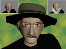 by billyboy 5936 views - final score: 54.1% | Maroon Eyes (Your New Teacher) 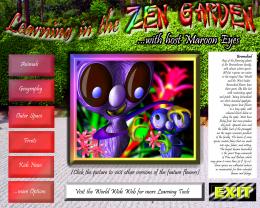 by GolemAura 7482 views - final score: 52.9% |
A Chubby Hero 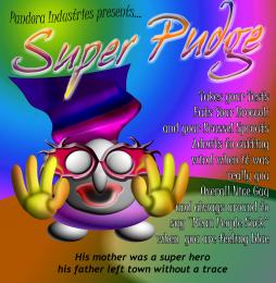 by GolemAura 5634 views - final score: 51.8% | Okammmi Bear 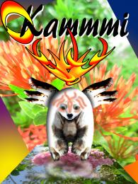 by GolemAura 3941 views - final score: 49.6% |
Howdie Guest!
You need to be logged in to rate this entry and participate in the contests!
LOGIN HERE or REGISTER FOR FREE
Or maybe if the name Blood Strike turns out to be taken, you could call him "Really Hard To See Guy".
Author.. I loaded this image into my PS and I dodge tooled/contrast and even super brightened and I couldn't make out any detail (though the texture is quite nice).. just can't make out the detail.. might want to do something about that
EDIT: I turned out all the lights in the house and looked at it with the curtains closed..it's much better.. still dark.. but a great character all the same.. good luck
very nice creation, great mood and lighting....fantastic!!
good work
nice!
nice work....I'm still thinking in which X-men's should I place this character.......anyways GL author....
He's cool!
Excellent pic, would definitely look at home in a comic book. Great atmosphere.
Great character nice atmospherics top job!!
really cool
looks like a genuine villain
Agree with Philister & Warlock: cool character, environment fits well. Reminds me a bit of the design from the '90s animated version of Batman (more stylized version). Maybe one thing: I guess this character is floating, he seems to come towards you, so then I'd expect the smoke part under to be more behind. Maybe if you'd do that, it will get more movement (but then I'm not sure if that's what you want). Good luck!
The character is essentially a mix of batman beyond smiderman, and strangely enough the grinch, so you are right in your design assumption. Regarding the movement, I wanted it to look like he came from the BG on the right of the picture but I also wanted it to look like he then moved up and stopped. Anyway, I thought I'd ramble about this for a sec. Thank you to everyone who voted, hope you enjoy.
very nice
Congrats!!!
great entry, should've placed higher.
Howdie stranger!
If you want to rate this picture or participate in this contest, just:
LOGIN HERE or REGISTER FOR FREE