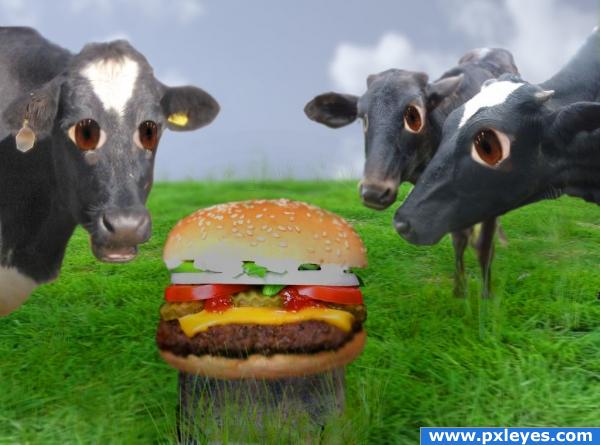
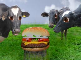
1st , add cloud layer, add grass layer, add cows, blur edges of cow, add grass overlay and use grass brush to add extra strands. blur some for the distance. hue/sat overlay for shadows,
gaussian blur clouds
thanks for the advice, amended entry. i like the stump idea i think it looks better. (5 years and 4012 days ago)
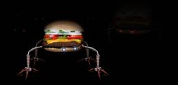
- 1: cow 1
- 2: 2cows
- 3: grass 1
- 4: grass overlay
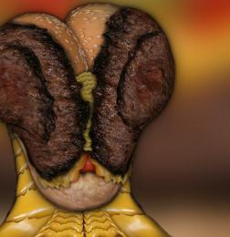
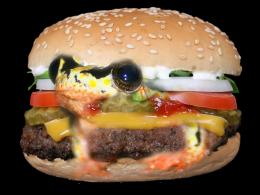
- 5: crying eye
- 6: cloud
- 7: tree stump






interesting
nice idea.
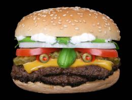
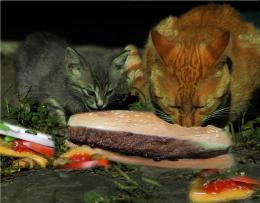
just a thought author.. but if you upped the color/contrast on the burger to make it pop.. and then try to get rid of the orange around the cows eyes it would make the message much more powerful.. but that's a definate IMHO because this piece is just marvelously surreal (Placing the burger on a cut off stump would be a cool idea as well.. would give the message more power)
humor and kinda a message that we should all be veggies. nice work
hhhha!!!!!!

good
Funny! I love the expressions in the cows' eyes. Didn't see the picture pre-alterations but I do like the changes you made (and the stump definitely works). Only thing I can really critique is the burger looks VERY large compared to the cows. Might want to take it down a tad. Also, the sky seems a bit dark and gloomy. If you brighten it up it would juxtapose the shocking material (for a cow, anyway) and further the humor even more. Nice job!
Howdie stranger!
If you want to rate this picture or participate in this contest, just:
LOGIN HERE or REGISTER FOR FREE