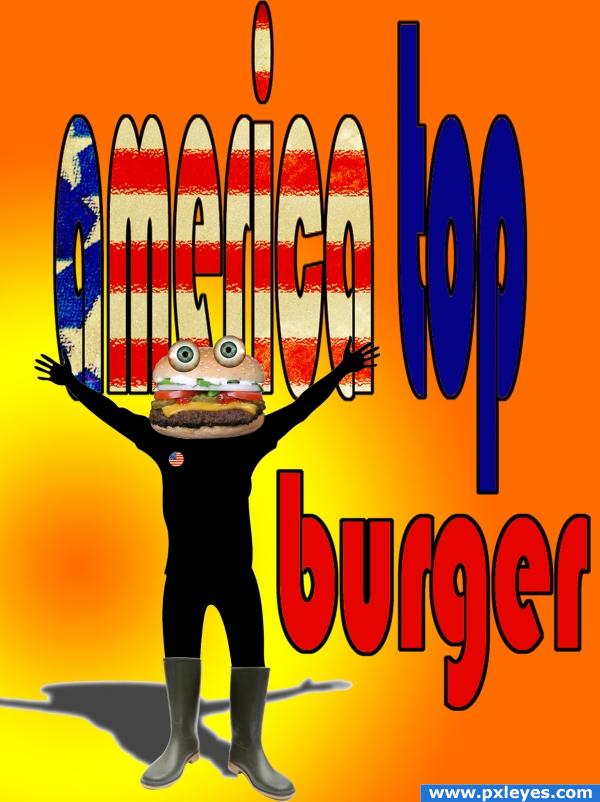
please see in high resolution (5 years and 3929 days ago)
5 Sources:
Bonsai 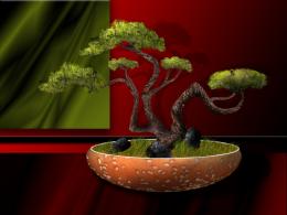 by George55 12082 views - final score: 59.9% | Fishes 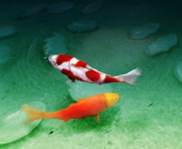 by Mayechung 16970 views - final score: 59.5% | Where's the Beef Owl 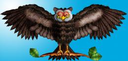 by GolemAura 14049 views - final score: 59.2% |
Geranium 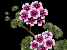 by George55 11291 views - final score: 59.1% | Burger-Bear 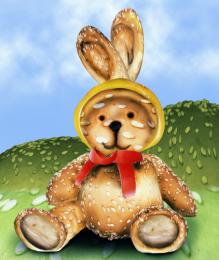 by nasirkhan 10581 views - final score: 57.6% | Burgtoise 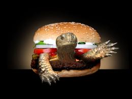 by dreamdriven 5375 views - final score: 56.7% |
Big Burger 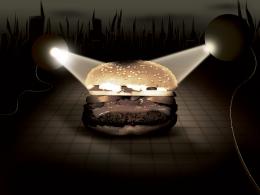 by creativangle 12987 views - final score: 55.6% | Burger-PPle 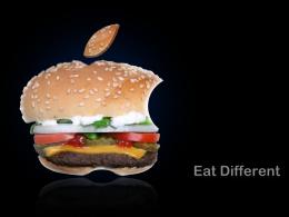 by vinshine 4715 views - final score: 55.4% | alien burger 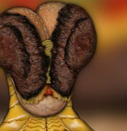 by digifix 8750 views - final score: 54.5% |
Robo-burgah  by Illusionism 9617 views - final score: 54.5% | Alone  by magicsteve 5939 views - final score: 54.4% | Angry Burger! 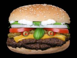 by unkskitty 15121 views - final score: 53.3% |
FooD CaGe 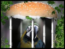 by vinshine 5617 views - final score: 53.2% | A few too many 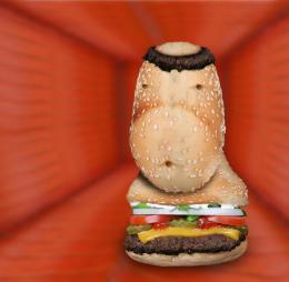 by digifix 5994 views - final score: 51.9% | Mouth Watering Steak Sandwich 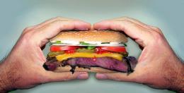 by lchappell 10125 views - final score: 51.7% |
Alas we knew him well 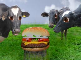 by scratzilla1 6592 views - final score: 50.9% | top burger 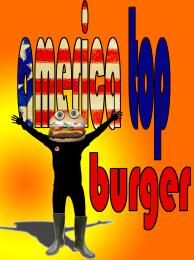 by mariosilva 8517 views - final score: 50.9% | Beauty burger 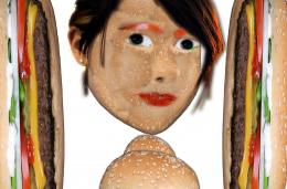 by sathya 6271 views - final score: 50.1% |
FOOD 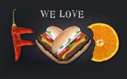 by dotch 6787 views - final score: 49.7% | Tempted 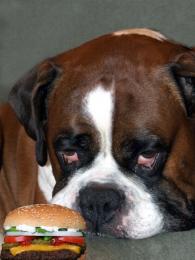 by George55 3911 views - final score: 49.7% | sandwich art  by hoorenazar 5884 views - final score: 49.6% |
Delicious Dinner 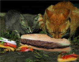 by shankar 5608 views - final score: 49.3% | STOP!!! 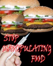 by mariosilva 3995 views - final score: 48% | Eat burger with Frog?!! 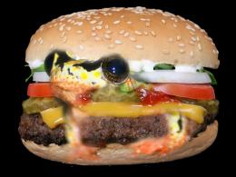 by shaiju1974 12142 views - final score: 46% |
The New Era of Burger Fashion 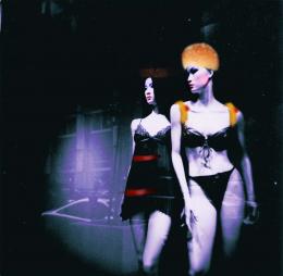 by cazallama 10209 views - final score: 45.7% | Remove this.  by vinshine 8287 views - final score: 38.7% |
Howdie Guest!
You need to be logged in to rate this entry and participate in the contests!
LOGIN HERE or REGISTER FOR FREE
very fun Idea.. but the lettering is way too distorted.. if you bring the text into the realm of readability you will have a much better piece (also the eyes are a bit floaty.. shading and bring the burger to more detail might help fix that (burger is a bit too blurred (the bun part)
very good piece author.. I just see where it can be better
also you need to blend the boots into the silhoette better( try the warp tool), and their shadow needs work...nice idea
I'd just extend the text, otherwise do what i always do and hold shift while resizing from the corners, that makes the image being resized maintain its proportions
thanks for the helpfull comments
honestly, this image just lacks some spark and i have to agree with lchappell
I'd like to add that the shadow our burger buddy is casting probably doesn't need a stroke on it (thin as it may be). Still, this piece made me laugh! Nice job.
ye steve u rigth i gonna change this soon as possibel, problem is that i flatt burger, but is not a big deal thanks a lot
thanks Tuckinator i know that i still have to work some things here but this is pure kitch, to me, with a bit dádá same as america top... (u know) apreciate your comments u´re wellcome, see u.
good, but body is flat and shadow having a white edge. correct it
colourful
Howdie stranger!
If you want to rate this picture or participate in this contest, just:
LOGIN HERE or REGISTER FOR FREE