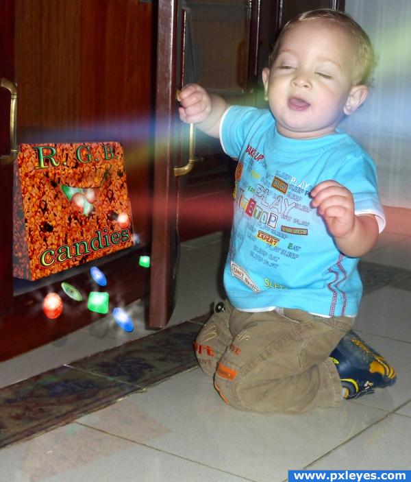
They are amazing, attractive, and delicious. No kid can stay away from them.
No sources from Internet were used in this entry. Picture of kid is my own. All other stuff made in PS. (5 years and 3930 days ago)
SmilieZ  by loopyluv 6307 views - final score: 61.3% | kaboom! Flavour Explosion  by Mike 15069 views - final score: 61.3% | nosepickers  by yahidithmonnalisa 7986 views - final score: 61.2% |
Educative tooth brush candies 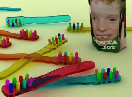 by billyboy 14849 views - final score: 58.5% | Holy Cow Patties! 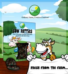 by rednovember 8684 views - final score: 58.4% | BubbleMeat Gum 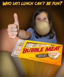 by pixelkid 5767 views - final score: 58.4% |
LoLLy ThumBs 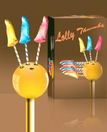 by vinshine 7829 views - final score: 54.3% | Air candy  by nevena 4715 views - final score: 52.6% | R.G.B. candies 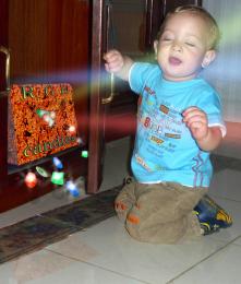 by momvera 3845 views - final score: 50.6% |
Howdie Guest!
You need to be logged in to rate this entry and participate in the contests!
LOGIN HERE or REGISTER FOR FREE
sorry author.. even though you used all those great lights and whistles and those fantastically made candies..that baby is stealing the show hook line and sinker...LOL..High marks anyway..but you have to be very careful when putting a baby in a pic... all eyes are always on them..especially this little stinker LOL (High marks anyway.. because of the BABE.. woo HOO-
Nice
OMFG what a blissfull face... so C U T E... lol don't care bout candies lol... The baby stealing the limelight lol...
cool
must ... not.... stare... at.... cuteness... concentrate... on the work........ ok, now that i covered the cuteness factor, i think that the box fonts look as if they are floating, not part of the packaging. also, the type colors against the bg make it hard to read. may i suggest designing the packaging first by itself and later adding it to the chop? ok, now back to baby....awwwwwwwwwwwwwww
IMHO the kid's expression is saying: "Get this crap away from me!"...a true organic child!
Thank you guys for your comments. yahidithmonnalisa, 100% agree with you on the box issues. CMYK, child is just blinded by unexpected bright light.
he is stoned with those drugs!!! cheers!
Howdie stranger!
If you want to rate this picture or participate in this contest, just:
LOGIN HERE or REGISTER FOR FREE