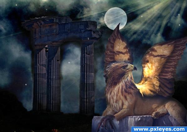
http://en.wikipedia.org/wiki/Griffin for the meaning of the Griffin: "The griffin (griffon or gryphon (see below)) is a legendary creature with the body of a lion and the head and often wings of an eagle. As the lion was traditionally considered the king of the beasts and the eagle was the king of the birds, the griffin was thought to be an especially powerful and majestic creature. Griffins are normally known for guarding treasure.[1] In antiquity it was a symbol of divine power and a guardian of the divine.[2]
Most contemporary illustrations give the griffin legs like an eagle's legs with talons, although in some older illustrations it has a lion's forelimbs; it generally has a lion's hindquarters."
Very hard for me...Since the orig. PST went down, I have been so out of practice with my methods....can't say I did great here....the shadows are too much, but I think the blending went ok....BE GENTLE PLEASE!!
Changed foot....got rid of wing shadows and added a better background...I hope this improves him!!! (5 years and 4010 days ago)
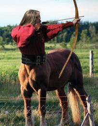
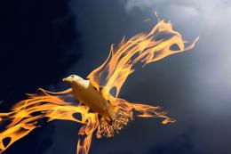
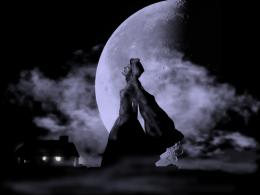
- 1: wings 1
- 2: wings 2
- 3: head
- 4: foot
- 5: lion
- 6: background 1
- 7: background 2

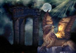
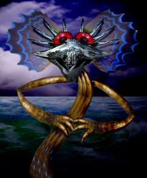
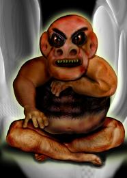
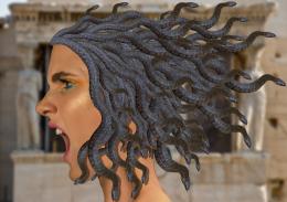
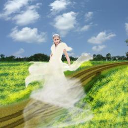
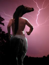


Nice idea, i'm not so sure about the shadow from the wing on the background. Good luck!
Good job, although I agree about the shadow...
awesomer image indeed
nice work author. i was too slow HEEEE. good luck .
Fantastic work. Seems so real!
nice work there im just wondering about the angle of the front paw.. it looks odd to me i dunno theres something about it.. love the monster you choose
image is super
Cool... Nice portrayal of the griffin... But would have been nice if the griffin's size would be much bigger... Well I never seen a real griffin myself( and never will I guess)... Or it might be a baby griffin...
Edit: Lol my mistake... Didn't see the source... Thought, you made it out of a pussy cat lol... I guess due to the wall behind it, it looks small...
I like this one a lot! thought it's a little too obvious that you used a smudge brush/ or liquify, If you use a smaller much smaller brush on those edges and clean that up it wouldn't be as distracting, and would lend some very nice constancy, then it would be an amazing piece.
I think contrast is too low, and I agree with the wings shadows, but good job
very nice
Great idea,shadows hmmmmmmmmmmm
Howdie stranger!
If you want to rate this picture or participate in this contest, just:
LOGIN HERE or REGISTER FOR FREE