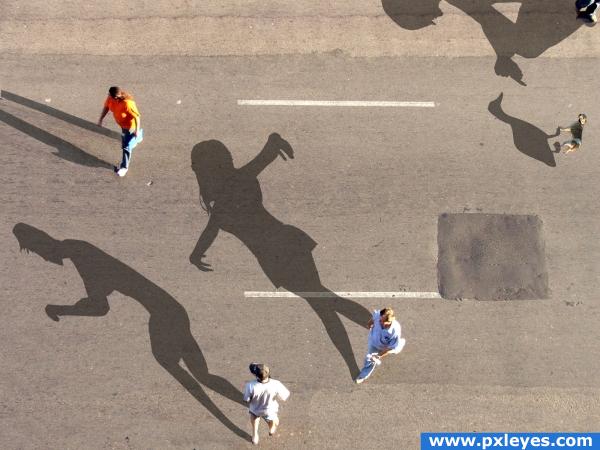
Well I have fixed the few problems that ppl told me about and well tell me what you think. Comments that will help me improve in photoshop and manipulating images are highly appreciated. THANKS (5 years and 3902 days ago)
5 Sources:
the pidgeon 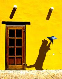 by elficho 10968 views - final score: 57.9% | Shadow casting man 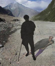 by CMYK46 17234 views - final score: 57.5% | rock on 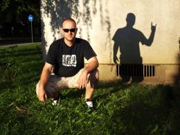 by elficho 10797 views - final score: 56.3% |
Bike On Street 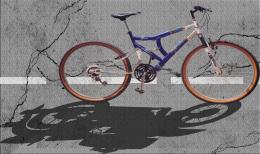 by jra 12424 views - final score: 55.6% | things that bump in the night. 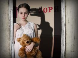 by bddesign 14708 views - final score: 55.3% | Should have gone golfing today 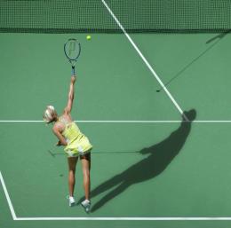 by robvdn 10228 views - final score: 55.2% |
Indian Beauty 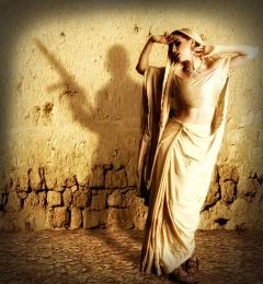 by nasirkhan 7285 views - final score: 55.1% | Creepy Shadows (Modified) 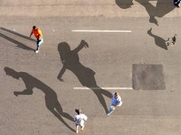 by jra 11011 views - final score: 54.8% | Alfred Hitchcock Presents 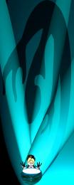 by GolemAura 6715 views - final score: 54.6% |
Candle Dreams 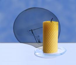 by Alan2641 6702 views - final score: 54.5% | Broken Heart 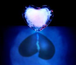 by Nator 9268 views - final score: 54.1% | Visions of Grandeur 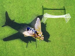 by lchappell 5511 views - final score: 54% |
Slow Cheetah 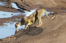 by jra 9339 views - final score: 53.3% | Axes 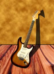 by Alan2641 4036 views - final score: 52.6% | Impossible Split Shadow Enigma 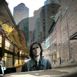 by GolemAura 6580 views - final score: 50.3% |
Howdie Guest!
You need to be logged in to rate this entry and participate in the contests!
LOGIN HERE or REGISTER FOR FREE
nice image, but change the name! :p
Yeah I sort of forgot to do that but it's fixed.
The idea is good, especially this dancing shadow. But have a look at the original shadows. To match them to the existing one, maybe you could make them more blueish and maybe also a little bit more leant to the left side, so they look more natural in comparison to the persons shadow with the orange shirt. Beside that... I don't get the duck shadow at all, cause there is nothing, that could cast a shadow. Maybe you could add a dog there, so it'll look like someone is feeding the dog, but the dog casts a duck shadow or something like that. Good luck
Well Lelaina there suppose to be a a person standing there casting the shadow on the corner but i guess it's a little hard to see Thanks for the comment
Nice image great creativity would agree the shadows do need a little tweaking
just sample the original shadow color and it will look great! also, change the direction the shadows are being cast because it would be pretty much impossible for the guy in the orange shirt to have his shadow in another direction
LOL...where's the duck? And the guy at upper left has a much darker shadow...
well first off to help you improve your photoshop, is that your shadows are going in the WRONG direction, and they arent blue like the real shadow on the top left...
I have been thinking about the changes that I did and looked at the title of the contest isn't it called "Wrong Shadows"? Well I made the changes all of you suggested.
try to change the picture of a dog with one that was taken form above. now it looks copy-paste-like and perspective is wrong.
This is much better than it was when I saw it yesterday. Did you clone out some of the middle upper? I'm seeing some repeated patterns, you may want to break those up a bit.
really nice
Howdie stranger!
If you want to rate this picture or participate in this contest, just:
LOGIN HERE or REGISTER FOR FREE