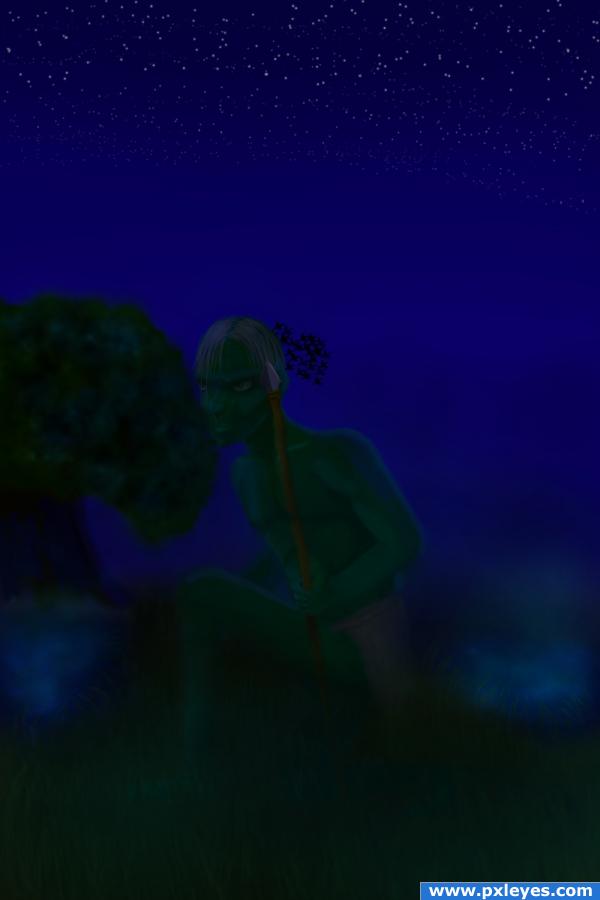
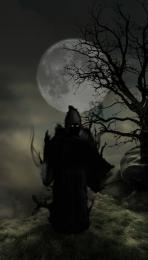
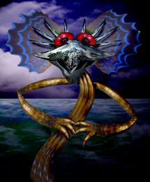
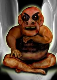
A lone goblin rests quietly waiting to spot his next prey.
Everything was painted in by hand.
Please leave comments. I love to hear how I'm doing, good or bad. If you have suggestions, I love to hear them because I'm trying to learn and get better with photoshop and painting.
BTW, I know the SBS is a little short, but I painted everything in on one layer and forgot to save steps as I went along. (5 years and 4013 days ago)

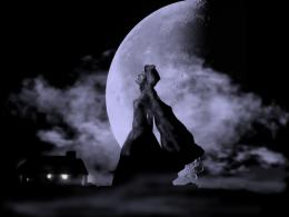
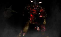
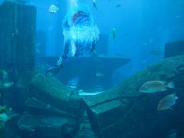


Looks like you did a very detailed job, BUT it's just extremely dark, maybe try brightening it up? That would be my suggestion, because your work really isn;t standing out, and we can't see the effort that you put into the entry.
thanks ponti.. I thought it was just me so I waited .. yes author, ponti is right. it's a very well drawn image, but the darkness doesn't allow the detail so show.. good luck
Well I do agree goblins like dark place... But really can't see the detail of the goblin... As ponti55 and Golem suggested, brighten up the pic a notch or two up... Well it's night time( i think) so maybe you can add a fireplace, but that may be compel you to do a full rework...
Or maybe make some hue/sat adjustment layer and brighten it up with selective masking...
you need to make it lighter. Very nice picture
I agree, it's way too dark to see much.
Thanks for all the useful comments. I lightened up the image a little to let some of the detail come out, as most of you suggested. Though I'm still trying to keep it a little dark because it is a night scene. Thanks again and keep the comments coming.
Nice idea. Apart from the light, maybe you can also pay a bit more attention to the composition (well, for another time then, I understand you made all on one layer). Right now the goblin and the tree are on almost the exact same height & close to each other and just behind the goblin are also some birds (very sharp/focussed). I can imagine that from this camera view you'd see the top of the tree way higher compared to the goblin. This way you also use the space in the image better and will happen some more than the air that you have now (which also doesnt have much connection with the rest of the image). If you also put the goblin a bit more to the right and the birds some higher too, you make the image more "open" and at the same time let them involve more with each other, so that the image is more a whole. Good luck!
Looks a bit better now... I do admit saving the unflattened image as a jpeg image... Or flattening the image and then saving it as jpeg... Results in a wee different image( not much difference though or I think my monitor is really whacked lol)
Anyways next time you wanna save it as flattened image, make a copy... Well coloring using color and hue/sat adjustment layer loses some details but it is really flexible and can be tweaked on the fly...
Pls lighten this... can't see a thing ;(
nice
very hard to see anything
It is such ashame that it's too dark and even more ashame that you haven't had time to modify it! I have the feeling that this is actually very good, if only I could see more of it...! Best of luck!
Howdie stranger!
If you want to rate this picture or participate in this contest, just:
LOGIN HERE or REGISTER FOR FREE