(5 years and 3913 days ago)
4 Sources:
Serenade for Su-C my sweety  by wazowski 26295 views - final score: 76.4% | Brass Gear Spider  by arkncheeze 31519 views - final score: 65% | The Time Tamer  by Nellista 25174 views - final score: 63.5% |
Amped Up 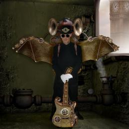 by scratzilla1 16804 views - final score: 62.6% | Flying Steam Sub 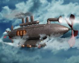 by Missy 23701 views - final score: 62.5% | I C U ... 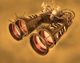 by thecreative 10097 views - final score: 62.5% |
Steampunk submarines 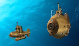 by CMYK46 15703 views - final score: 62.4% | Steampunk Dolphin  by Nellista 24460 views - final score: 62.3% | Clockwork 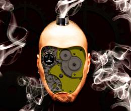 by arkncheeze 20550 views - final score: 58.4% |
Victorian ray blaster 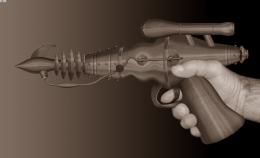 by CMYK46 12107 views - final score: 58.1% | Time machine 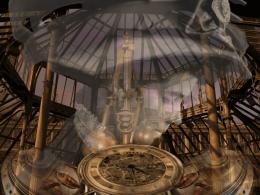 by filantrop 7911 views - final score: 57.7% | Dreaming Jules Verne 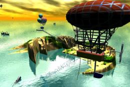 by billyboy 12869 views - final score: 57.4% |
Steampunk Ben 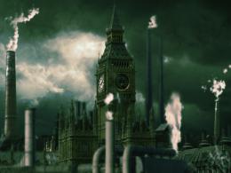 by Missy 15330 views - final score: 57.3% | Armoured dragonfly 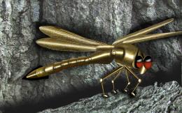 by hereisanoop 6699 views - final score: 56.3% | How does he do that?! 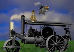 by BlueSparkle 8895 views - final score: 55.8% |
Chicken Run Inspired 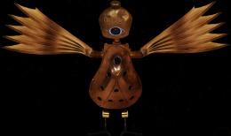 by OliviasArts 8616 views - final score: 55.2% | Photographic 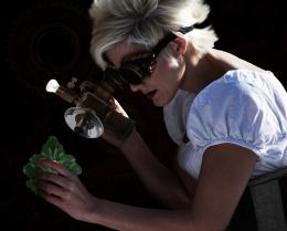 by OliviasArts 6227 views - final score: 55.1% | Valve Cherub  by GolemAura 6571 views - final score: 54.8% |
Steampunk Heaven 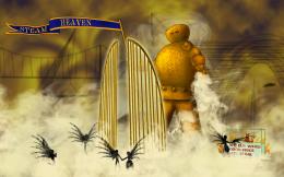 by Stoli4naq 9377 views - final score: 53.9% |
Howdie Guest!
You need to be logged in to rate this entry and participate in the contests!
LOGIN HERE or REGISTER FOR FREE
nice!
nice work
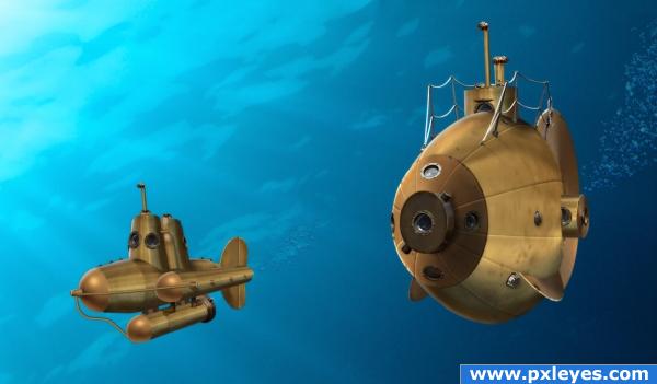
Oh how great would it be, to drive with one of these! I love all the bull's-eyes! (I hope, that is the right translation) And the railing! Aaaah... I'm in love


Edit: Oh, it's you!
Hi Lelaina! Those are called portholes. Thanks for your comment!
Aaah thanks! Always good to learn something new And you're welcome of course
wow really awesome!
Good job!!
i have no idea how you guys make these things so well....grrr im getting nowhere with mine lol... well done author, looks good
Cute and maybe a bit cartoony--but I'm not sure that's quite the steampunk style. I think lighting is the problem. Light from above (not the side) would be more realistic and then adjust the shadows on the subs accordingly. (BTW the shadows on the subs don't even match the apparent light direction here.) [Some fish brushes to add fish in the background might increase the feeling of depth.]
Really good idea, and I'm a huge steampunk fan, and this is "ok" theme wise, but steam punk has nothing to do with cartoon anything... Your big sub has some major issues w/ perspective, and the whole thing is lit wrong from your light source.
I've always thought of the whole steampunk genre as cartoony...it's a parody crossbreed of Victoriana and Sci-fi. How can the big sub have perspective issues when it's a duplicate of the real thing? Did you look at the SBS?
PS: Lighting upgraded.
I don't see *much* difference in lighting, the tank under the lil sub should have much more shadow, the light source and the tanks/sub above would be blocking most of the light on that part, so should the back side of the big sub, and Yeah I saw your source.
awesome work author!! i know the sub in the background! it's in barcelona next to an aqua museum.. i think..
Great picture but not quite on theme..Really get into the mechanics of things...Show the steam power
"Steampunk" doesn't mean literally steam powered. It's a genre concept!
I understand the concept of steampunk..Here's an idea show me the mechanics of the subs and not just them floating around...Just my opinion
i think it's very on theme. as well as your other entry.
Howdie stranger!
If you want to rate this picture or participate in this contest, just:
LOGIN HERE or REGISTER FOR FREE