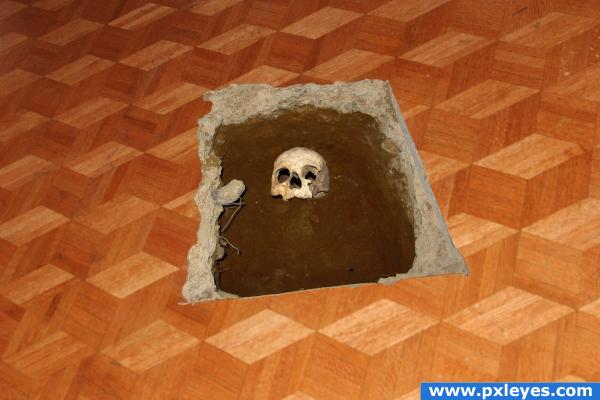
simple select copy and try to line up perspective (5 years and 3915 days ago)
ins outs ups downs  by Stowsk 13156 views - final score: 62.5% | Enough! I Quit!  by tapiona 15336 views - final score: 56.3% | Tile Rooster  by kandiflavored 13024 views - final score: 56.1% |
Gruesome discovery 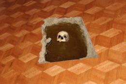 by vapaholic 13243 views - final score: 55.2% | P hoto S hop  by PSA2009 11387 views - final score: 54.2% | CUE BERT  by xwd 9618 views - final score: 54.1% |
Planets  by Dallaclya 5187 views - final score: 53.4% | Show Time  by Arryko 7346 views - final score: 53% | autumn...  by sebykxxx 3479 views - final score: 52.4% |
tribute to the stickmen 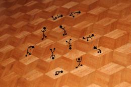 by wtfayla 5983 views - final score: 50.1% | Trance Floor.  by fille 5018 views - final score: 49.8% | Escher Cubes  by Jimmis 5645 views - final score: 47.3% |
Howdie Guest!
You need to be logged in to rate this entry and participate in the contests!
LOGIN HERE or REGISTER FOR FREE
Very creative use of source! It looks absolutely fantastic and very realistic! Good luck!
with this picture you sure DID NOT dig yourself a grave.... lol great...
Nice touch on the perspective manipulation. Looks very realistic to me. You can be proud of this.
cool, but you've made the dance floor paper thin! i see a few other mistakes but i'll give you a break. for now good job on putting the skull in the dirt though
MUST VIEW HIGH RES to really appreciate the detail.. good job author
Thanks for all of your feedback. I added an outline to the lineloeum to try to give it a little depth, tell me if it looks better tis way elficho. thanks
nice choppin! and the end result is fantastic! very good work here author and the perspctive lines up very well! i hope to see more like this!
Creative idea edges of the hole need some work ( i.e remove all the white parts) you may want to add a pile of rubble & dirt beside the hole for a bit of realism.
Was going to write same as Warlock - seriously, author, do not use magic select tool for cutting out perposes, most of the times it sucks a lot. If you used smth else - ok, but still u need to fix the edges. And the source picture is more blurred then the hole. To make the whole this look realistic, you need to add wood on the edge of breaking - that's wood, not linoleum. But even if it were linoleum, you need body, otherwise it looks like a sticker. Good luck!
I didnt use the magic select tool. I carefully traced a mask but added the white edge to try and create depth after elfichos comment. Also the fact that the source is more blurred than the hole is ok because the dance floor would seem to be not as sharp as the dirt from wear and tear and scuffing.
Good use of source... like the high res version. GL .
nice wrk.....looks so real.........................gl
Nice it looks like a phtograh, amazing blending!
looks real and pragmatic :P
Yes, finally I see an original idea, keep this way, good luck.
Howdie stranger!
If you want to rate this picture or participate in this contest, just:
LOGIN HERE or REGISTER FOR FREE