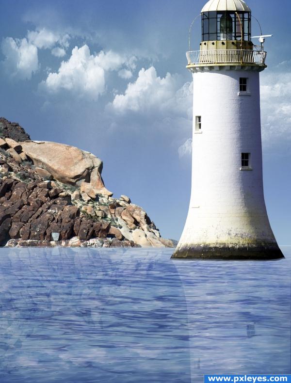
Thank you julesinky, JavierZhX and Obsidian Dawn (5 years and 3914 days ago)
3 Sources:
- 1: lighthouse
- 2: clouds
- 3: water brushes

Thank you julesinky, JavierZhX and Obsidian Dawn (5 years and 3914 days ago)
Rejection  by jaskier 11147 views - final score: 64.6% | Matron of Darkness  by ponti55 13366 views - final score: 60.6% | old bridge  by sosipatra 17828 views - final score: 58.8% |
Skull  by creativefx 13138 views - final score: 58.4% | Night on Skull Mountain  by CMYK46 15257 views - final score: 57.5% | Gargoyle  by cafenaderi 7724 views - final score: 56.5% |
Welcome Home 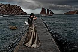 by OliviasArts 6535 views - final score: 55.8% | Gargoyle2 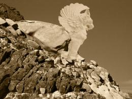 by cafenaderi 6193 views - final score: 55.3% | Night Conversation 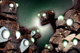 by GolemAura 5038 views - final score: 53.8% |
Blood from Stone 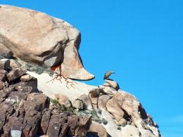 by spero4 10248 views - final score: 53.4% | In The Middle Of Nowhere 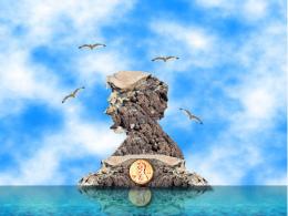 by Chuck 5803 views - final score: 52.9% | stone(ed) indian 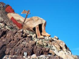 by wtfayla 4966 views - final score: 52.8% |
rocky dreams 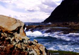 by SHIPLEYGIRL 5442 views - final score: 51.4% | Rockface Point  by tapiona 6173 views - final score: 50.7% | Gargoyle Hill 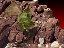 by PSA2009 5325 views - final score: 50.1% |
Unbalanced Rock  by designedwright 4357 views - final score: 46.6% |
Howdie Guest!
You need to be logged in to rate this entry and participate in the contests!
LOGIN HERE or REGISTER FOR FREE
Very nice! I think that maybe the reflections should be abit more subtle, and set to something like overlay or soft light, but the image itself looks very nice. Good luck!
give the reflection the wiggles like the water surface and you'll have an awesome image (right now it's perfection takes away from the beauty) still beautiful, but you might want to try to subtle it up

whoops.. what ponti said
MUCH BETTER REFLECTION.. good job author
you might want to fix the water around the edges of the tower it looks a little chopped right now but that problem can be fixed easily! and the image is worth a lot of high marks and you got yourself a high mark from me!
fixed
Lighthouses are built on land...like that nice patch of rocks over to the left... Cloud brushes are repetitive.
o.o omg plz remove the reflections in the water.... its way too bright...
they should e a little wavey and way darker and blurry
you know, i think that the clouds look fine...i didnt even notice the repetitiveness until cmyk46 pointed it out and i just wanted to say that i love the image!
hi res looks great too
I know the reflection has been mentioned, but as this lighthouse is built in the water go back to your source image and have a look at the reflection it has
you have light hitting the front of the rocks, but the light on the lighthouse is on the back. With the way you have done the reflections its made the water look fake.. look at the bottom of that lighthouse, chances are the water there isnt that perfect. The clouds are a bit repetitive as well.... goodluck anyway
Howdie stranger!
If you want to rate this picture or participate in this contest, just:
LOGIN HERE or REGISTER FOR FREE