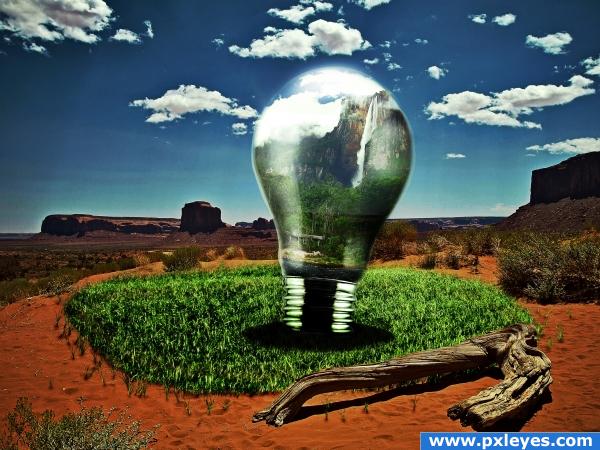
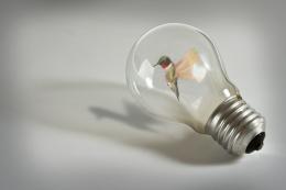
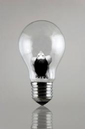
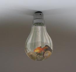
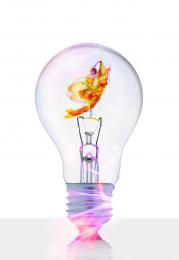
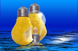
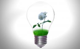
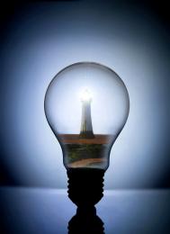
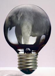
A truly green idea ;-) It was a lot of fun doing this one!
Please view the high-res!
Edit: Took some advice on the highlights and shadows. Also gave the image more of a surreal/hdr look.
Edit Edit: Adjusted shading some more, as well as adding a slight reflection to the bulb. Thanks for all your suggestions! (5 years and 3912 days ago)

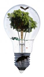

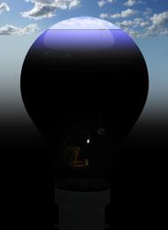


wow that looks realy nice could use some refining though with the shadows and highlights of the bulb
i agree about the shadows, they are really harsh, just blur it by a few pixels and tone the opacity down a little, the rest of the image looks good though!
I don't know about changing the shadow, if you look at the log, the shadow is also very sharp and dark in the original. Was trying to keep everything consistent.
I think there refering to the shadow on both sides of the bulb, right now you have it dark on both sides. but a peice of glass is reflective, so once side should be almost white if one side is dark , you could also try reflecting the ground in the bulb to give it that real look. very nice job thoe, i really like it. im working on one also , only half way done thoe
Nice job.
im so sorry author the shading is killing your image and i would hate ro see it nt finish well because of a silly reason like shading! the idea is super! dooper! i love it!
Thanks for all of your suggestions guys Hopefully its getting better lol
Way to think outside the "bulb"....LOL Awesome image and very creative!! Best of Luck
the grass turned out pretty good! great image!
Congrats for your second place!
Congratulations for 2nd
Congrats!
Congrats!!
Howdie stranger!
If you want to rate this picture or participate in this contest, just:
LOGIN HERE or REGISTER FOR FREE