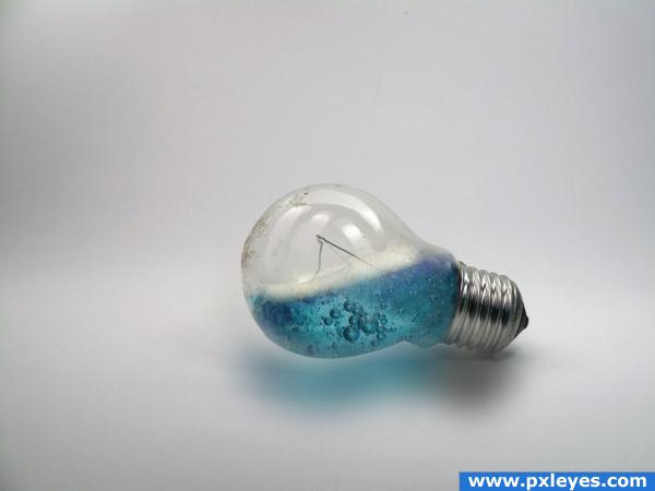
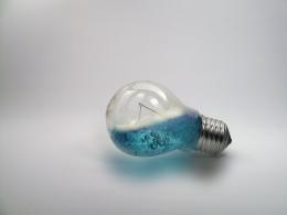
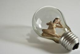
For the comment on the shadow, please look at the original image I did no editing on the the bulb. Thats how the photo was taken .
Ok Ok guys. I hope this is better. Edited shadow
Thanks for the image
Soap Bubbles 3 by ~Artress-Stock (5 years and 3916 days ago)

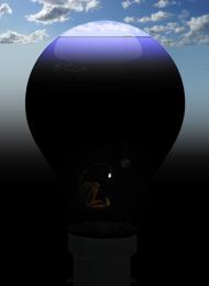
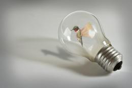
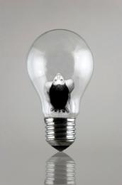
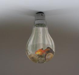
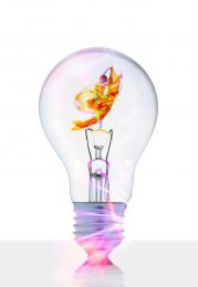

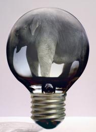


I've no idea what this is supposed to do, it looks really cool! Although the angle at which the bulb itself is "put" is somehow wierd..
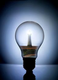
nice work, but i think the bulb angle and water angle are off, water level should almost be straight horizontal. great work thoe!
Looks good!
the shadow is not so good ,lamp looks like floating, good luck
umm i dun understand why the bulb is flooating it seems to have come loose of the floor , nice work adding the fluid
Making me thirsty. Looks like some kinda soda. I like it.
hahaha cool bulb! i like this one!
how can the shadow be blue? also, about that blue part of the shadow, put it underneath the bulb, not next to it there's white space between the bulb and the shadow and if you pushed it under it, it would look better imo
like the concept. however, you may like to work on the water line a little. GL
good job
Howdie stranger!
If you want to rate this picture or participate in this contest, just:
LOGIN HERE or REGISTER FOR FREE