(5 years and 3914 days ago)
4 Sources:
The Call...  by Nellista 13457 views - final score: 68.9% | Cloud tether  by CMYK46 10707 views - final score: 61% | Green Planet  by siderismaris 8349 views - final score: 60.2% |
Hard Lemonade  by RickLaMesa 10010 views - final score: 60.1% | Ball sculpture 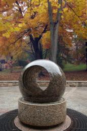 by CMYK46 12930 views - final score: 60% | Floating world 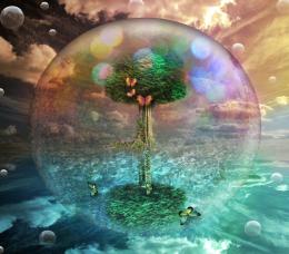 by siderismaris 3548 views - final score: 59.2% |
Wave 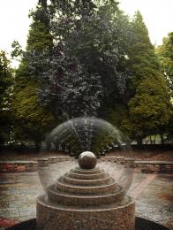 by cafenaderi 5826 views - final score: 58.7% | Summer Globe 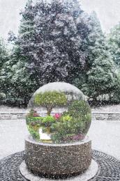 by IDt8r 6513 views - final score: 58.3% | Soliloquy of Destitude  by ponti55 5122 views - final score: 57.3% |
Stone cube 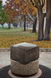 by Palaekman 8684 views - final score: 57.3% | Indiana revisited  by robvdn 4793 views - final score: 56.1% | Coconut Island  by elficho 7870 views - final score: 55.6% |
Let it rain... 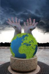 by sosipatra 4889 views - final score: 55.2% | Game On 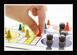 by wtfayla 4225 views - final score: 55.2% | Stone EyeBall 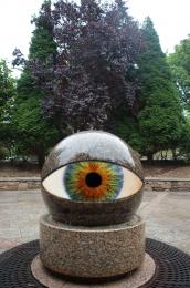 by Alan2641 7130 views - final score: 55.1% |
Mayo Flavored Ice Cream 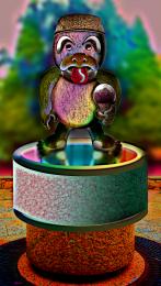 by GolemAura 6673 views - final score: 55% | mama mia! 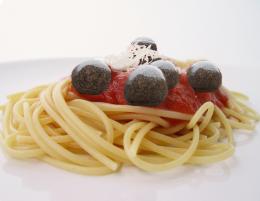 by wtfayla 2481 views - final score: 54.2% | Dance of the orb 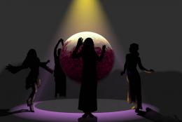 by whiteshade 4931 views - final score: 53.4% |
Country Club  by RickLaMesa 5623 views - final score: 52.8% | stone planet collision  by genuine2009 6140 views - final score: 51.8% | Where did that come from 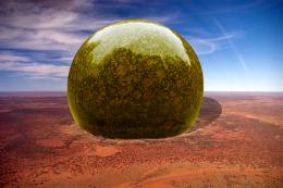 by vapaholic 6372 views - final score: 50% |
Howdie Guest!
You need to be logged in to rate this entry and participate in the contests!
LOGIN HERE or REGISTER FOR FREE
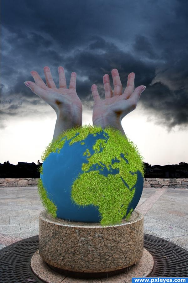
A very interesting use of the source image, i'll give you that, but i think you could blend the hands a little better, maybe starting from lower down on the globe to make it nice and smooth. I also question or use of the grass for the world, the image would be a lot more effective with a flat - brown and green land. That's just my opinion though, after all, it's your image! Good luck!!
i like it but think it would look better without the hands.
i like the image we all need rain it makes the worl happy right? and we all need to be nice to the worlsd ! its our only one right! nice blending on the hands! i love the earth you know because without it, we wouldnt evenbe here wed just be...well... nothing so i congratulate you on your wonderful image and idea and im giving you high marks! oh and by the IMO
Very creative.......love the grass
the earth looks great, but I think that the hands should be lightened a lil bit more. Also, the mood og the image should be in harmony with the other graphic ellements.
very interesting
the foreground of the image is very bright considering the background you have chosen.. Also the hands are a nice touch but maybe lower them a bit so they look like they are coming out of the earth... right now they look like they go straight up and it throws the whole perspective off to me goodluck.
idea is good but this gress in earth is ugly, sorry, good luck
I LIKE THE GRASS... REALLY SMART IDEA.... GREAT WORK
nice
i like the grass a lot... good job...
Howdie stranger!
If you want to rate this picture or participate in this contest, just:
LOGIN HERE or REGISTER FOR FREE