
(5 years and 3912 days ago)
3 Sources:
- 1: source1
- 2: source2
- 3: photo by kevindooley
The Call... 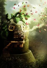 by Nellista 13457 views - final score: 68.9% | Cloud tether  by CMYK46 10707 views - final score: 61% | Green Planet  by siderismaris 8349 views - final score: 60.2% |
Hard Lemonade 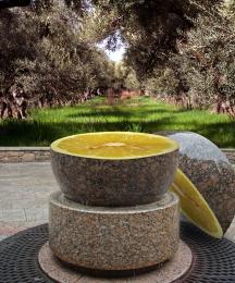 by RickLaMesa 10010 views - final score: 60.1% | Ball sculpture 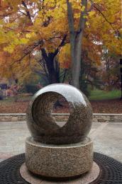 by CMYK46 12930 views - final score: 60% | Floating world  by siderismaris 3548 views - final score: 59.2% |
Wave 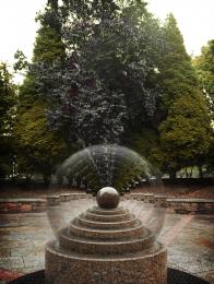 by cafenaderi 5826 views - final score: 58.7% | Summer Globe 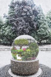 by IDt8r 6514 views - final score: 58.3% | Soliloquy of Destitude  by ponti55 5122 views - final score: 57.3% |
Stone cube 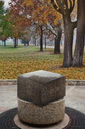 by Palaekman 8684 views - final score: 57.3% | Indiana revisited 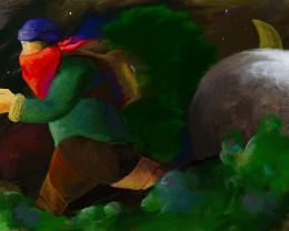 by robvdn 4793 views - final score: 56.1% | Coconut Island 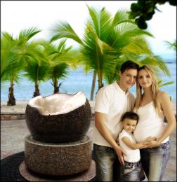 by elficho 7870 views - final score: 55.6% |
Let it rain... 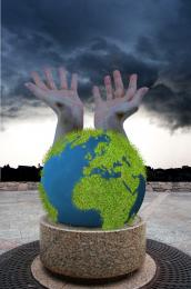 by sosipatra 4889 views - final score: 55.2% | Game On 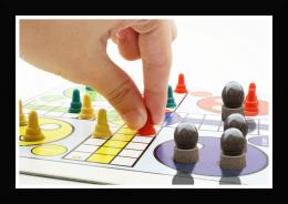 by wtfayla 4225 views - final score: 55.2% | Stone EyeBall 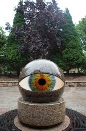 by Alan2641 7130 views - final score: 55.1% |
Mayo Flavored Ice Cream 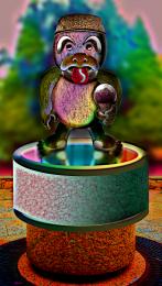 by GolemAura 6673 views - final score: 55% | mama mia! 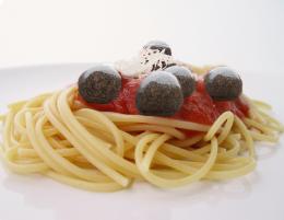 by wtfayla 2481 views - final score: 54.2% | Dance of the orb 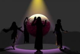 by whiteshade 4931 views - final score: 53.4% |
Country Club  by RickLaMesa 5624 views - final score: 52.8% | stone planet collision  by genuine2009 6140 views - final score: 51.8% | Where did that come from 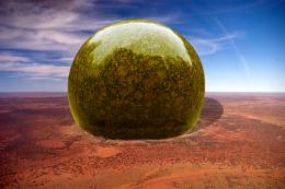 by vapaholic 6372 views - final score: 50% |
Howdie Guest!
You need to be logged in to rate this entry and participate in the contests!
LOGIN HERE or REGISTER FOR FREE
Haha cool!!
Liek the idea -- the letters appear to be a bit floating as oppoaed to being on the ball and the perspective of them on the ball seems a bit off (IMHO)
the words just look like they are floating and not on the actual ball... need to warp them a bit into all those little grooves if you want it to be believable goodluck.
you should use a displacement map on the lettering.
for me, the text ruined the image it really needs more work love the image though
i agree...the type sucks...i dont have much experience with type so i'll count this as a clunker
Nice idea, though.
u dt have to type again u just have to use displacement map, good luck
totally agree about wording in images... i can never get it right lol
author a displacement would rock this entry look at a tut for it they are pretty straight forward for type good luck you still have time
the background looks stretched I dont know if that was the intention but i cant say i like it, nice work on the golfball tho
i tried the displacement map and youi were absolutely right,,,thanjs a lot for the tip cabldawg
you are welcome Author better now
gl
very nice... golf bal-stone ball. it is all the same... good luck.
Howdie stranger!
If you want to rate this picture or participate in this contest, just:
LOGIN HERE or REGISTER FOR FREE