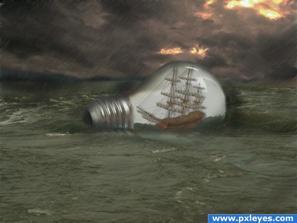
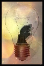
Lots of layers and blending...
Thanks to lindowyn-stock, *unholy-stock, night_fate, and Buckey for the great images!!!
Changed the hues a little thankx to some good advise!!
Was able to fix the hues on the water inside the bulb...thanks for the advise!! (5 years and 3913 days ago)
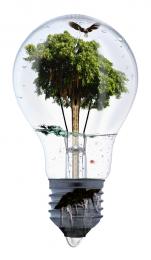
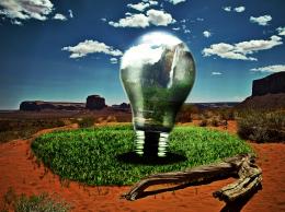
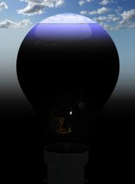
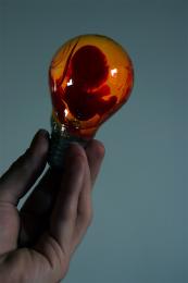
- 1: bulb
- 2: storm clouds
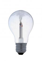
- 3: ship
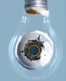
- 4: rough seas


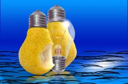
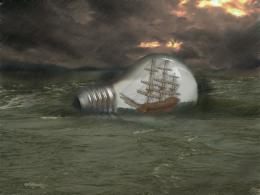

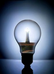



Very nice, but before i looked at the image closely, i thought the sea was sand.. if it's meant to be the sea i think you should make it blue.. and maybe work on a light reflection , otherwise if you like the colour of the ocean, you should make the lightbulb and the ship match as well. Good luck!
nice image good luck
wow the ocean is great! i think the bulb is cool and the ship is a great image to use! the idea is awesome! aqnd the alternation between the bottle and bulb is great a fave deffinately!
Good image nice thinking on this....the bulb should be a little more transparent ....
good idea
very nice idea...
o.o dunno why you changed it but i liked the water in the bottle better when was darker and greyer same with the ship they look more painted on especially because the light bulb doesnt seem to be transparant
Me too, but because the first ocean had a non-derivitive copyright that I did not see at first I hade to pic another...I will try and get that water in the bottle to match up a little better. Thanks for the advice!!
Howdie stranger!
If you want to rate this picture or participate in this contest, just:
LOGIN HERE or REGISTER FOR FREE