
Grunge is one of my favourite styles.
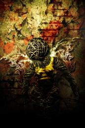
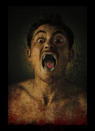
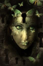
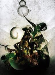
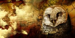
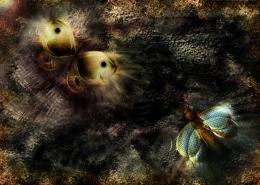
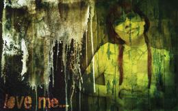
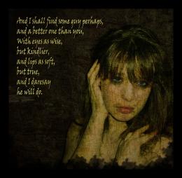
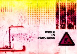
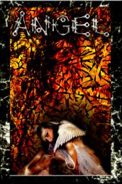
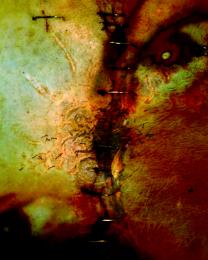
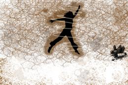
In step 1 you could see something like a texture. But it is not. I used Valley of Dry Bones brushes, which can be found on www.brushking.eu. And the Clouds filter to make it look like a texture. I have used only one texture, to which I have given the link. About the typography, every word is connected to another.
Enjoy.........
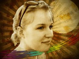
source 1 : Thanks to jjrye for the Photo.
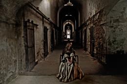
source 2 : Thanks to firehawk77 for the photo.
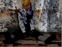
Thanks to seudavi for the Valley of Dry Bones 3 brushes.
Edit : In the previous version I thought that making the words in tune with the background will make them hard to read (they were white). But after getting the chemistery with the background the words are still clear. So, thats the only thing I've edited. (5 years and 3890 days ago)










Ha ha ha thats cool...
Texture is prett grungey . Maybe if you use another more eroded font (or a few) for the messages (check for example here http://www.dafont.com/theme.php?cat=107), they might get more relationship with the background. Good luck!
Definitely needs a font overhaul...
wow i just love this image so much author its incredible!
Elegant.... Dirty... very nice...
Howdie stranger!
If you want to rate this picture or participate in this contest, just:
LOGIN HERE or REGISTER FOR FREE