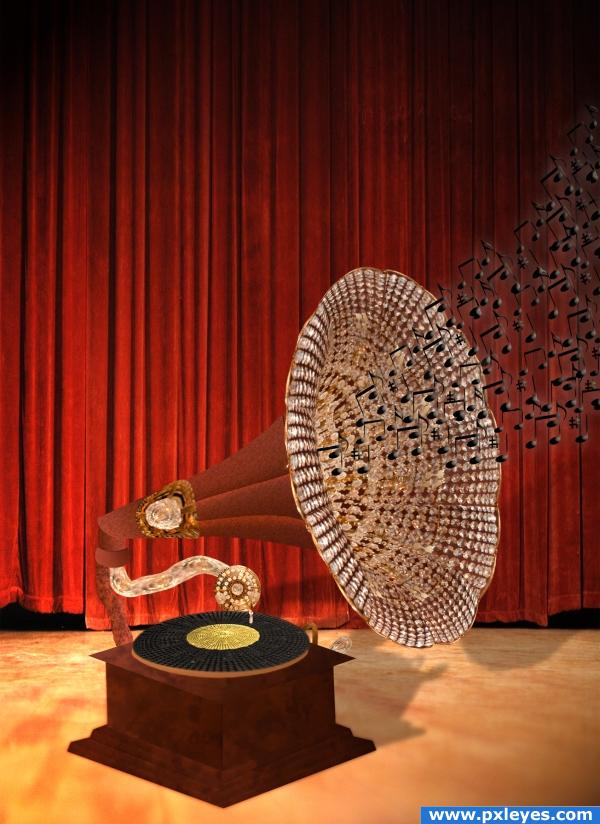
Only source image used
EDIT :Updated
EDIT :Updated 2 (5 years and 3902 days ago)
- 1: Background
- 2: Refrence

Only source image used
EDIT :Updated
EDIT :Updated 2 (5 years and 3902 days ago)
Expedition 205.35 LAPD  by Sander 13402 views - final score: 69.7% | Wings  by CorneliaMladenova 7618 views - final score: 63.9% | luxurious cart  by chakra1985 9731 views - final score: 62.9% |
Gramophone  by Mario 9925 views - final score: 60.6% | Grim  by IRONCOW 7544 views - final score: 60.1% | Jeweled Eagle  by whiteshade 5625 views - final score: 58.5% |
Exotic Dancer  by arkncheeze 33469 views - final score: 58.1% | Chandelier Bird  by Tuckinator 5970 views - final score: 57.5% | Breakfast Bonanza  by GolemAura 4712 views - final score: 57.4% |
Indian look  by siderismaris 6369 views - final score: 57.3% | Coming Home  by lchappell 6627 views - final score: 54.8% |
Howdie Guest!
You need to be logged in to rate this entry and participate in the contests!
LOGIN HERE or REGISTER FOR FREE
nice job... the musical notes need some work. they look a little to fuzzy.. it took me a moment to catch on what they were.. (Just a nit pick) over all image is quite nice .. Maybe make them black and a bit more glossy?.. just a suggestion and good luck
EDIT: Much better, I can really see the music now without squinting.. great job!!!
Not bad, but the base is blurry at bottom, and the drop shadow is totally wrong. Try to make a realistic shadow...
i like this image but the wood from the grammophone seems a bit blurry, if you want to make it more realistic try adding a shadow lin at the bottom of the eddges of the grammophone, and personally i wouldnt add so many music notes or make the grammophone smaller and let the musicnotes go up in the air
Nice, i think you should use some more burn/dodge and shadows.
very nice!
very very nice and creative fav so far
thanks for suggestion but ...if you look at the background picture you will see it is blurry at the bottom so I must to do gramophone blurry too ...the light came from bottom left corner so shadow supposed to be behind object...ok CMYK 46 I will do a realistic shadow but please explain me how
This is a really good idea but to me the gramophone looks too 'cut out'...maybe you intended that? Also, if you look at the shadows...they are very shallow whereas the curtain is quite a distance away...the shadow for the actual 'phone would be along the floor not a cut out behind...good luck!
very good work!
Glad to help with your shadow, author: http://www.photoshop-pack.com/details/Casting_Realistic_Shadows/11041
wow, great how you made3 this... it looks like real to me...
Kudos on the new shadow, author...looks great! (Base is still blurry, though...).
Oh, beautiful work! I'd really like to have this one in my living room Good luck!
great image! the notes are a nice touch!!
winner!!! congratz
very nice job and clever idea .. GL
Howdie stranger!
If you want to rate this picture or participate in this contest, just:
LOGIN HERE or REGISTER FOR FREE