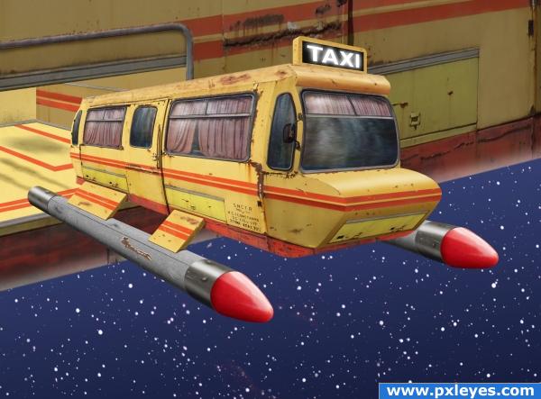
After losing another starship and his job, Captain James D. Jirk takes the only job available...Cabbie in a poor quadrant of space. His former first officer, Mr. Spook, took a job at Taco Bell. (5 years and 3907 days ago)
1 Source:
Star Taxi  by spaceranger 14387 views - final score: 69.9% | Goodbye...  by Lelaina 15594 views - final score: 62.1% | Fully Re-vamped  by thomasms 12949 views - final score: 57.9% |
Playing with the Trolley 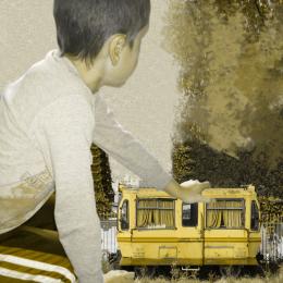 by designedwright 12725 views - final score: 52.5% | big train go out 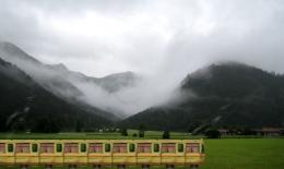 by rikigoft 11162 views - final score: 51.6% | Animal train 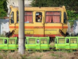 by shaiju1974 5144 views - final score: 48.9% |
Howdie Guest!
You need to be logged in to rate this entry and participate in the contests!
LOGIN HERE or REGISTER FOR FREE
excellent! very clever love the depth of field
Well done. It looks really nice!
super kool look kinda like the taxi form the movie the fifth element
EDIT: dunno what I was thinking, but I saw it completely wrong if it was about the light, so skip what I say, apart from that it's nice work
great idea and well done I feel the nose of the taxi and the "landing things" are perhaps a little too clean in comparison to the rest of the rust bucket
I love this. I love this. Did I say I love this? OK, now...having said that, the perspective on the nose of the cab is wrong. Adjust it a bit and your image will get a very high vote.

good use of source. great entry.
Spectacular! If you could grunge up the added parts and the interior this would be even better. A midnight blue sky would highlight the taxi better but it still looks great!
omg!omg! this image should win mean it really 100 percent! i love it ad im adding it tgo my faves
Nice work
AWESOME!!!!
Thanks for the comments and suggestions. Madamemonty I forgot to turn on a layer with the grunge thanks for noticing. I adjusted the nose a touch,thanks CMYK46 it looks correct to me. Yes lilking92, I love Fifth Element and it did lend some inspiration to my original concept for sure.
Looks much better love it
Fantastic entry! Great imagination and great execution! But I think, that Captain Jirk isn't so happy with it at all
Good luck!
rust in space.... I LOVE IT...hehehehe
haha love it author... well done is all i can say..goodluck
Amazing work, Congrats! winner in advance


Really Nice, best I have seen for ages!
Great idea, well executed. The perspective looks a bit off, but apart from that, it is a fantastic image.
very original ... great work author ... i love this one overall, GL
very WOW


Congrats for your first place, Spaceranger
Congratulations, Spaceranger! Do you use this taxi for your space trips?
Congratulations for 1st
Well done, you deserved first place.
Congrats Spaceranger, awesome work
Congrats! for 1st place
Thanks to all! Much appreciated!
Congrats!
Howdie stranger!
If you want to rate this picture or participate in this contest, just:
LOGIN HERE or REGISTER FOR FREE