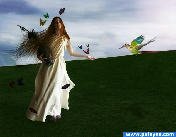
There you go Lelaina! (5 years and 3883 days ago)
4 Sources:
- 1: woman
- 2: bird
- 3: Hair brushes
- 4: Butterfly brushes

There you go Lelaina! (5 years and 3883 days ago)
La Defense  by mqtrf 15410 views - final score: 67.6% | On Yorkshire moors  by Missy 14549 views - final score: 60.6% | stone  by slayyou 16198 views - final score: 58.3% |
Dragon Slayer  by mjeprie 18878 views - final score: 58.2% | A strange place  by Missy 15881 views - final score: 57.3% | Just an old village  by sosipatra 11090 views - final score: 56.9% |
It lights up at dusk  by k5683 5869 views - final score: 55.5% | staires to the darkness 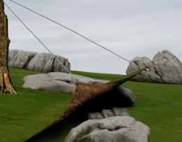 by hereisanoop 5396 views - final score: 54.7% | The shadows of the wind 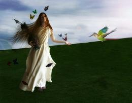 by ponti55 5765 views - final score: 54.5% |
Grass and Sand 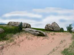 by k5683 5884 views - final score: 54.1% | Angel Ferret on rocks 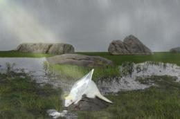 by workhorse0graphics 11248 views - final score: 53.3% | Replica 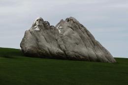 by JustinCase 4189 views - final score: 53.3% |
The Battle 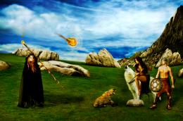 by Akassa 4685 views - final score: 52.9% | Enter Grassman 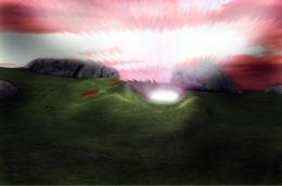 by dka120 5702 views - final score: 51.3% | Optical Déjà vu 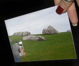 by dka120 3839 views - final score: 49.8% |
Soft Rock Cafe  by GolemAura 6474 views - final score: 48.6% | Zen Garden  by rikigoft 5557 views - final score: 46.1% |
Howdie Guest!
You need to be logged in to rate this entry and participate in the contests!
LOGIN HERE or REGISTER FOR FREE
*lol* Damn... That was a pretty short no-ideas-phase... Uh, I'm under pressure
Now I need an idea...
Good luck!
I'd raise the bird up a bit. It looks like it's perching on the horizon line...
Beautiful image but i think the grass is a little empty, maybe add some flowers
the girl doesn't look like she is part of the image... i am just learning about feathering give that a go. nice idea though and good cloning. i will hold my vote for the moment.
Sorry OliviasArts, i don;t understand what you mean.. i use the pen tool to select my images, and then i feather the selection by one pixel to smooth it out. If it still doesn;t look right i normally go back and add a selection border around the entire figure of about 3 or 4 pixels and then blur it. What you're seeing i think is a bit of pixelation, unfortunately i have to work in medium resolution because my computer is extremely slow and very full, so i can't go adding ultra high-res images, and i apologise for that. Thank you for the comment.
purdy purdy like the Sixties only with soap
i think the girl and the bird need more shading on the shadows
Shading on the shadows?
for me, the background just seems a little bit too empty, perhaps add an old tree with a swing??? or some other object that will fit in with the image??? But nice work here! Well done!!!
I wanted to create simplicty, and then everything gathering around the model to create a sense of control, which is really what i was trying to achieve
You could add one of the rocks back to the background, as it is now using the grass is minimal use of source.
Golem: you're so funny! I like this image.......minus the bird. Good luck
Howdie stranger!
If you want to rate this picture or participate in this contest, just:
LOGIN HERE or REGISTER FOR FREE