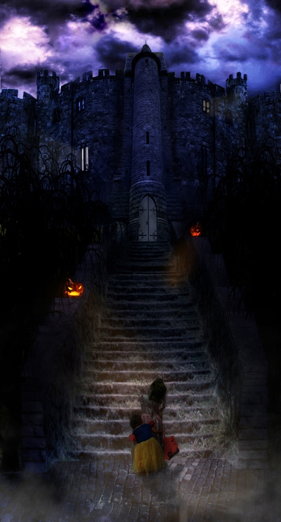
I seen something similar to this a long time ago, don't remember where i seen it now, but remember thinking it was really cute and was the first thing i thought of when i seen this image .
Hope you guys enjoy it!
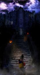
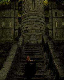
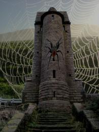
Stairs are built using the stairs from the source image and blended together
trees are a tree brush.
castle is pieces of castle from source attached and original image
ground is also made from original image.
then several color layers laid over and blending changed to add color etc
edit : changed image of boy to my 2 little girls , the pic of the girls if from my own camera :)
also brightened it up a bit.
ps. not 100% sure what combo of brushes i used, as i have a few sets "mergerd" in photoshop that i labled clouds, but the set is made up of the 3 sets i posted as sources :) (5 years and 3904 days ago)



beautiful image
you cant use the castle image or the pumpkin stock image.. castle is pre made and the pumpkin image is a no no as to the guidelines... ive have asked about these in the forums... see if you can find another castle and use a real pumpkin instead. Im not sure how you will go with the trees either as they are another png premade image. sorry.
Illustrations and renders are allowed since not everybody can draw and know how to use 3D- programs http://www.pxleyes.com/forum/viewtopic.php?f=9&t=95&sid=dfc20094b0034616408a63cb0a407641 However you should be able to do some PS and photo manipulations such as source 5 can’t be used as sources. Also of course copyrighted photos such as source 1
yhanks for clearing that up maja , ill change the child image monday ( when i have access to the psd file. its on my work pc) i didn't notice , funny think is it would have been easier to just draw the child lol half of him was missing anyway, i had to dra his right side/legs and the rest of his bucket as its all cut off or in the wrong posistion in the origianal photo.
Here is a link to the topic about using images like the pumpkin.. the castle is straight forward as it even says on the original image it is pre manipulated, so that needs to be removed anyway.

http://www.pxleyes.com/forum/viewtopic.php?f=9&t=322
I had an entry removed awhile back for this very reason, so i think the rules should apply to all. no offence author, its a fantastic image
hey olivias, the castle is here : http://angelus-knight.deviantart.com/art/castle-stock-6-65114386 , the sky is a sky brush with over layed colors. if you check the pre made image and mine the sky is different, originaly i used the premade but didn't like the sky so used the other versio n with the white sky to make masking easier. . i do have to change the little boy thoe, as he is c/w i didn't notice. ill be doing that monday when i have access to the psd again ( im camping now at my trailor)
Source 1 is © by twehl
did you get that from the comments or did you figure it out all by yourself cmyk? hehe jj :p yeah i didn't notice that, im going to fix it monday when i get at the pc that has the psd file on it. i have a pic of my 2 little ones im going to put there instead . dunno how i missed that, im usually pretty good at finding stock. ah well. easy fix anyway
I don't understand. It sounds like from the link that Oliviasarts posted, you cannot use an image that was already manipulated by someone else. I went to this castle and I don't see where it's been manipulated. It just looks like a castle that someone photographed and made it a stock photo. It says nothing about being premanipulated in the description. Is it my eyes? Am I missing something, or do I not get the problem?
there is a premunipulated version of the image you seen on devident art with a sky, and the castle colors changes. ( i put the wrong link when posting) so my link was showing the wrong image.
Oh, ok. Well really nice job.
incredible!
The child has no shadows on the ground, does it? o.o
shadows added to children ( children also added, replaced little boy with a pic i had of my 2 girls) also brightened the image up a bit. hope you guys like the new version!
Great!! the two little girls are just the right for this entry, the little girl hiding behind the older girl is so sweet. Perfect contrast to the gloomy castle.
Perspective wise the source image (the tower) is off. Should be an easy fix to correct this with the perspective tool (edit > transform > perpective) and make to top a little wider.

OOO and don't forget to post the sources for the sky AND stairs you used
thanks


The stairs are made up of the stairs in the original source
The sky is just a few brushes, with 4 layers over it, black blue grey and purple layer overlayed, and erased in certain spots with a soft brush then the opacity adjusted
The 2 girls are my 2 little ones, i won't put names ( just incase someone can figure out who owns the entry) but the little one is 2 and she was hiding like that every house and in a few pics in the basement. it was so cute i got a few pics of it for my parents to see glad i did now lol worked good for the spooky house
cool idea but I think the pumpkin at the top is too big for the castle awesome job though
Howdie stranger!
If you want to rate this picture or participate in this contest, just:
LOGIN HERE or REGISTER FOR FREE