(5 years and 3893 days ago)
Sweet Protector  by SOLARIS 18871 views - final score: 70.4% | Jelly Venus de Milo  by rcscruff 23011 views - final score: 64.5% | Cubistic Jelly Guitar  by akasha 18234 views - final score: 61.2% |
Foot in it  by Oriel 17535 views - final score: 58.5% | Jelly Dancer  by paradise1278 15330 views - final score: 57.2% | tea cup 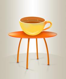 by hereisanoop 7171 views - final score: 56.2% |
Aromatic Candles  by Richirajd 11737 views - final score: 55.9% | Jellyfish  by Alan2641 5924 views - final score: 55.8% | jelly bears 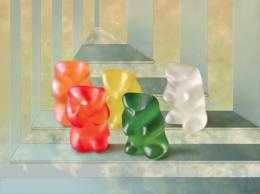 by vertigo 7511 views - final score: 55.1% |
Jello Again 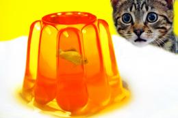 by woodztockr 13413 views - final score: 54.3% | jello clown 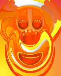 by spygirl1978 8039 views - final score: 54.3% | jelly snooker 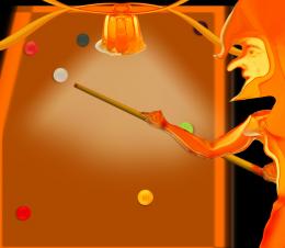 by shaiju1974 5490 views - final score: 53.4% |
Popsicle Time 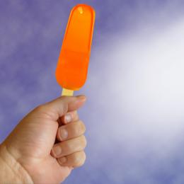 by designedwright 6857 views - final score: 53.3% | Gingerbread Attack of 85 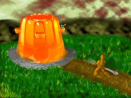 by aaronrad 6574 views - final score: 53.1% | jelly abstract  by spygirl1978 5494 views - final score: 53.1% |
Jelly Tree  by GolemAura 6498 views - final score: 52.9% | Jelly Fly 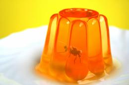 by etherwarrior 11271 views - final score: 51.9% | JellyFish 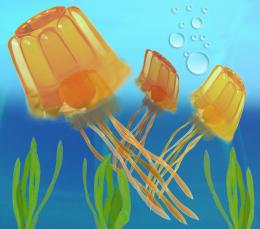 by Ory 7470 views - final score: 51.2% |
Trapped 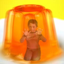 by designedwright 6743 views - final score: 50% | amber necklace  by k5683 5384 views - final score: 49.9% | Dude! Someone's In Your Jello! 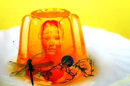 by downoffthedragon 15756 views - final score: 49.7% |
eggcellent  by k5683 4445 views - final score: 49.1% | Tasty jelly 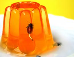 by billyboy 14006 views - final score: 48.4% | Flower  by designedwright 4569 views - final score: 48.1% |
Howdie Guest!
You need to be logged in to rate this entry and participate in the contests!
LOGIN HERE or REGISTER FOR FREE
nice
Very, very nice.
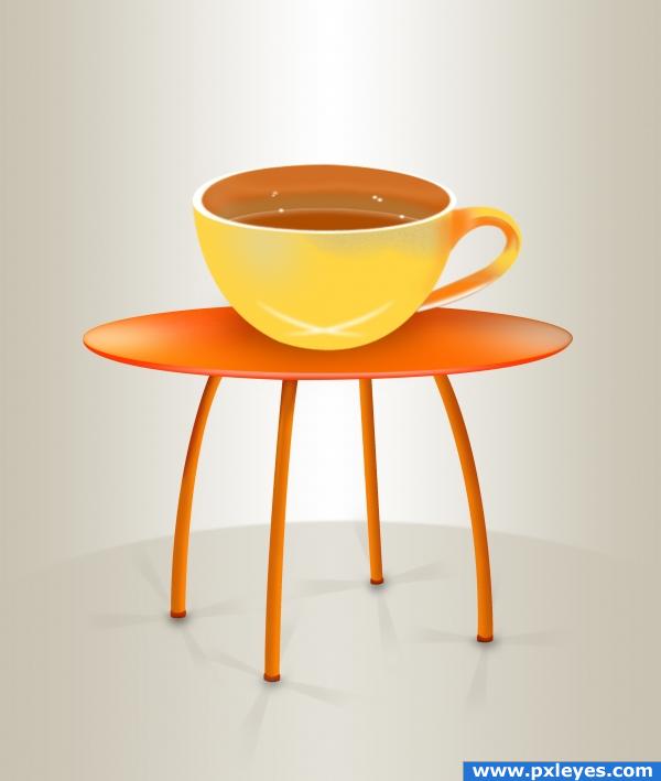
Perspective of top of cup should match the table...
Thats really cool. Nice idea. Theres 2 things i would change about the shadows: 1 nice job on the shadows on the legs but they should all be going nearly the same direction. 2, make the shadow of the cup darker right where te cup meets the table. maybe try the same thing as you did with the legs (just an idea. that might be too much) Great job otherwise!
i love the table! the cups shadow needs more work and the perspective isnt quite threre
Agree with CMYK. If perspective is fixed, might want to consider a flatter shadow from the cup onto the table. Everything else is really good.
nice job
not bad...very simple... but still good
Howdie stranger!
If you want to rate this picture or participate in this contest, just:
LOGIN HERE or REGISTER FOR FREE