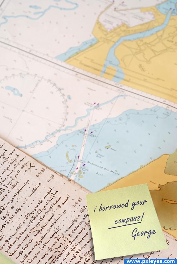
a lot of cloning.. (5 years and 3971 days ago)
1 Source:
Magic Charts  by Sander 14399 views - final score: 71.5% | Queen  by CorneliaMladenova 8601 views - final score: 68.6% | Fantasy Bird  by jaskier 12237 views - final score: 67.3% |
Excalibur  by mqtrf 8143 views - final score: 64% | Pirate ship sailing  by marina08 13504 views - final score: 63.4% | gone 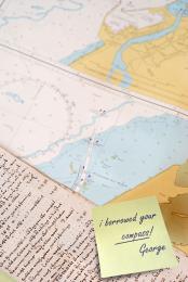 by elficho 5802 views - final score: 60.1% |
No Direction Home  by GolemAura 5678 views - final score: 57.4% | Show Time  by nasirkhan 4782 views - final score: 56.7% | The Skull  by nasirkhan 4420 views - final score: 55.2% |
Navigate  by Mayechung 3227 views - final score: 53% | Faceless  by Akassa 4455 views - final score: 52.8% |
Howdie Guest!
You need to be logged in to rate this entry and participate in the contests!
LOGIN HERE or REGISTER FOR FREE
awesome clone work
thanks!!
Woah!! Good job, looks great
cool cloning work... won't bother about the detail but just a lil thing... the paper somehow looks to me as if it's floating, I dunno maybe it's just me... still awesome work adding that piece of paper to change the whole mood of the image
It's really good but the papper seems to be "flying", you should work better on the shadows/light, great work with the clonage.
of course that paper is flying - it fall right now - where is question? finally one very clear work - that's how it must be done.
thanks everybody! i think it was the shadow, it was beneath the sticky part of the post-it which is impossible if it's glued on the map. well, i fixed it, i think it looks better! any suggestions are very welcome!
aha how ingenious! awesome stuff... what a great idea! and well pulled off!
Cloning work looks quite good. I kinda agree with arkncheeze about the paper. Maybe it needs a bit of distortion (right top corner could be a bit lower) and perhaps make a shorter shadow, keep it closer to the paper itself. The more shadow, the more the paper looks above the background (not impossible, but not completely natural either). Up to you if you agree. Good luck!

EDIT: is improved already, looks better
Very neat work, Author. I think you mean you borrowed the compass and stole the trammel because that thing is missing too but you don't mention it in your note.
ahhah so funny
no cornelia, it wasn't me, george did it duh! (who am i kidding, i didn't know the name for the "tremmel"
  )
)
wow wow amazing work
I did not borrow the compass.... probably it was taken away by Curious George! Good luck author.
Great work
give it back George. i need it to plot the chart. neat idea, good work. i agree with the others great cloning work.
A quite good idea! Really funny!! I like this sheet of paper - and the font You used.. extraordinary fitting! I honor the extensive cloning-work.
This would be even better if you actually scrawled the note instead of a font. Nice work though!!
pixelkid, i know, that would be great but i don't have a tablet nor a scanner.. i did draw that line below "compass" though
Actually, that shadow is perfect because a sticky note does curl up at the bottom. You see how there is no shadow where the "sticky" part is but, where the "sticky" part isn't, the paper is coming up---just like sticky notes do. Awesome job!
Great work! But the sticky note looks a bit to "clean". Maybe a little part of an edge would come of, or a little bit of a fold somewhere. And I was thinking that there should be a little bit of the edge from the paper where it is pressed on should come through.
nice clone.. good job
Wonderful idea.
Wonderful idea.
Wonderful idea.
thank you thank you thank you
great idea.
Very clever idea And a very good cloning job! Good luck
Howdie stranger!
If you want to rate this picture or participate in this contest, just:
LOGIN HERE or REGISTER FOR FREE